What to Include in Your Ecommerce Product Page? (New Study)
Share
Share
Get a quick blog summary with


What makes a great e-commerce product page?
To find out, we studied 21 fast-growing online stores and analyzed 29 key features that improve user experience and sales.
From product images to pricing strategies, we uncovered what the top sites do best.
In this research, we’ll share key takeaways to help you create a high-converting product page that fits your business and customers.
How we conducted this study
We wanted to find out what makes a great e-commerce product page.
Here’s how we did it:
First, we searched for the fastest-growing e-commerce websites. We found a study by Ahrefs that listed top e-commerce startups: Ahrefs Study.
Next, we picked 21 websites from the list. We only chose sites that sell physical products so we could compare similar businesses.
Then, we decided on 29 important features to study. These included things like product images, videos, pricing details, discount labels, "Add to Cart" button placement, and customer reviews.
To collect data, we hired a virtual assistant (VA). They visited one product page from each site and recorded the details manually.
Finally, we studied the data, looked for patterns, and put together this research to help online stores improve their product pages.
👉 Find the Google Sheet with raw data and study notes: Ecommerce product page study
1. How many header menu items should you have?
What it is:
The header menu helps users navigate your store quickly. Too many items can overwhelm visitors, while too few can limit exploration.
What we found in our study:
The e-commerce sites we analyzed had an average of 5.52 header menu items. Having too many menu items can overwhelm users, while too few can limit navigation and product discovery. Keeping it around 5-6 key categories helps maintain a clean and user-friendly interface.
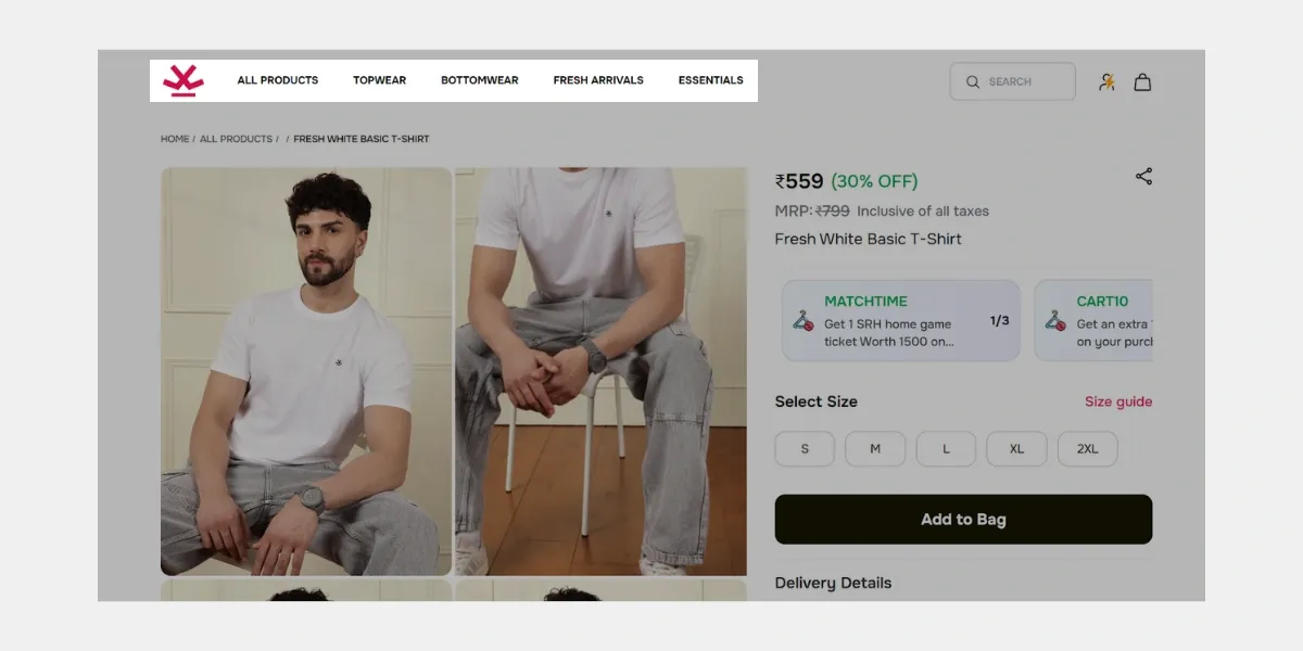
As we can see here, Wrogn has used only 5 categories to keep the header section concise.
What you should do:
Aim for 5-6 key categories in your header menu to keep navigation clean and user-friendly. Avoid cluttering it with excessive links.
2. Should your product page have a breadcrumbs feature?
What it is:
Breadcrumbs show users their navigation path, helping them go back to previous pages easily.
What we found in our study:
Out of the 21 sites analyzed, 52.4% included breadcrumbs, while 47.6% did not. Breadcrumbs improve navigation and SEO, especially for stores with deep category structures.
However, for stores with a simple hierarchy, they may not be necessary.
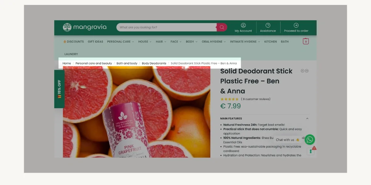
To improve user experience, Mangrovia strategically implemented breadcrumbs to enhance customer navigation through their product categories.
What you should do:
If your store has deep categories, breadcrumbs improve user experience and SEO. For simple stores with fewer categories, they may not be necessary.
3. Where should you place your logo?
What it is:
Your logo placement impacts brand recognition and navigation ease.
What we found in our study:
Among the sites studied, 71.4% placed their logo in the top-left corner, whereas 28.6% positioned it in the center-top. The top-left placement aligns with common user behavior, as it is the first place visitors typically look.
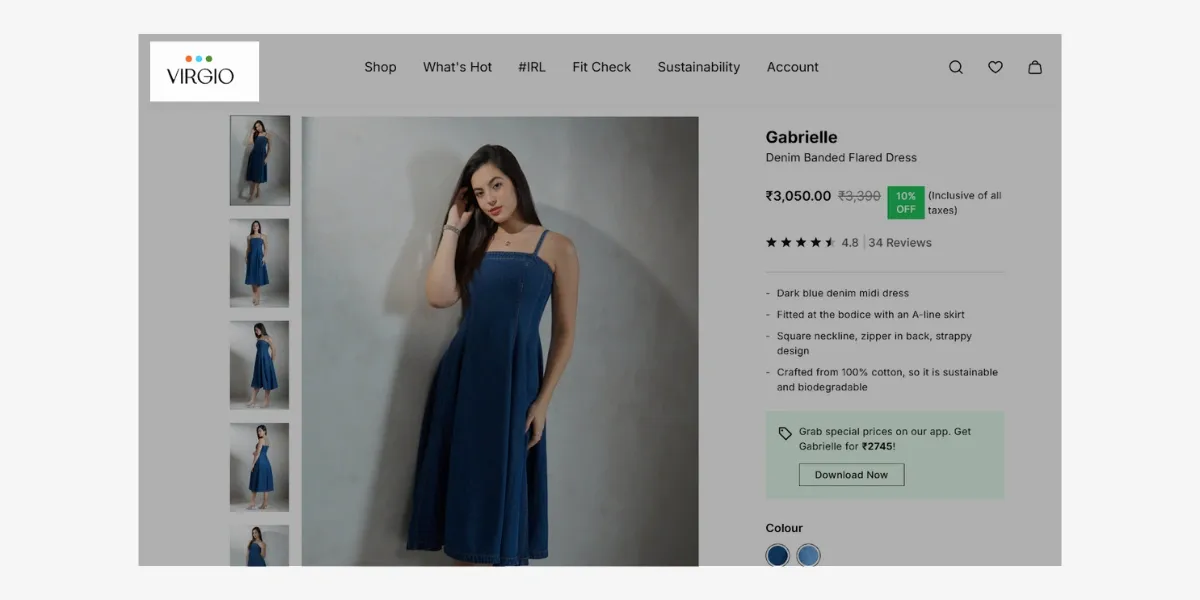
Since the popular practice of placing logos in the left corner, Virgio did the same.
What you should do:
The left corner is the best choice as users naturally look there first. If you have a unique brand aesthetic, center placement can work but should not affect usability. This aligns with the F-pattern reading behavior, where users scan from left to right, starting at the top left.
4. Should you have a search bar in the header?
What it is:
A search bar helps users find products faster, improving conversions.
What we found in our study:
A total of 85.7% of the sites included a search bar in the header, while 14.3% did not. A search bar enhances product discoverability, especially for stores with large inventories. Including this feature can improve user experience and increase conversions.
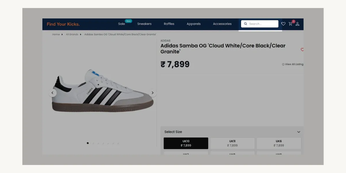
Find Your Kicks integrated a search bar into their sticky header, ensuring constant accessibility for users.
What you should do:
Always include a search bar, especially if you have many products. It improves user experience and increases sales by helping customers find items quickly.
5. What is the ideal page load speed?
What it is:
Page speed affects user experience, SEO, and conversion rates.
What we found in our study:
The average page load speed for the analyzed e-commerce sites was 4.12 seconds. Faster load times improve user experience and reduce bounce rates. Optimizing for a load time under 3 seconds can help enhance performance and engagement.
What you should do:
Aim for a load time under 3 seconds. Optimize images, use caching, and reduce unnecessary scripts to improve performance.
6. How long should a product title be?
What it is:
A product title should be clear, concise, and SEO-friendly.
What we found in our study:
The average product title length across the sites was around 40-41 characters. Titles should be concise, clear, and SEO-friendly to ensure easy readability while incorporating relevant keywords.
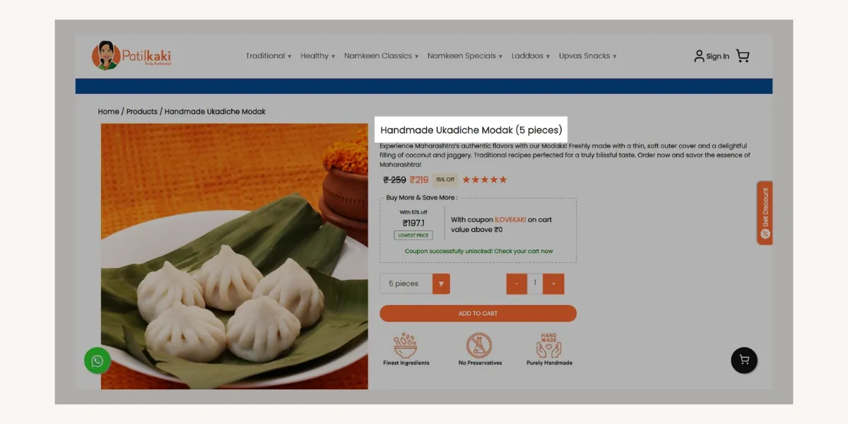
Patilkaki aimed for product name efficiency, keeping them under 50 characters for most of their products.
What you should do:
Keep titles under 50 characters, including keywords for SEO, while maintaining clarity for users.
7. What is the optimal product description length?
What it is:
A well-written product description helps buyers make informed decisions.
What we found in our study:
On average, product descriptions contained around 190 words. This length balances providing detailed information while keeping the content easy to scan. Using bullet points can further enhance readability.
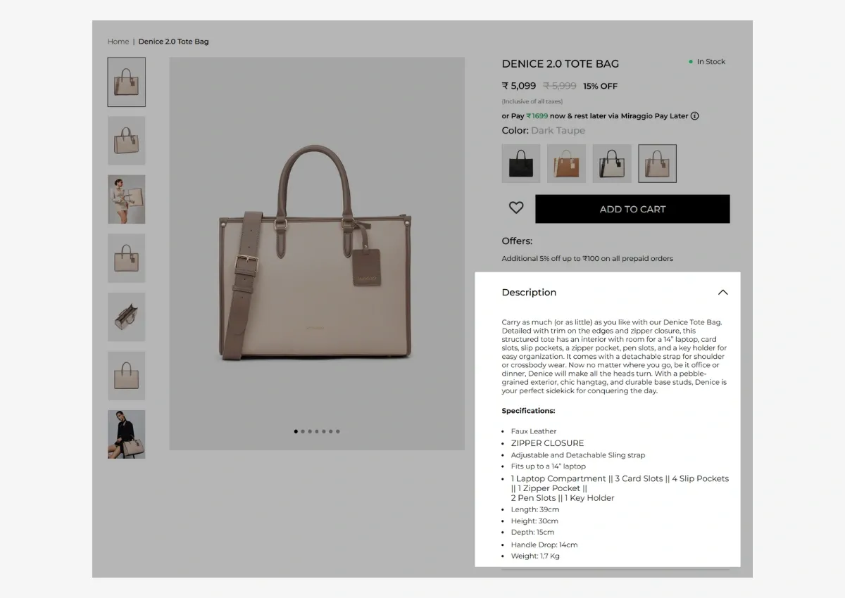
Following the preferred length, Miragio provided a 150-word product description.
What you should do:
Write detailed but engaging descriptions. Break up text with bullet points and highlight key features for easy scanning. Include answers to your product’s FAQs in the description itself to address concerns upfront and increase conversion rates.
8. How many product images should you include?
What it is:
High-quality images help customers visualize the product.
What we found in our study:
The 21 ecommerce sites in our study used an average of 8-9 images per product. Multiple high-quality images from different angles improve customer confidence and reduce purchase hesitation.
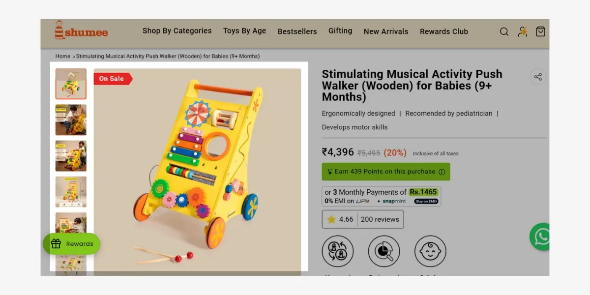
For reference, Shumee added 7 pictures of their push walker from different angles and with How-to Use video.
What you should do:
Provide multiple images, including different angles, product in-use shots, close-ups, and lifestyle shots. More images lead to better conversions.
9. Should your product page have a zoom-in feature?
What it is:
A zoom-in feature allows users to view product details up close.
What we found in our study:
Among the sites analyzed, 61.9% offered a zoom-in feature, while 38.1% did not. This feature is particularly useful for products with fine details, such as fashion or electronics, as it helps customers examine items more closely.
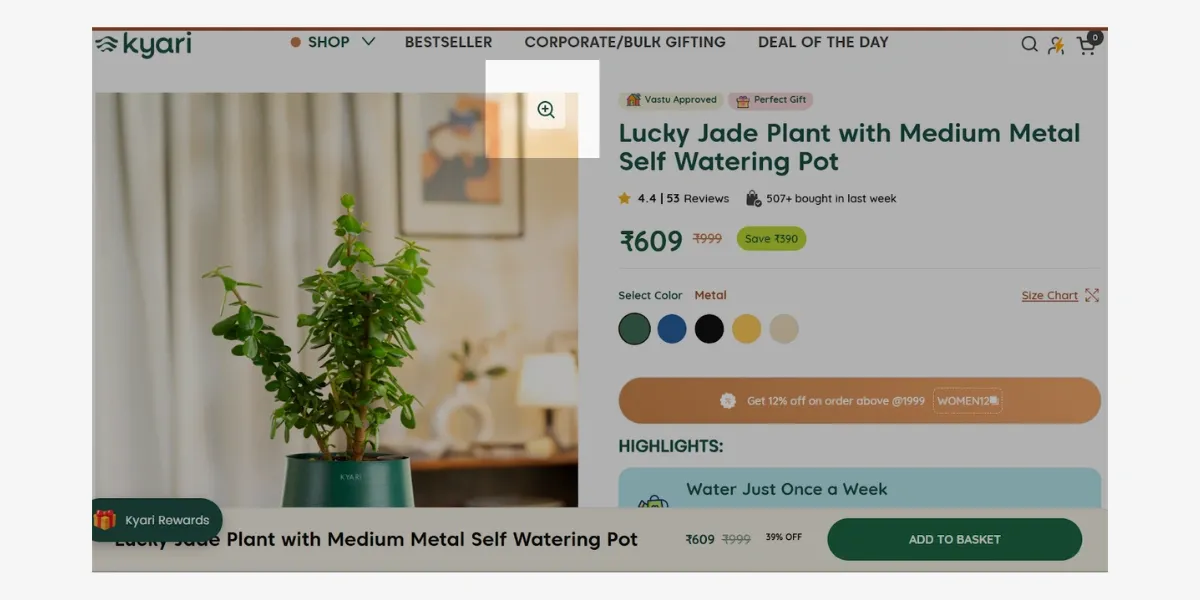
As we can see, Kyari utilized a zoom-in feature to provide users with a more detailed view.
What you should do:
If your products have fine details (e.g., fashion, electronics), enable zoom-in functionality. It builds trust and reduces hesitation.
10. Do top ecommerce sites use product videos or explainers?
What it is:
Videos help showcase products in action, increasing buyer confidence.
What we found in our study:
Our study found that 71.4% of sites did not include product videos, while 28.6% did. Product videos help demonstrate key features and benefits, increasing customer engagement and confidence.
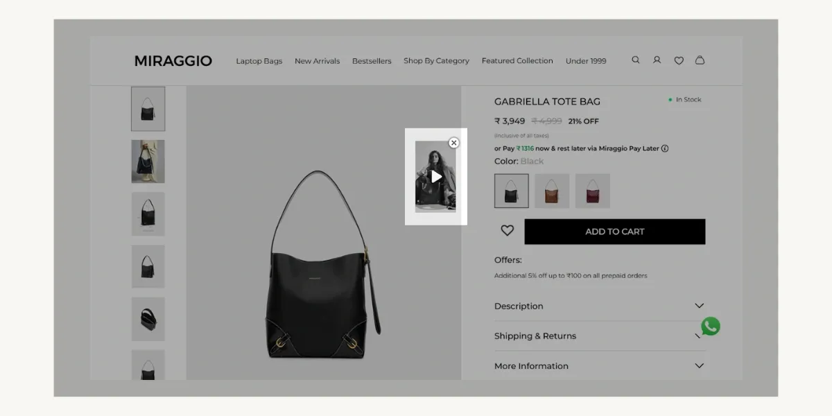
To enhance user experience, Miraggio provided video guides showcasing product styling and features.
What you should do:
Adding a short explainer video can boost conversions. Focus on demonstrating key features, real life usage/application and benefits.
11. Should you display strike-through pricing?
What it is:
Strike-through pricing shows a discount, making the offer more appealing.
What we found in our study:
Strike-through pricing was present on 61.9% of the analyzed sites. This technique effectively highlights discounts and can encourage purchases by emphasizing cost savings.
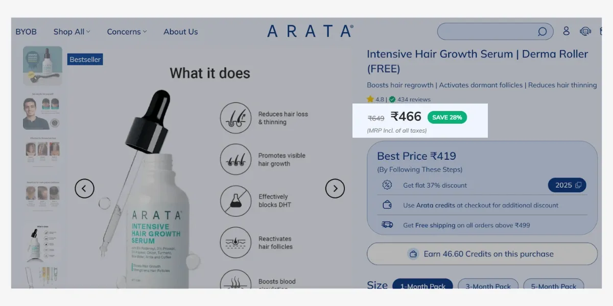
Arata, a fast-growing website, implemented strike-through pricing to show original versus discounted prices.
What you should do:
Use strike-through pricing to highlight discounts, create FOMO triggers, but ensure original prices are genuine to maintain trust.
12. Should you show the discount percentage?
What it is:
Displaying the discount percentage makes deals look more attractive.
What we found in our study:
A total of 52.4% of sites displayed the discount percentage. Displaying the percentage discount makes promotions more appealing and transparent to shoppers.
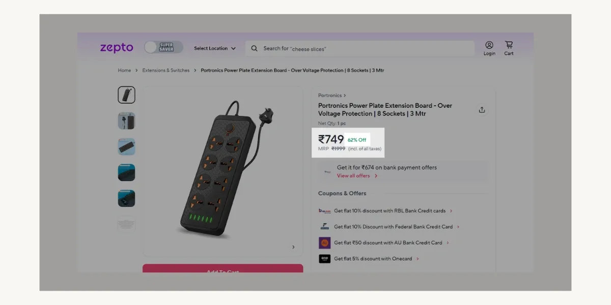
Zepto strategically presented percentage discounts to capture customer attention.
What you should do:
If you frequently offer discounts, displaying percentages can increase conversions.
13. Is offering EMI or installment options beneficial?
What it is:
EMI (Equated Monthly Installments) allows customers to pay in smaller amounts.
What we found in our study:
Around 5 out of 21 online stores offered EMI (Equated Monthly Installments) as a payment option. EMI options can be beneficial for high-ticket items, as they reduce the financial burden on customers and increase conversion rates.
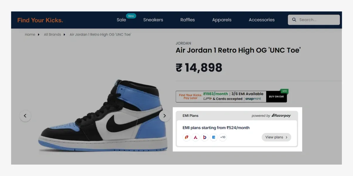
Find Your Kicks highlighted their multiple EMI options to facilitate customer convenience.
What you should do:
If you sell high-ticket products, offering EMI can reduce purchase hesitation. Buy Now Pay Later (BNPL) options can also be explored to increase conversions. Popular providers like Klarna, LazyPay, Simpl, and ZestMoney make installment eCommerce payments easier for customers.
14. Should you include a free shipping label?
What it is:
A free shipping label reassures customers and can improve conversions.
What we found in our study:
Free shipping labels were highlighted on 57.1% of the e-commerce sites. Displaying this information prominently can encourage more purchases by reducing perceived additional costs.
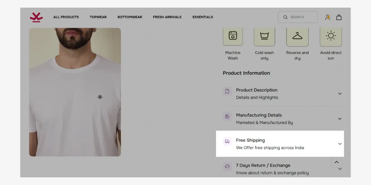
To maximize customer convenience, Wrogn placed free shipping information directly beside product details.
What you should do:
If you offer free shipping, or if you include it in your product’s pricing, it’s always recommended to display ‘free shipping’ prominently to encourage purchases.
15. Should the "Add to Cart" button be visible above the fold?
What it is:
An above-the-fold "Add to Cart" button ensures users don’t need to scroll to buy.
What we found in our study
All 21 e-commerce sites in our study (100%) positioned the "Add to Cart" button above the fold. Keeping it easily accessible ensures a smoother purchasing process and reduces friction for shoppers.
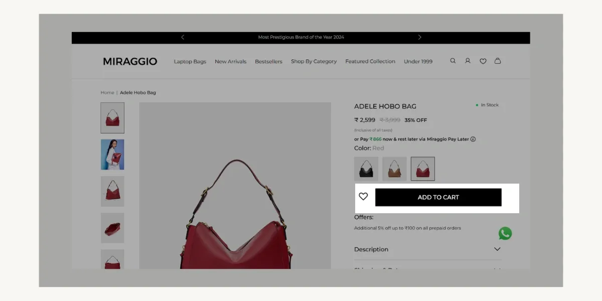
All e-commerce brands use an add to cart CTA button; Miraggio did the same with a bold coloured, attention-grabbing button.
What you should do:
Make sure the button stands out with a clear color contrast and is always accessible.
16. Should you display estimated delivery dates?
What it is:
Showing delivery estimates helps manage customer expectations.
What we found in our study:
An estimated 57.1% of sites displayed delivery dates on their product pages. Providing estimated delivery times helps manage customer expectations and can reduce cart abandonment rates.
Heads Up For Tails displayed their delivery estimation for the given pincode location to increase customer convenience.
Here’s another example from Shumee:
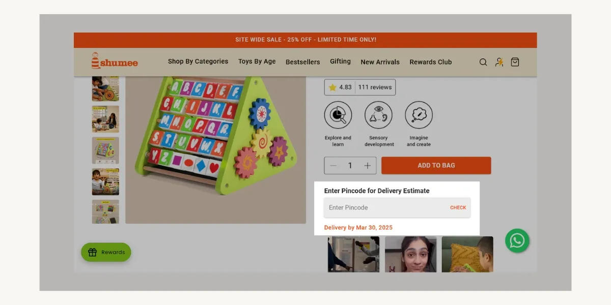
Shumee displayed delivery date estimations to facilitate a smoother customer journey.
What you should do:
If you have reliable shipping estimates, displaying them can reduce cart abandonment.
17. Should you create urgency by showing low stock alerts?
What it is:
Urgency tactics, like "Only X left in stock," encourage faster purchases by creating scarcity.
What we found in our study:
Only 14.3% of ecommerce sites display stock urgency messages, while 85.7% do not. This means that most stores do not rely on scarcity to drive sales. However, when used correctly, urgency can push customers to buy faster.
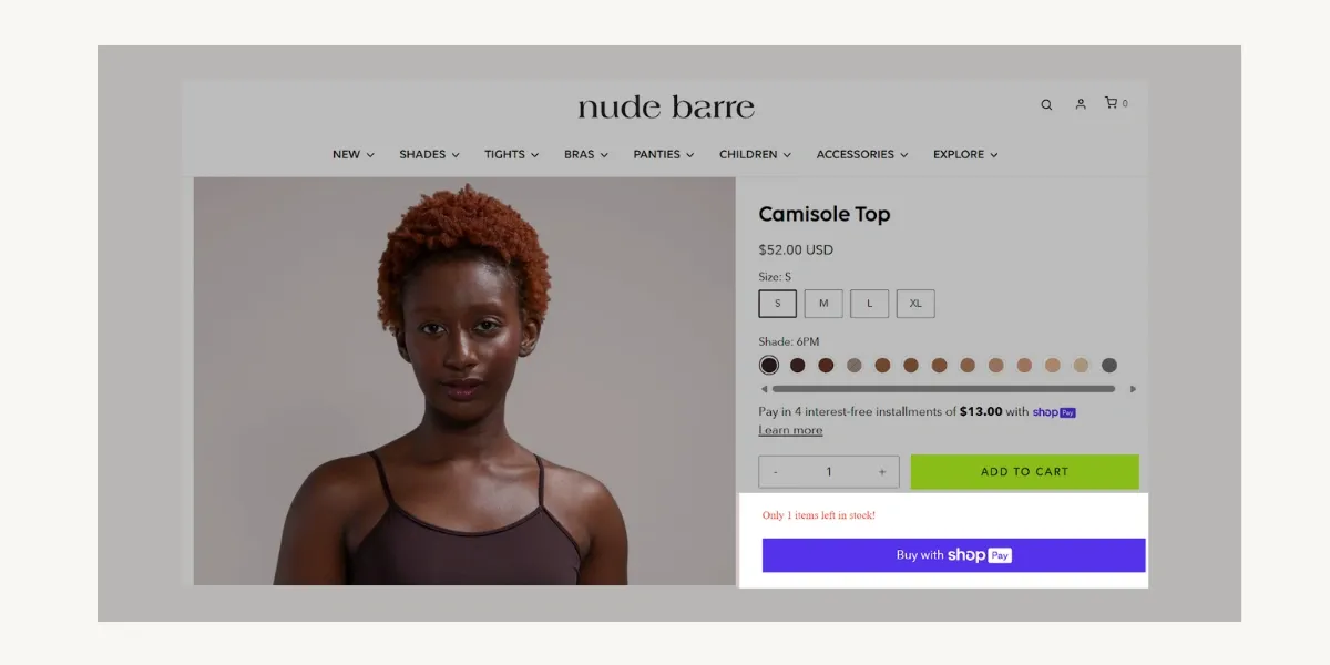
Nude Barre showed their remaining stock to encourage immediate purchases.
What you should do:
Use urgency carefully. If stock levels are genuinely low, showing scarcity can drive conversions, but false or constant urgency triggers may reduce trust.
18. Should you add social share buttons?
What it is:
Social share buttons let users share product pages on platforms like Facebook, Twitter, or Pinterest. These social buttons also allow users to easily share products with friends and family on these platforms.
What we found in our study:
About 76.2% of ecommerce sites have social share buttons, while 23.8% do not. This shows that most growing ecommerce stores encourage users to spread the word about their products.
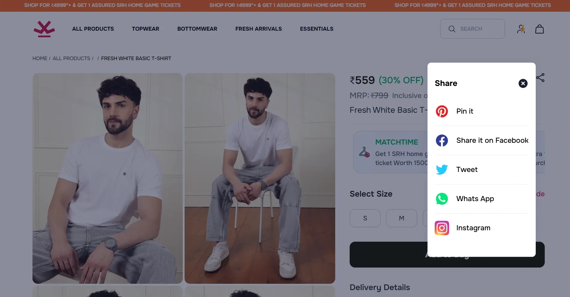
Like most e-commerce brands, Wrogn placed a social share button to allow customers to share their favorite products.
What you should do:
If your products are visually appealing or trend-driven, social sharing can boost organic reach. Otherwise, they may clutter the page.
19. Should you display product star ratings?
What it is:
Star ratings provide quick social proof, helping potential buyers assess product quality.
What we found in our study:
Around 15 out of 21 sites display star ratings, while the remaining 6 choose not to. Most successful online stores use ratings to build trust and help customers make decisions.
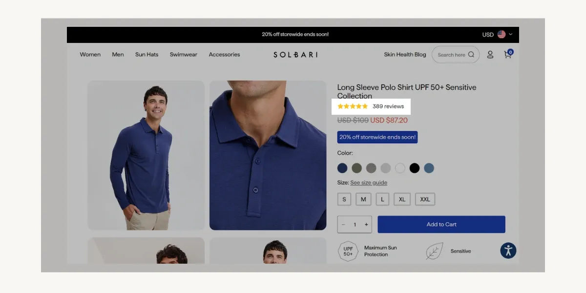
For each of their products, Solbari displayed star ratings along with the number of reviews to build customer trust and ensure transparency.
What you should do:
Include star ratings if you have good customer feedback. Verified reviews increase trust and conversions.
20. Should you have a bottom-to-top button?
What it is:
A bottom-to-top button lets users quickly scroll back to the top of the page.
What we found in our study:
Only around 4 (19%) out of 21 ecommerce sites use a bottom-to-top button. This means most online stores do not find it necessary.
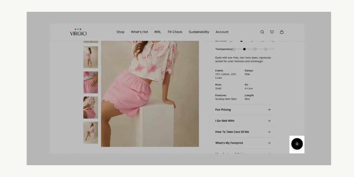
To enhance navigational flow, Virgio implemented a bottom-positioned button that instantly scrolls users to the page's header.
What you should do:
If your product pages are long, a bottom-to-top button can improve user experience. Otherwise, it's not essential.
21. Should the return policy be visible on the product page?
What it is:
A visible return policy reassures customers and reduces hesitation.
What we found in our study:
About 9 of the ecommerce sites display their return policy on the product page, while 12 do not. Shoppers feel more comfortable buying when they know they can return a product easily, or what to expect if they wish to return.
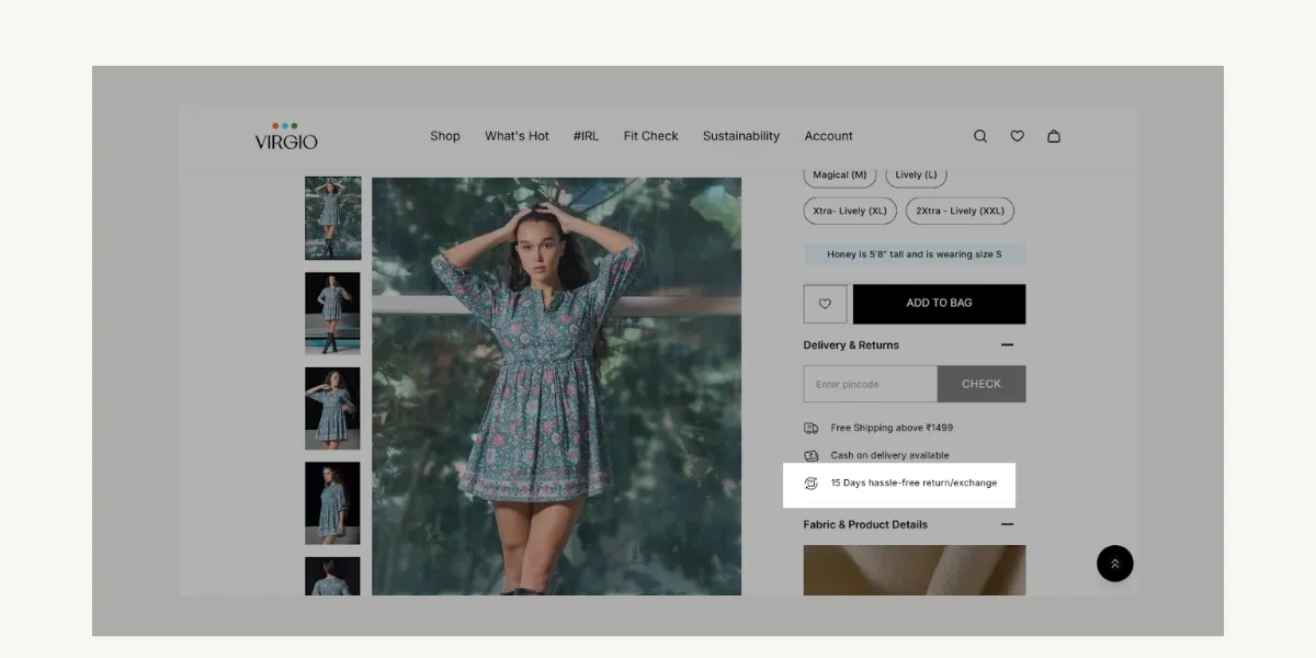
Virgio presented their return and exchange policies, allowing customers to make informed purchasing decisions.
What you should do:
Highlight your return policy clearly, especially if you offer hassle-free returns. Customers prefer transparent policies(and easy return policies).
22. How many similar or recommended products should you show?
What it is:
Recommended products help users discover more items and increase average order value.
What we found in our study:
Successful ecommerce sites display an average of 9-10 related products on each product page. This helps shoppers find other relevant items, keeping them engaged longer.
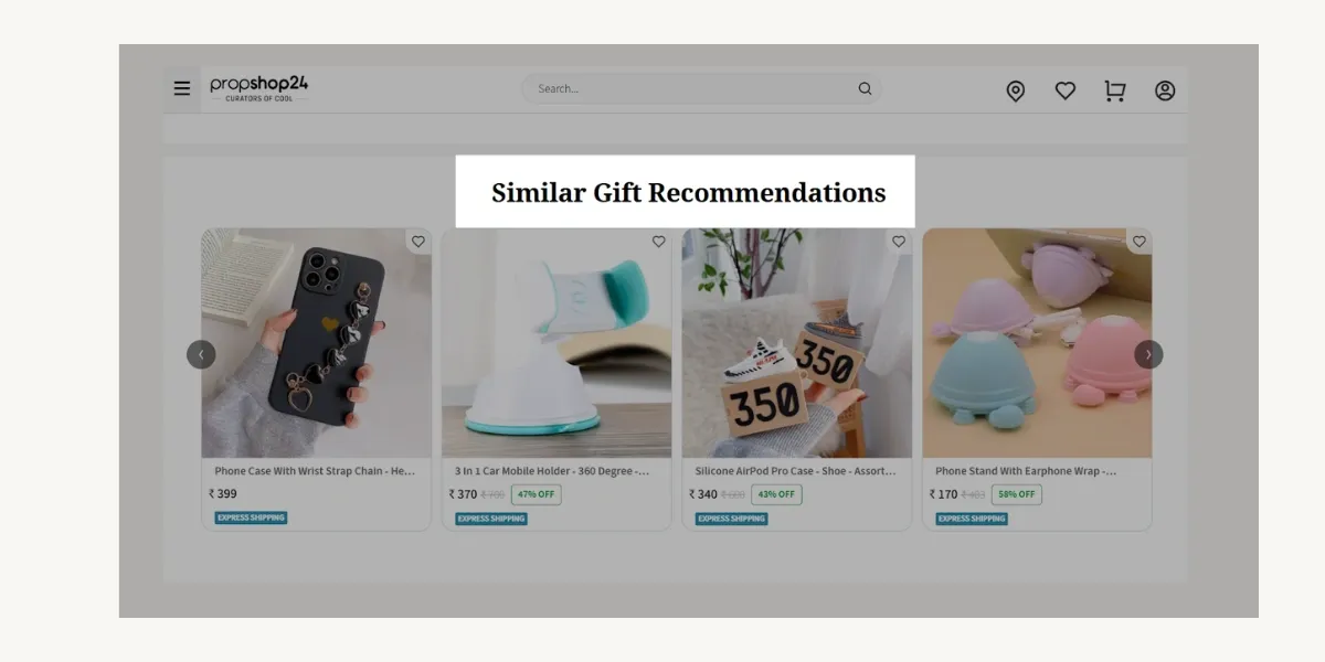
Propshop 24 and mostly every ecommerce site provides a section for recommended products.
What you should do:
Show related products, but avoid overwhelming users. Prioritize relevant recommendations.
23. Should you mention coupon codes on the product page?
What it is:
Coupon codes encourage discounts and drive purchases.
What we found in our study:
Around 61.9% of ecommerce sites mention coupon codes on the product page, while 38.1% do not. This suggests that many stores use discounts to attract buyers.
Coupon codes encourage customers to complete their purchases, and Wrogn captured that opportunity as one of the top e-commerce brands.
What you should do:
If you run frequent promotions, mention coupons on the product page. But avoid overuse, as it might lead to cart abandonment if users leave to search for codes.
24. Should you display secure payment badges?
What it is:
Secure payment badges (e.g., Visa, Mastercard, SSL security) build trust.
What we found in our study:
Only 47.6% of ecommerce sites display secure payment badges, while 52.4% do not. Many online stores focus on other trust signals, but payment security remains important.
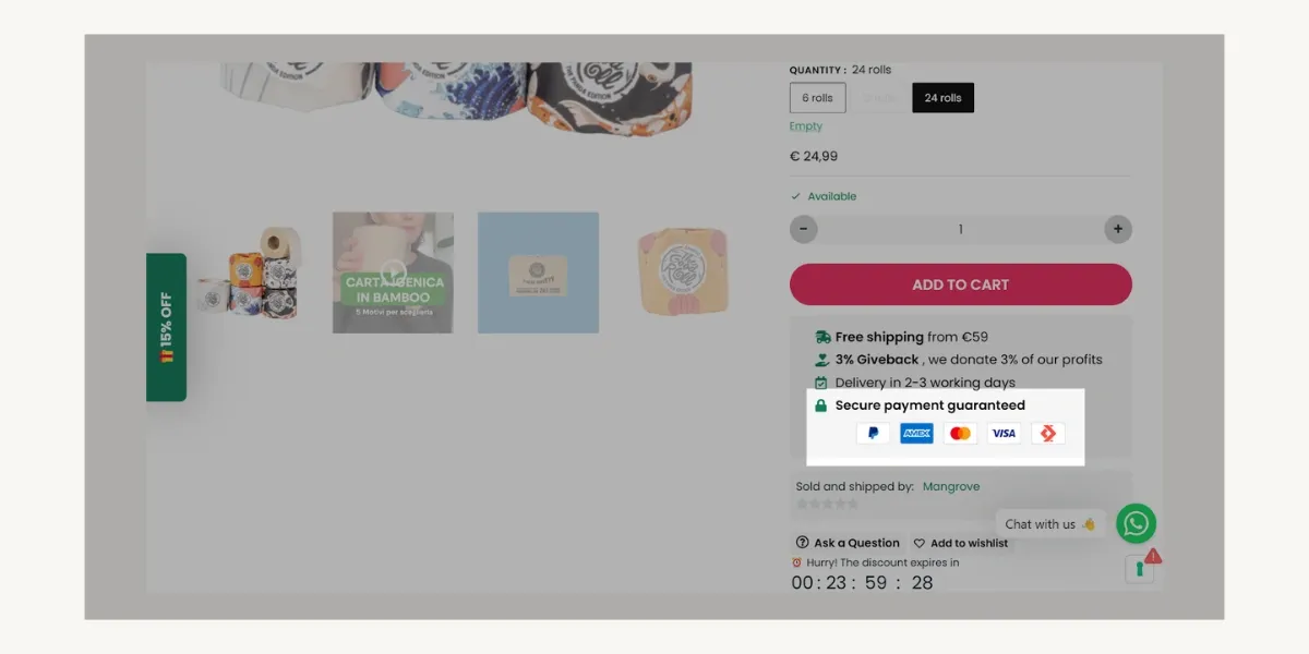
Here we can see, Mangrovia utilized their secure payment badges to build customer trust and assurance
What you should do:
If security concerns are common in your industry, or if your brand is not very established for users to trust it, adding payment badges can increase conversions.
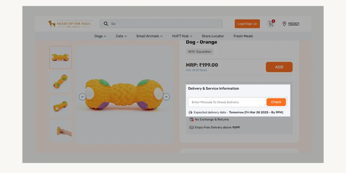
25. Should you offer a pincode check for availability?
What it is:
A pincode checker lets customers confirm product availability and delivery timelines.
What we found in our study:
Only 28.6% of ecommerce sites have a pincode checker, while 71.4% do not. Most stores rely on general shipping policies instead of location-based checks.
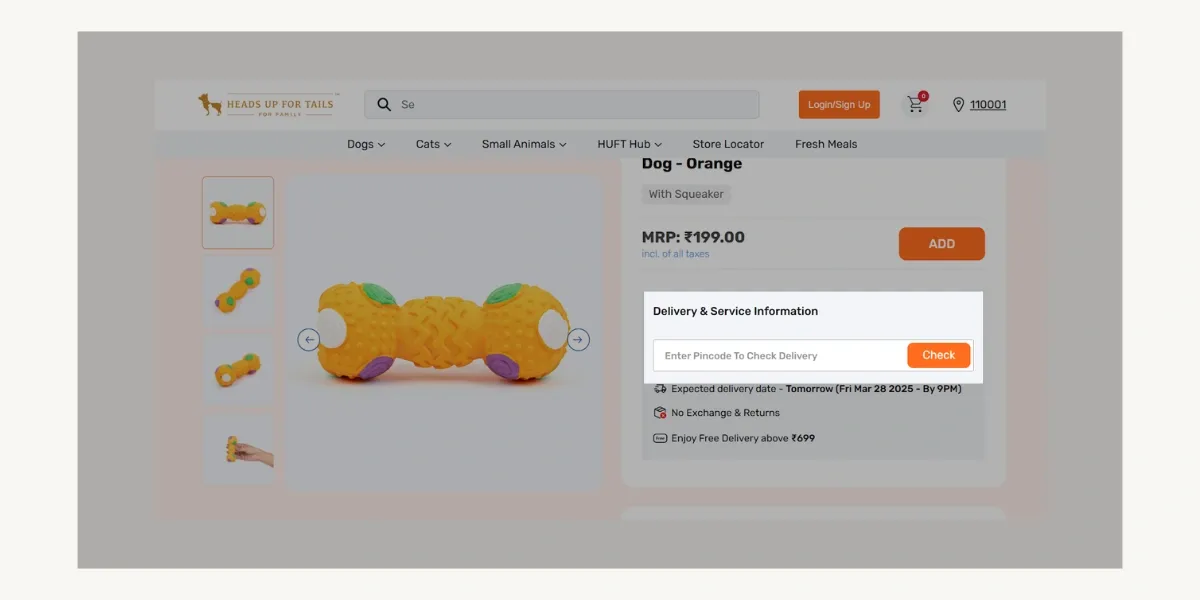
Heads Up For Tails made their Pincode Check Delivery option visible beside the product images to improve customer journey.
What you should do:
If your shipping availability varies by location, a pincode checker can prevent disappointment and reduce cart abandonment.
26. Should you add a chatbot for customer queries?
What it is:
Chatbots provide instant customer support and can answer FAQs.
What we found in our study:
Out of 21 eCommerce sites, 13 sites use chatbots or live chat support, while others do not.
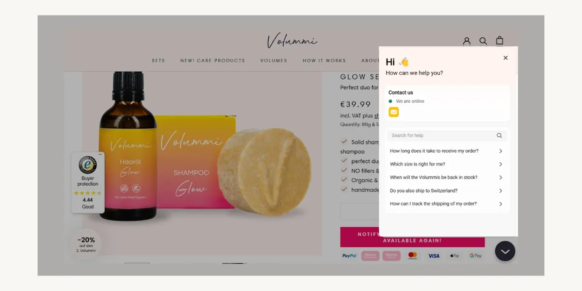
Volumni’s Chatbot is ready to serve you with frequently asked questions.
What you should do:
If you receive frequent inquiries, a chatbot can improve customer experience and reduce support load. If you do decide to include a chatbot, you can explore integrating an AI based chatbot trained on your customer support tickets, and FAQs. This way, not every query would need human intervention.
27. Should you have a sticky header or footer?
What it is:
A sticky header or footer keeps important navigation elements visible as users scroll.
What we found in our study:
About 66.7% of ecommerce sites use sticky headers or footers, while 33.3% do not. This means that most successful online stores keep their menus or call-to-action buttons visible at all times.
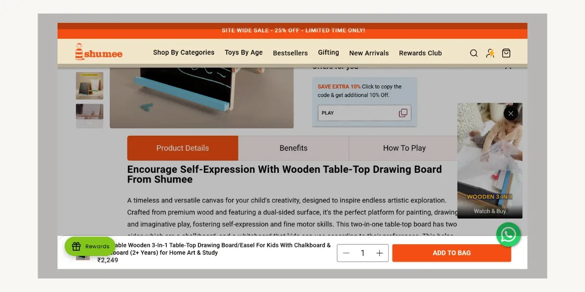
Shumee implemented both the sticky header for better navigation and the sticky footer for an extra add to cart button.
What you should do:
If you have key CTAs (like "Add to Cart" or search) in your header, making it sticky can improve usability.
What key elements make an eCommerce product page effective?
Navigation and user experience
- Header Menu Items: Aim for 5-6 key categories to maintain a clean and user-friendly interface.
- Breadcrumbs: Use them if your store has deep categories to improve navigation and SEO.
- Logo Placement: Top-left placement is best for brand recognition and ease of navigation.
- Search Bar: Always include one, especially for stores with large inventories, to enhance product discoverability.
- Sticky Header/Footer: Helps keep important navigation elements (e.g., "Add to Cart") always accessible.
- Bottom-to-Top Button: Useful for long product pages but not essential for shorter ones.
Performance & load speed
- Page Load Speed: Optimize for under 3 seconds to improve user experience and reduce bounce rates.
Product information and presentation
- Product Title Length: Keep it under 50 characters, including relevant SEO keywords.
- Product Description Length: Around 190 words with bullet points for easy readability.
- Number of Product Images: Use 8-9 high-quality images from different angles and lifestyle shots.
- Zoom-in Feature: Essential for products with fine details (e.g., fashion, electronics).
- Product Videos: Helps showcase product functionality and increases buyer confidence.
Pricing & discounts
- Strike-through Pricing: Effective for highlighting discounts and encouraging purchases.
- Display Discount Percentage: Makes deals more attractive and transparent.
- Mention Coupon Codes: Can drive purchases, but avoid overuse that might lead to cart abandonment.
- EMI/Installment Options: Beneficial for high-ticket items to reduce purchase hesitation.
- Buy Now Pay Later: Popular among Indian e-commerce brands, BNPL allows customers to make purchases instantly and pay in installments, increasing affordability and conversions.
Call-to-action & purchase process
- "Add to Cart" Button Placement: Keep it above the fold for easy access.
- Estimated Delivery Dates: Helps set expectations and reduces cart abandonment.
- Pincode Check for Availability: Useful for stores with location-based shipping constraints.
- Return Policy Visibility: Clearly display it to build trust and reduce hesitation.
- Urgency Tactics (Low Stock Alerts): Use sparingly to avoid damaging trust.
Social proof & engagement
- Social Share Buttons: Useful for trend-driven or visually appealing products.
- Product Star Ratings: Helps build trust and influence purchase decisions.
- Recommended Products: Show 9-10 relevant items to encourage further shopping.
Trust & security
- Secure Payment Badges: Helps reassure customers about transaction safety.
- Free Shipping Label: Display the free shipping label prominently, if applicable, to increase conversions.
Customer support & assistance
- Chatbot for Queries: Enhances customer experience and reduces support workload.
Final words
This research gives you a look at what’s working for some of the fastest-growing online stores. Things like easy navigation, clear product images, good pricing strategies, and trust signals help make shopping simple for customers.
But just because these things worked for others doesn’t mean they will work the exact same way for you.
Your success depends on:
- What you sell: A clothing store might need a size chart, while an electronics store might need product videos.
- Where you sell: Free shipping and payment options like EMI may be more important in some countries than others.
- Who your customers are: If most people shop on their phones, things like a sticky header and chatbot support could help more than desktop features.
You don’t need to follow all the things we studied. Instead, use this as a starting point. Try different ideas, listen to your customers, and adjust your product page to fit their needs.
The best online ecommerce stores don’t just copy others— they test, learn, and improve.
Limitations of our study
We analyzed only 21 e-commerce sites, so the results may not apply to all industries. We studied just one product page per site, which may not reflect the entire website.
Also, our data is based on manual checks, so small errors are possible. Use this research as a guide, not a strict rulebook.
Explore our Ecommerce services at Tenet
- Custom eCommerce Development Company
- eCommerce App Development Services
- eCommerce UI UX Design Services
- eCommerce CRO Agency With Proven Results
Need help designing your eCommerce site? Book a call now.
Need help designing your eCommerce site? Book a call now.


Got an idea on your mind?
We’d love to hear about your brand, your visions, current challenges, even if you’re not sure what your next step is.
Let’s talk


