10 Must-Have UX Design Principles for Fintech
 By
By Share
Share

Get a quick blog summary with


Most fintech users do not leave because the product lacks features. They leave because they feel confused or unsure. They struggle to complete onboarding, hesitate during payments, or do not trust what happens after they tap “Confirm.”
This is a UX problem, not a technology problem. When fintech interfaces feel complex, slow, or unclear, users abandon tasks, delay transactions, and lose confidence in the product. In finance, even one confusing step can break trust.
Fintech UX design solves this by making financial products simple, secure, and easy to use. It focuses on clear flows, strong usability, and subtle trust signals so users can manage money, payments, and investments without stress or guesswork.
What is UX design for fintech?
Fintech UX design creates smooth and enjoyable digital experiences for financial products. Fintech UX involves designing efficient and functional interfaces for digital platforms like mobile apps, websites, or software that handle financial tasks— such as banking, investing, payments, budgeting, or cryptocurrency management.
A great Fintech UX prioritizes usability, security, and accessibility, ensuring that users can navigate financial tasks effortlessly— no frustrating roadblocks or confusing steps.
Unlike enterprise UX, which is geared toward employees and industry professionals, fintech UX is designed for everyone. It aims to help people feel at ease, even if they’re new to using fintech tools.
10 UX design principles and strategies for startups
1. Accelerate time to value in onboarding
Category: Usability/interaction design
Key focus: Optimizing fintech onboarding to deliver value quickly
When to use: When designing an onboarding experience that must quickly communicate the app’s value and engage users effectively.
Onboarding is critical to determining whether users stay or drop off. The “aha” moment occurs when users immediately grasp the platform's value and find the experience smooth and rewarding. The goal is to shorten the time to value by using strategies like:
- Short, simple forms to reduce friction
- One-click tasks to make users feel capable and engaged
- Progressive onboarding to guide users efficiently
Example: Revolut
Traditional banks often require 3-4 weeks for onboarding, involving extensive paperwork and multiple verification steps. As a challenger bank, Revolut reimagined onboarding by reducing friction and time to value. The entire process takes just 10-15 minutes. Some key strategies:
- Users can download the app via a manual search or a direct link from the Revolut website, reducing extra steps.
- Users can either go through quick tutorial slides (launch screens) or skip them if they already understand the app.
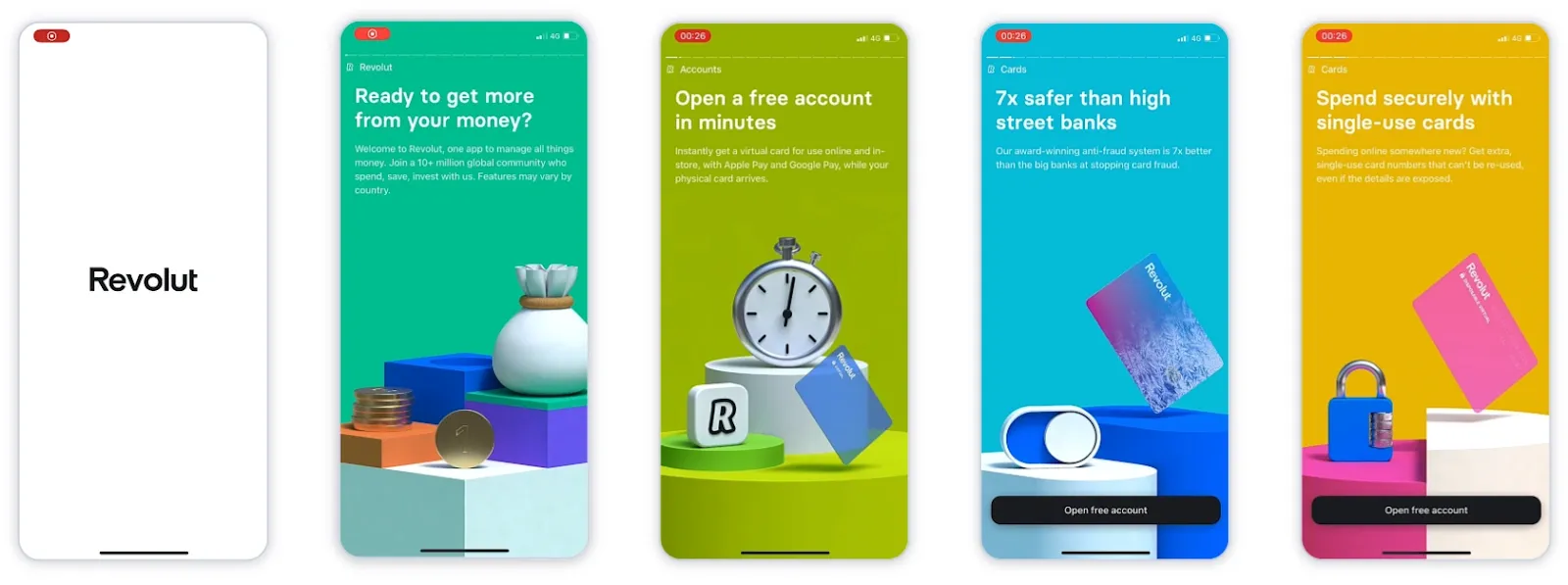
(Illustrates the optional tutorial slides that guide new users through the app’s features while providing a skip option for those familiar with the platform)
2. Clear data visualization for financial tracking
- Category: Interaction design
- Key focus: Help users track spending effortlessly
- When to use: When designing dashboards or financial summaries
Users need clarity when managing their money. Cluttered transaction histories and unclear breakdowns create frustration.
A well-structured fintech UI should use visual elements like interactive graphs, progress bars, and categorized expenses to make financial insights easy to understand. Instead of a basic transaction list, smart data visualization enables users to look at spending trends, set budgets, and make informed financial decisions at a glance.
Example: Monzo
Monzo's insights feature ensures users understand, control, and optimize spending. Transactions are auto-tagged into categories like groceries, entertainment, travel, etc.
Users see live spending trends, helping them course correctly before budgets spiral. Lastly, Monzo’s clean visuals, color-coded categories, and simple charts make insights easily digestible.
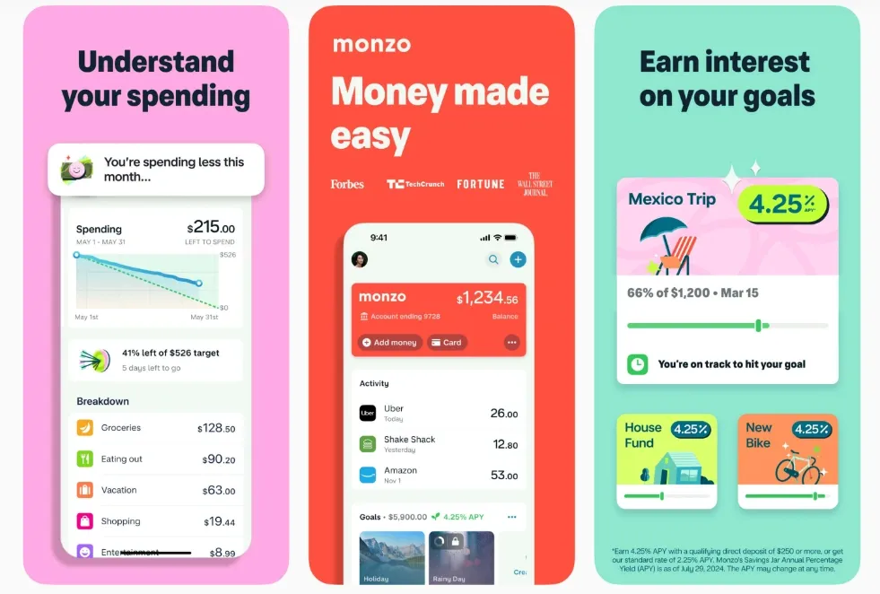
(Shows how Monzo automatically categorizes transactions with real-time spending insights)
3. Instant activities with one-tap actions
- Category: Performance
- Key focus: Speed up transactions or activities to improve convenience
- When to use: When optimizing payment and transfer flows
A common frustration in banking apps is the number of steps required for a simple transaction. A good UX design allows users to send money or perform activities with minimal taps. Features like “quick actions” on the home screen, autocomplete recipient suggestions, and real-time confirmation messages increase user satisfaction.
Example: N26
N26 takes instant money transfers to the next level with MoneyBeam, a feature that lets users send and receive funds in seconds. It eliminates the need for complex banking details, allowing users to transact using just an email or phone number.
This real-time banking is further enhanced by instant notifications so users always stay updated on their transactions.
- Instead of overwhelming users with fields, N26 reveals only what’s necessary at each step: selecting a contact, entering an amount, and sending.
- A clean, single tap interface reduces friction, making the transfer process effortless.
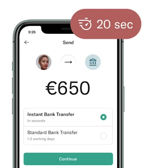
(A look at how users can send money instantly using just an email or phone number. No banking details required)
4. Minimalist interfaces with high information density
Category: Performance and usability
Key focus: Delivering essential information without overwhelming users
When to use: When designing financial workflows like payments, transfers, investment tracking, or loan applications where users need clarity without distractions
Fintech users deal with complex financial decisions, and difficult-to-understand interfaces only add to the confusion. A minimalist design with high information density ensures that users get the right details at the right time without unnecessary friction. This means structuring content with a clear hierarchy, using whitespace to separate key actions, and ensuring visual balance so important data remains easily scannable.
Example: Robinhood
Robinhood’s UI is built around clarity and ease of use, making trading less intimidating. Users get a clean, high-level view of their portfolio from the dashboard.
Instead of bombarding users with excessive data, Robinhood focuses on hierarchy and typography to make key information easy to scan. Additionally, users can buy, sell, and research stocks with just a few taps.
Features like swipe-to-trade further remove extra steps, making transactions feel effortless.
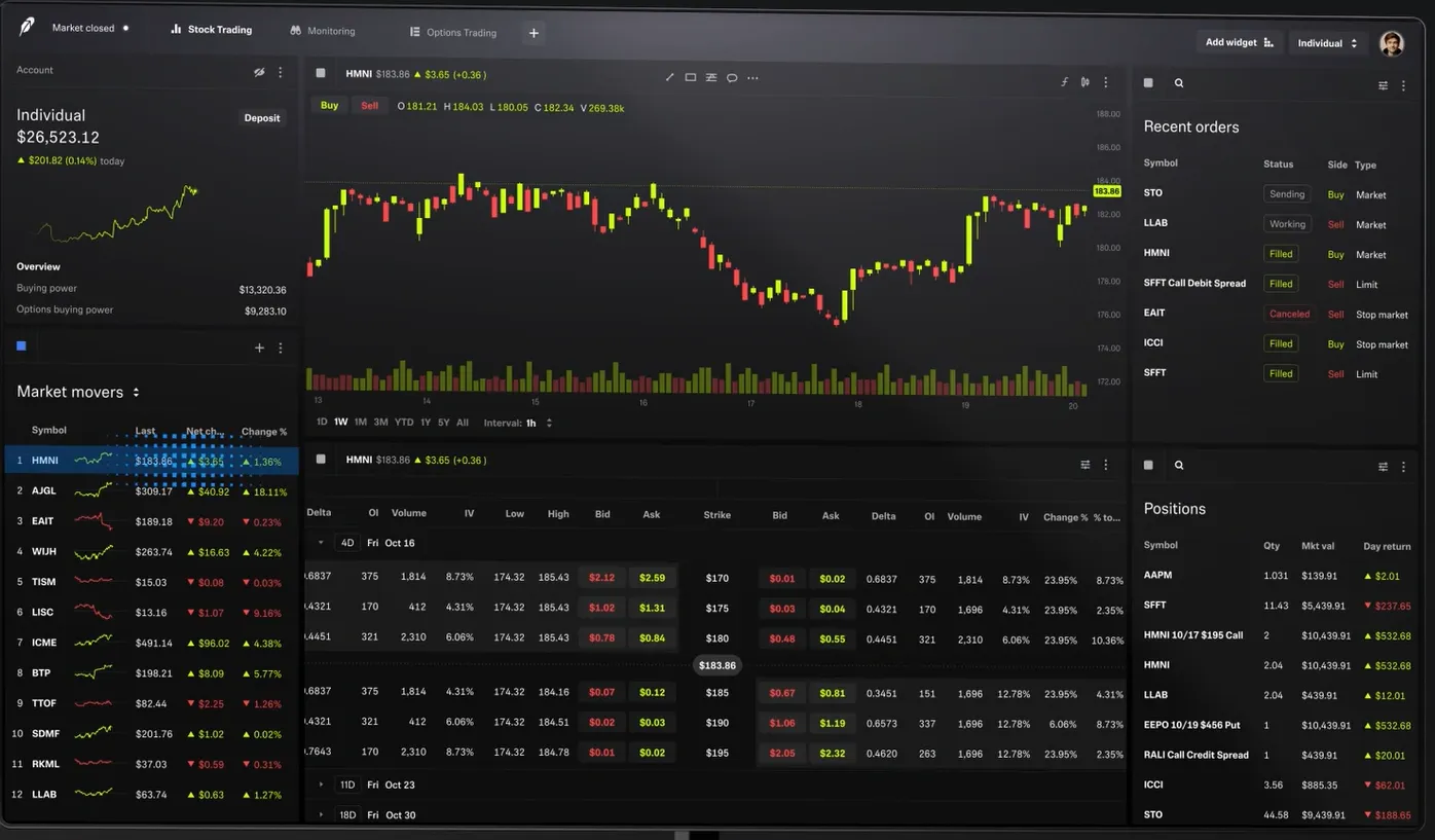
(Demonstrates how users can research, buy, and sell stocks in just a few taps)
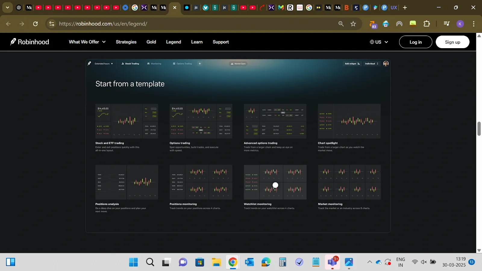
(Shows how users can create a dashboard directly from a template for faster access to market insights)
5. Trust-building microinteractions
- Category: Usability and accessibility
- Key focus: Reinforcing security trust through small UI details
- When to use: To improve user confidence in financial transactions
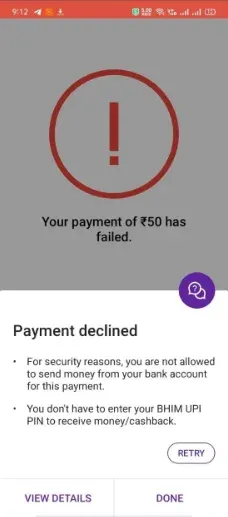
Making users feel secure comes from minor UI details that subtly reassure them at key moments. Think of loading animations that say “securing your transaction…” instead of just a spinning wheel or green checkmarks confirming successful authentication.
These micro-interactions build transparency. Users don’t just assume their transaction is safe; they see it happening. This reduces anxiety and builds trust.
Example: PhonePe
PhonePe does this well with its UPI transaction status UI. When you send money, you see a smooth animation showing the transaction processing, followed by a green checkmark and a confirmation message of the secure transaction.
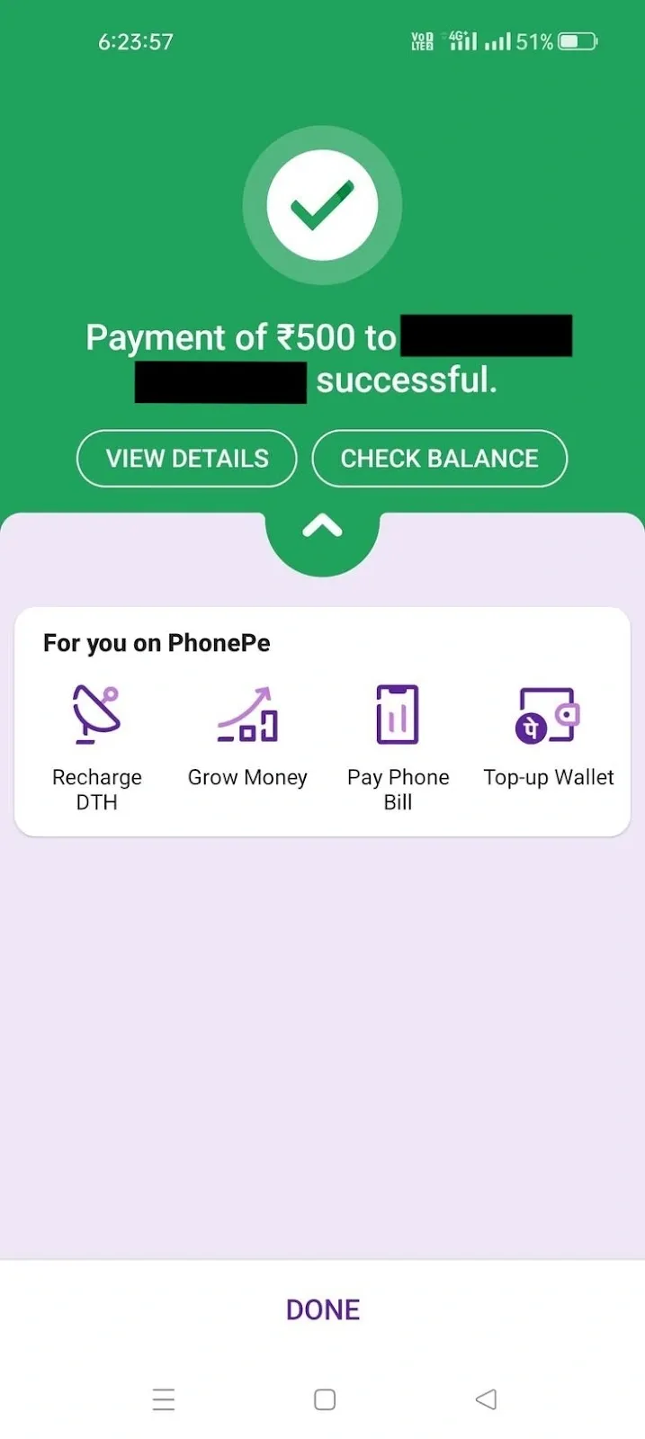
(Shows the green checkmark and confirmation message after a successful transaction along with a failed transaction)
If there’s a delay, it shows a clear status update if your money would be refunded, still in processing, or a failed transaction instead of leaving users in the dark.
6. Sticky action buttons for quick transactions
- Category: Interaction design/usability
- Key focus: Keep essential actions accessible at all times
- When to use: Ideal for fintech apps with frequent transactions, such as payments, stock trading, or budget tracking
For fintech apps, users often need to execute key actions quickly, such as transferring money, making investments, or checking balances. Sticky action buttons (fixed floating buttons) ensure critical actions are always without excessive navigation.
Example: Binance
Binance’s sticky Buy/Sell buttons play a big role. When a user enters a market, the Buy and Sell buttons stay fixed at the bottom so users don’t have to scroll or search when the right moment hits. This keeps trading smoother, whether the user checks charts, compares price movements, or switches between trading pairs.
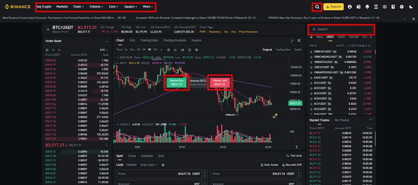
(Users can check charts, compare price movements, and switch trading pairs without losing access to action buttons.)
On the desktop, Binance shifts sticky action buttons from the bottom bar to the left sidebar, aligning with how users interact on larger screens.
Additionally, users can browse different markets via lists or the search bar, pick a currency pair, and jump straight to the trading screen.
Once there, the Buy/Sell buttons remain sticky, ensuring no unnecessary taps slow down execution. This UX setup makes Binance feel instant.
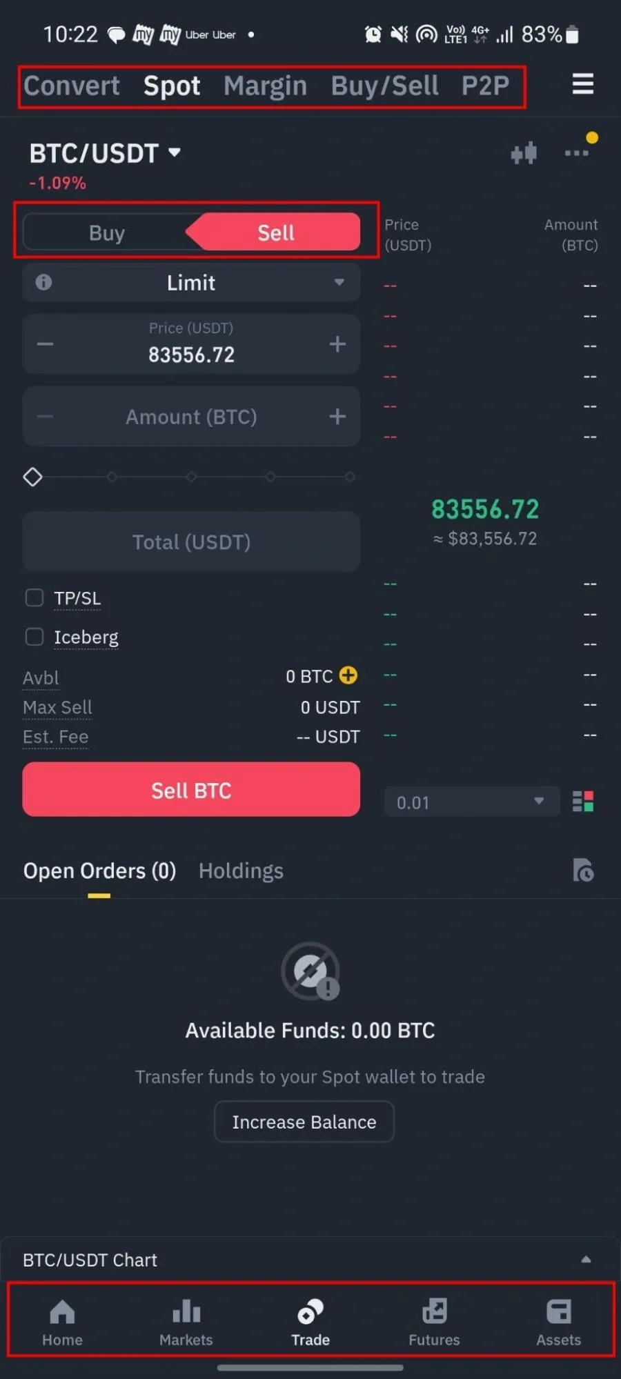
(Binance on mobile version, with similar sticky buttons and navigation)
7. Low-bandwidth optimized checkout
- Category: Usability
- Key focus: Ensuring smooth payment experiences even on slow networks
- When to use: When users may access the service in areas with poor internet connectivity
Slow or failed checkouts due to weak internet can frustrate users, leading to abandoned payments and loss of revenue. Many fintech users, especially in mobile-first markets like India, rely on 2G/3G or unstable connections. If a payment gateway isn’t optimized for low bandwidth, pages load slowly, buttons become unresponsive, or transactions fail altogether.
- Use minimalistic, lightweight UI design elements to reduce heavy graphics and ensure faster loading.
- To prevent delays, use pre-loaded essential payment components (like UPI QR codes and OTP fields).
- Auto-retry mechanisms and offline confirmations prevent drop-offs in case of a temporary failure.
Example: Google Pay
Google Pay’s integration of UPI Lite significantly reduces the strain on banking infrastructure by shifting small-value transactions (up to ₹4000 per day) away from real-time bank servers. Unlike standard UPI transactions, UPI Lite processes payments within the app, ensuring a faster and more efficient experience for users.
However, a stable internet connection is required to add funds and make credit payments for secure wallet management. One of the standout UX features is the PIN-less transaction flow.
Since UPI Lite transactions do not require real-time authentication, they avoid excessive API calls, ensuring faster payment execution even in weak network conditions.
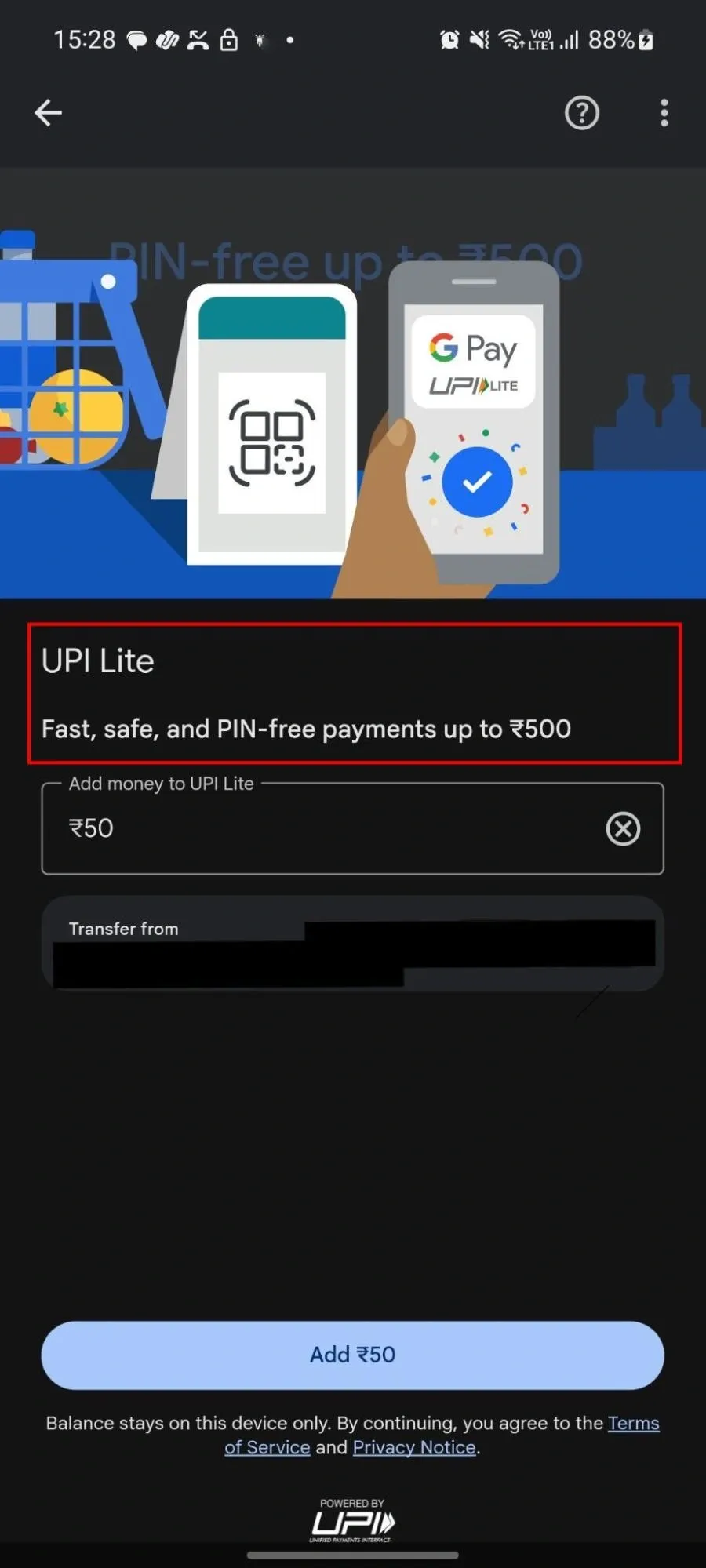
(Shows Google Pay’s seamless UX of UPI Lite where users can add amount and make quick payments without entering a PIN)
8. Universal payment API for consistent UX
- Category: Interaction design
- Key focus: Creating a unified, simplified experience for handling multiple payment options
- When to use: Businesses must support multiple payment methods (UPI, cards, wallets, etc.).
A clunky checkout flow kills conversions. If a user pays via UPI today and a credit card tomorrow but faces different interfaces each time, frustration kicks in. They hesitate, make mistakes, or drop off. A universal payment API keeps the experience consistent across all payment methods.
- Buttons, payment fields, and confirmation screens look and feel the same across UPI, wallets, and cards.
- Users can swap between payment methods without restarting the process.
- Smart autofill speeds up payments and reduces effort.
- A direct, in-app flow keeps users from bouncing between pages.
Example: Razorpay
Razorpay uses a single API for unified UX across all types of payments. This speeds up transactions and adapts to different networking conditions. UPI and card payments stay in-app, while net banking and wallets only open a minimal external window when required.
- Standardized payment fields, buttons, and confirmation screens.
- Users can shift between UPI, cards, and wallets without re-entering details.
- Suggested UPI IDs, saved cards, and intelligent field formatting minimize errors.
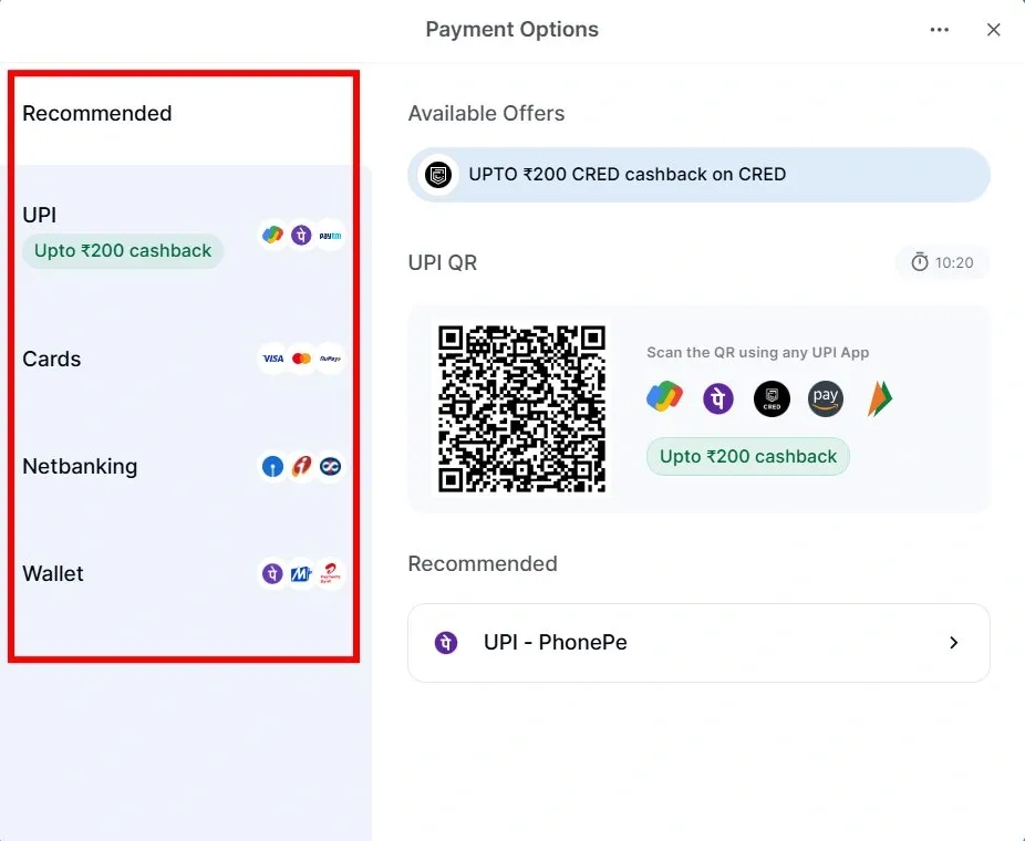
(Shows consistent payment fields, buttons, and confirmation screens for a seamless user experience)
9. Multi-tiered notification customization UI
- Category: Usability
- Key focus: Giving users layered control over alerts
- When to use: When users need to personalize notifications based on priority and frequency
Instead of simple on/off toggles, a multi-tiered notification UI categorizes alerts by urgency (high, medium, low) and type (price alerts, transactions, security updates). Users should be able to adjust notification frequency, real-time, daily summary, weekly digest, etc., along with preferred delivery modes like push notification, SMS, or email.
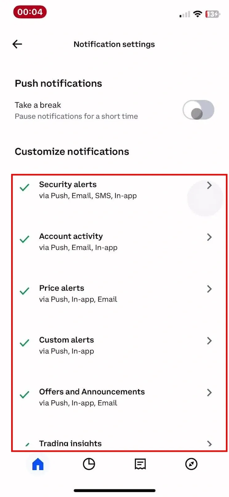
Example: Coinbase
Coinbase provides a well-structured notification settings UI that allows users to toggle specific alerts, set thresholds for price movement alerts, and select their preferred notification method.
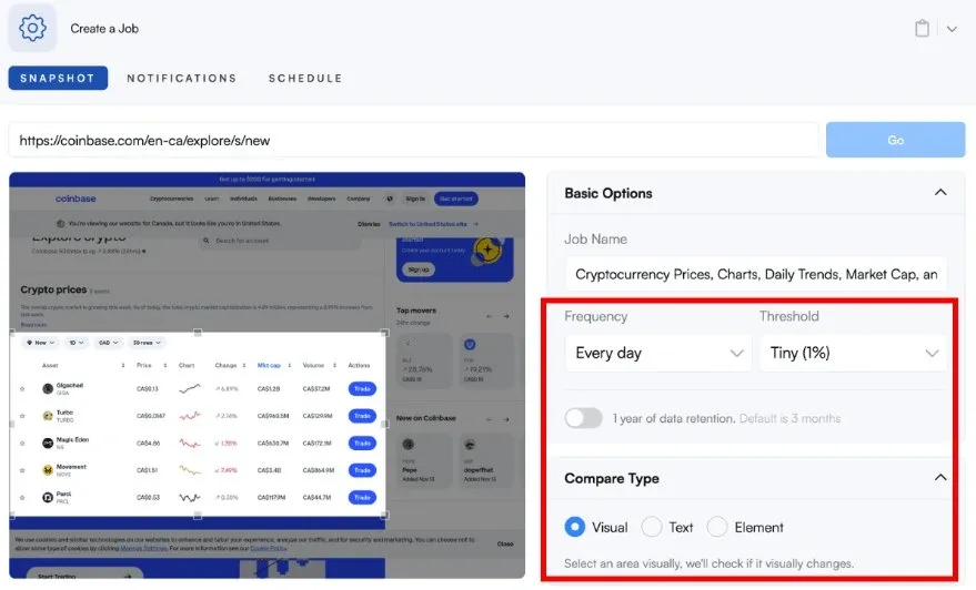
Users can also fine-tune notifications by alert type and delivery preference. This minimalistic UI with clear categories helps users stay informed without feeling overwhelmed.
10. Deep linking with context preservation
- Category: Interaction design
- Key focus: Ensuring easy navigation from external sources to in-app content
- When to use: When guiding users from emails, social media, or web pages to a specific in-app section
Deep linking UI ensures users land exactly where they need to be, thereby removing unnecessary steps that could cause frustration or drop-offs. Instead of dumping users onto the home screen, deep links should take them directly to relevant content, whether a specific payment request, transaction details, or an investment portfolio update.
Example: Cash App
Cash App users often share payment links on platforms like Facebook or Instagram, but standard links fail to open the app directly, redirecting users to a web login page. This disrupts the transaction flow, as many users don’t remember their passwords.
By integrating deep linking via URL genius, for example, Cash App ensures that clicking a payment request link instantly opens the app to the sender’s profile, bypassing necessary authentication steps. Even if the app isn’t installed, users are guided to the app store and then redirected to the correct page post-installation.
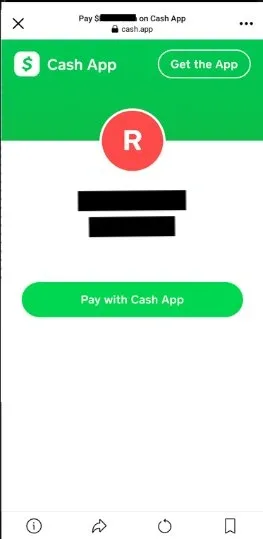
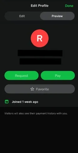
(Tapping a payment request link instantly opens Cash App, taking users directly to the sender’s profile without extra login)
💡 FURTHER READING
- IMPORTANT UI/UX Design Trends
- UI UX Design Companies in Dubai You Can Trust
- Best UX Audit Tools (Shared by Our UX Experts)
- UX Research AI Tools(Recommended by experts)
- User Experience (UX) Statistics to Bookmark
How Tenet helped Angles with UI UX design and app development [case study]
Angles, Kuwait’s premier lifestyle retail brand, needed a digital transformation. With intense physical store success, they also sought to improve their online presence. They turned to Tenet for a digital overhaul.
We mapped out a plan to create an excellent UX for both the customer and the internal team. Our focus was on making the process simple and fast, from browsing to checkout.
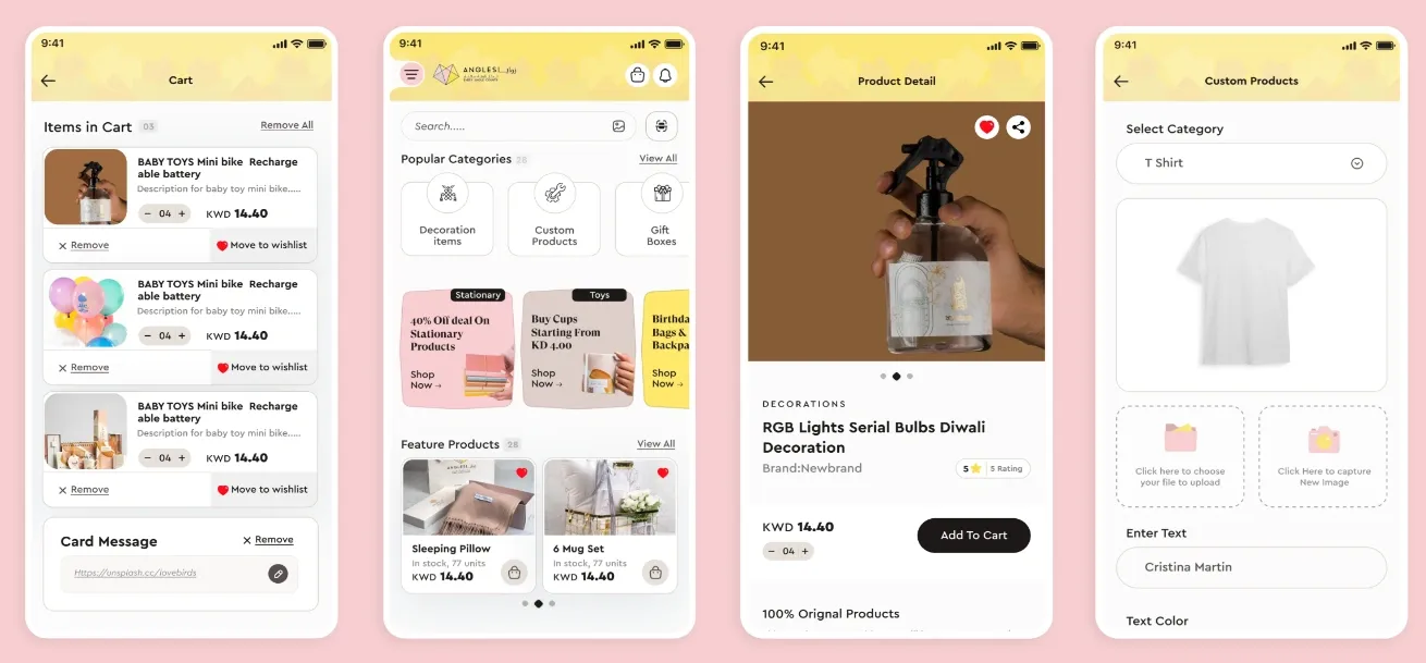
We designed web and mobile apps with AI-based recommendations, real-time order tracking, and secure transactions. On the backend, we built a dashboard for Angles to manage inventory and customer data all in one place.
In the end, the transformation improved both customer satisfaction and internal efficiency. Angles now has a digital experience that matches its physical presence, thanks to the thoughtful blend of UI/UX design and app development.
Need more impact? You aim for ROI; we design every experience that leads to it. Get your proposal today!
Here are the services that we offer for Fintech companies:
- Fintech app development services
- Fintech Design Agency (Custom UI UX Solutions)
- Website Design & Development For Financial Services
Learn how Tenet designs fintech UI/UX for trust, speed, and conversion
Fintech moves fast, but it's UX may struggle to keep up. Confusing UI, lengthy onboarding, and untrustworthy transaction flows drive users away. Businesses may struggle with lost customers or churn rates before users start onboarding.
With 98% client satisfaction and over 450+ solutions delivered for brands like Coca-Cola, DoorDash, and Deloitte, Tenet knows what it takes to fix broken fintech experiences. Our process starts with deep research, mapping user behavior, and identifying drop-off points.
We also believe that good design is about conversions. From onboarding that turns signups into active users to payment flows that keep them coming back, Tenet sharpens fintech UX into a growth engine. Let’s build experiences that convert.
👉 Further resources about UI UX terminologies:
- What Is Motion Design In UI/UX?
- What Are Nielsen’s Heuristics In UI/UX?
- What Is No-Code and Low-Code Design?
- What Are Prototypes In UI UX Design?
Contact our UI UX experts & know how we can help
Contact our UI UX experts & know how we can help


Got an idea on your mind?
We’d love to hear about your brand, your visions, current challenges, even if you’re not sure what your next step is.
Let’s talk


