🎨 15 Important UI UX Design Trends of 2026
 By
By Share
Share
Get a quick blog summary with


Bad design makes users leave fast.
Trends like simple buttons, quick-loading pages, and designs that work on phones first help businesses keep users happy.
At Tenet, we’ve designed 400+ projects for Indian users. And we use these trends to make your app or website fun, easy, and trusted—so people stay longer and buy more.
Want a design that turns visitors into fans? — our guide on UI UX design trends has got you covered.
👉 Need help in improving user engagement on your website or application?
Explore our UI UX design services and see how our expert designers can help you.
15 UI/UX Design Trends of 2026
Here are the trending UI/UX design trends:
1. Interactive 3D Objects
Interactive 3D objects offer immersive, engaging, and tactile user experiences by allowing users to rotate, zoom, or manipulate objects directly in a digital environment. This trend has gained momentum due to advancements in WebGL and libraries like Three.js.
It creates dynamic visual storytelling, especially for products or concepts that benefit from being explored in detail. It can help in the following ways:
- Engagement and Immersion: Interactive 3D objects enhance user engagement by providing immersive experiences that allow users to explore products or environments from multiple angles. This can be particularly effective in e-commerce, where customers can virtually "handle" products.
- Integration with AR/VR: Interactive 3D objects, along with augmented reality (AR) and virtual reality (VR), create new avenues for user interaction. Users can experience products in a simulated environment, leading to increased engagement and satisfaction.
- Realistic Simulations: Interactive 3D allows for realistic simulations that can demonstrate how a product works in real-world scenarios, fostering a deeper understanding and connection with the product.
When to use it: E-commerce, Exhibitions
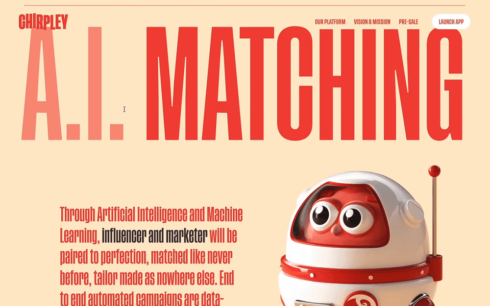
Chirpley.ai website has a distinctive 3D and interactive design to communicate its brand identity and services effectively. Central to this design is the red bird mascot, which appears throughout the site, adding a playful touch to the user experience.
The website features an array of three-dimensional cartoon visuals that not only enhance its aesthetic appeal but also serve to illustrate complex concepts in an accessible manner.
👉 Curious to know more about how UX impacts conversions and user experience? Read our curated list of User Experience (UX) Statistics
2. Metaverse Reality
Metaverse Reality is an emerging design trend centred on creating interconnected, immersive virtual worlds where users can engage, interact, and collaborate through avatars in real time.
It makes use of advanced technologies such as Virtual Reality (VR), Augmented Reality (AR), Artificial Intelligence (AI), and blockchain-based ownership models (like NFTs).
Unlike traditional 2D interfaces, metaverse environments prioritise spatial depth, realism, and interactive elements, giving users a sense of presence within a virtual space.
It can help in the following ways:
- Promotes Social Interaction: Spatial audio, real-time communication, and multiplayer functionality create collaborative, community-focused spaces where users can socialise, learn, or work.
- Breaks Physical Barriers: Enables users to connect globally in shared virtual spaces, bridging geographical divides for education, work, and entertainment.
- Gamification of Experiences: By integrating game-like mechanics, such as earning rewards, unlocking levels, or completing challenges, businesses can drive engagement and loyalty in new ways.
When to use it: Retail Experiences, Education, Gaming, or Large-Scale Events
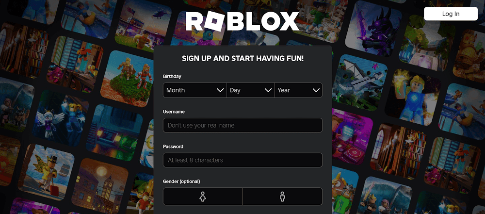
Roblox is a user-generated gaming platform that has evolved into a metaverse where users can create, interact, and immerse themselves in a vast digital universe.
It integrates 3D world-building with social connectivity, offering an interactive space where players can communicate, collaborate, and share experiences in real time.
Avatars are highly customizable, and users can purchase accessories, clothing, and animations using Robux, the platform’s virtual currency.
3. Bento Grids or Bento Box
Bento Grids, inspired by the Japanese bento box, is a visually structured UI layout that arranges content in modular, asymmetric, yet balanced blocks. Rather than presenting all elements in equal-sized blocks, Bento Grids uses a combination of larger feature blocks and smaller supporting elements.
This makes interfaces feel more engaging while maintaining clarity. The arrangement often uses text, images, and interactive components in a harmonious, multi-dimensional way that feels both structured and visually diverse. It can help you in:
- Improving Scanability: Users can quickly grasp key content at a glance, making it great for dashboards and overview pages.
- Reduces Cognitive Load: Organizes information intuitively, helping users process complex data without feeling overwhelmed.
- Great for Storytelling: Supports varied content formats (text, images, buttons, widgets), making it ideal for brand storytelling or interactive experiences.
When to use it: For dashboards, product listings, or educational platforms.
Koto is a global brand and design studio known for creating bold and strategically driven visual identities for companies worldwide. Koto Studio's design for WhatsApp employs a bento box layout. The bento box design translates into a grid system that arranges content into distinct, flexible modules.
This method allows for a clear and cohesive presentation of diverse elements such as text, images, colours, and icons. The modular structure not only enhances visual appeal but also facilitates a storytelling experience, reflecting the interactive nature of WhatsApp's communication platform.
4. Adaptive UI
Adaptive UI is a design approach that adjusts the user interface (UI) based on the device, screen size, user preferences, or environmental conditions. Unlike responsive design, which mainly focuses on scaling elements fluidly, Adaptive UI goes beyond customized layouts, functionalities, and even interactions to deliver the best possible experience for different users and contexts.
It achieves this through predefined breakpoints, device-specific optimisations, and personalised UI elements. This trend is becoming more important as users access digital products from various devices, including smartphones, tablets, desktops, foldable screens, smartwatches, and even AR/VR interfaces. It helps in:
- Improves Accessibility: Supports a wide range of users by offering adjustable font sizes, contrast modes, and simplified layouts for better readability.
- Optimizes Performance: Prevents UI bloat by loading only the necessary assets and features suited for the user’s device.
- Boosts Engagement & Retention: Users are more likely to stay engaged when the interface feels natural and comfortable on their device.
When to use it: E-Commerce, Gaming, Education, Healthcare, Finance, Retail, Enterprise Software, Smart Home & IOT, Automotive.
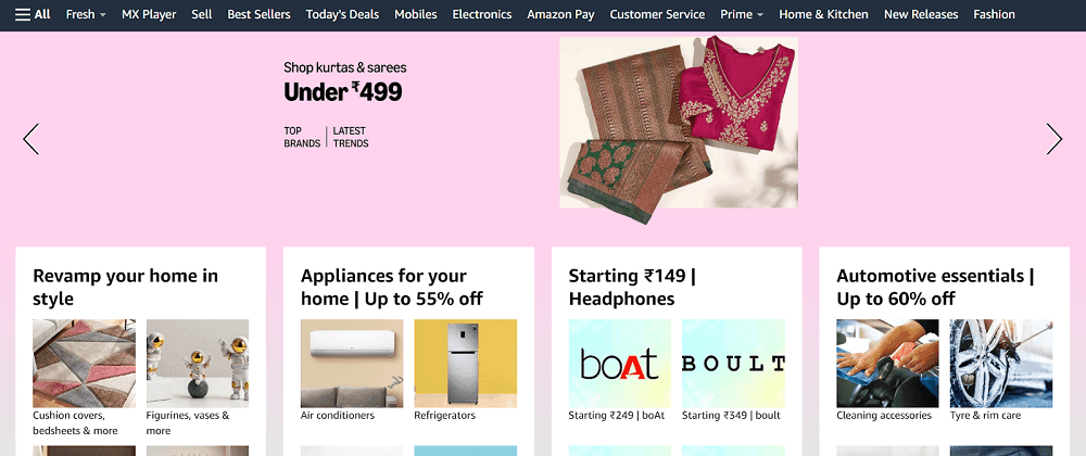
Amazon Adaptive UI (User Interface) design ensures seamless user experiences across different devices, screen sizes, and user preferences. It automatically adjusts elements like layout, typography, images, and navigation based on the device being used. One of the core principles of Amazon’s adaptive design is personalisation.
The UI intelligently adapts to individual user behaviors, past searches, and shopping habits, creating a tailored experience for each customer. This is evident in features like recommended products, personalized deals, and dynamic homepage content, which shift based on real-time data and user activity.
5. Brutalism
Brutalism in UI/UX design is raw, bold, and unapologetic, prioritising function over form. Inspired by the mid-20th-Century Brutalist architecture movement, this trend rejects polished, over-stylized, and ultra-minimalist UI elements in favour of bold typography, raw layouts, clashing colours, visible grid structures, and an intentionally ‘unfinished’ look.
Brutalist design often challenges traditional UX principles. It favours sharp contrasts, unrefined edges, and a stark aesthetic that appears intentionally “ugly” or unconventional.
By breaking away from modern web design norms, the brutalist design creates a disruptive, rebellious, and memorable user experience.
It can assist you in:
- Creates a Bold Brand Identity: Makes a strong, rebellious statement, perfect for brands wanting to stand out in a saturated market.
- Boosts Memorability: The unconventional look makes a lasting impression, making it ideal for experimental and artistic websites.
- Breaks Design Conventions: Provides a fresh alternative to overused modern UI patterns, creatively challenging traditional design norms.
When to use it: When designing for creative industries, experimental web projects, or brands that want to disrupt conventional design trends and leave a lasting impression with a raw, bold aesthetic.
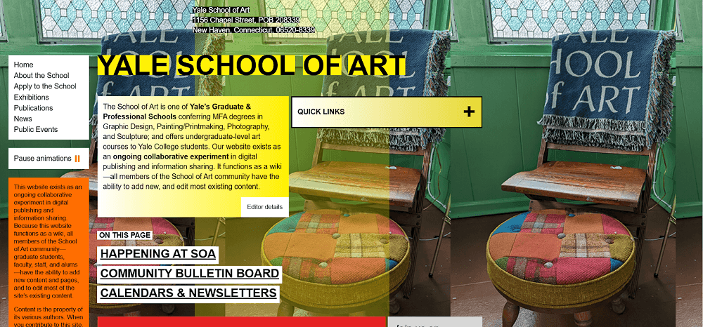
The Yale School of Art is a well-known example of brutalist web design, a design approach that emphasizes raw, unpolished, and often chaotic aesthetics.
Unlike conventional, polished web designs, the website has asymmetrical, unstructured layouts, harsh typography, and minimal refinement, reflecting the experimental and avant-garde nature of the institution.
This intentionally rough design mirrors the physical brutalist architecture seen in many academic institutions, where exposed concrete and raw materials dominate.
6. Parallax Scrolling
Parallax scrolling is a visual technique where background elements move at a different speed than foreground elements, creating a sense of depth and motion as users scroll through a webpage.
This effect mimics the way objects appear to move at different speeds in real life, enhancing immersion and engagement. When implemented effectively, it creates a cinematic feel that keeps users engaged while subtly directing their attention to key elements. It can help in:
- Improves Storytelling: Guides users through a narrative by progressively revealing information.
- Directs User Focus: By controlling how elements appear, parallax helps emphasise key messages, CTAs, or product features.
- Encourages Longer Time on Page: The engaging nature of parallax effects often leads to increased session durations.
When to use it: Landing pages, product showcases, creative portfolios, or engaging brand websites.
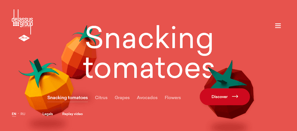
Delassus Group has implemented a distinctive parallax scrolling design on their website to create an engaging user experience.
As users navigate horizontally, background colors dynamically change to correspond with each showcased product—transitioning from tomato-red to grape-purple to avocado-green.
By leveraging parallax scrolling, it effectively guides visitors through their product offerings, creating a memorable and interactive experience that sets them apart in the agricultural industry.
7. Variable Typography
Variable Typography is a font technology that allows a single typeface to adapt across multiple styles, weights, widths, and optical sizes without requiring various font files. This makes typography more fluid, flexible, and responsive.
It enables designers to create scalable and interactive text experiences that adjust to different screen sizes, devices, and user preferences. Unlike traditional static fonts, variable fonts use adjustable axes (such as weight and optical size), allowing text to shift based on scroll position, screen size, or even user interactions. It helps in:
- Enhances Readability Across Devices: Ensures optimal text rendering across various screen sizes and resolutions.
- Improves Website Performance: By using a single variable font instead of multiple font files, loading times are significantly reduced.
- Supports Accessibility Needs: Custom adjustments allow better readability for users with visual impairments (e.g., increasing weight for better contrast).
When to use it: Fashion, Media, Advertising, Technology, and UX/UI design
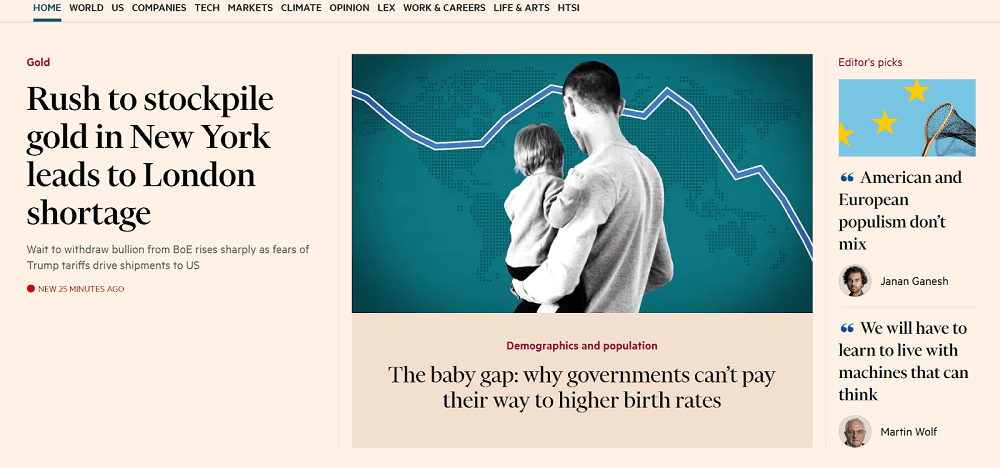
The Financial Times (FT) enhance readability and maintain a cohesive visual identity across its various platforms. Central to this system is the custom-designed typeface Financier. Financier comprises both Text and Display versions, each optimized for specific uses within the publication.
The Financier typeface balances readability and impact with two tailored versions: Text for body copy, featuring taller ascenders and a lower x-height, and Display for headlines, refined for larger scales.
This dual approach ensures a consistent typographic voice across print and digital media, optimizing readability while adapting to different contexts.
8. Sustainable Design
Sustainable design in UI/UX focuses on creating digital products that minimise environmental impact, promote accessibility, and prioritise ethical, long-lasting user experiences.
This trend emphasises energy-efficient web design, reduced data consumption, ethical design choices, and responsible resource usage to ensure a greener digital ecosystem.It can help in:
- Reduces Carbon Footprint: Lighter, optimised websites consume less energy, reducing their environmental impact.
- Increases Accessibility & Inclusion: Sustainable design often aligns with accessibility best practices, making digital products more usable for diverse audiences.
- Encourages Responsible Consumption: Helps users make conscious digital choices, such as opting for low-energy browsing modes or eco-friendly settings in apps.
When to use it: Architecture & Construction, Product Design, Fashion & Textiles, and Technology & Electronics
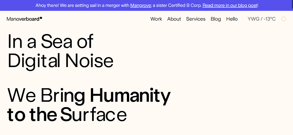
Manoverboard emphasizes sustainable web design by creating efficient, low-impact websites that minimize environmental footprints.
Their approach includes optimizing site performance to reduce energy consumption, utilizing green hosting powered by renewable energy, and implementing design strategies that prioritize accessibility and user experience.
9. Minimalism- Less is More
Minimalism in UI/UX design follows the principle of "Less is More," focusing on simplicity, clarity, and efficiency by eliminating unnecessary elements and emphasising only the essentials. It is about removing clutter while ensuring functionality, creating an intuitive and visually calming experience for users.
Minimalist design does not mean stripping everything away—it’s about achieving maximum impact with minimal elements by using clean layouts, ample white space, limited colour palettes, clear typography, and intuitive navigation. It can assist in:
- Improves Usability & Accessibility: Simple layouts and clear typography make navigation easier, benefiting all users, including those with disabilities.
- Faster Load Times & Performance: Lightweight design reduces unnecessary code, images, and elements, improving page speed and responsiveness.
- Reduces Cognitive Load: Users process information faster, leading to better engagement and decision-making.
When to use it: Tech, Fashion, Luxury, Wellness, Architecture, Interior Design, Finance, Art, Photography, Branding, and Lifestyle.
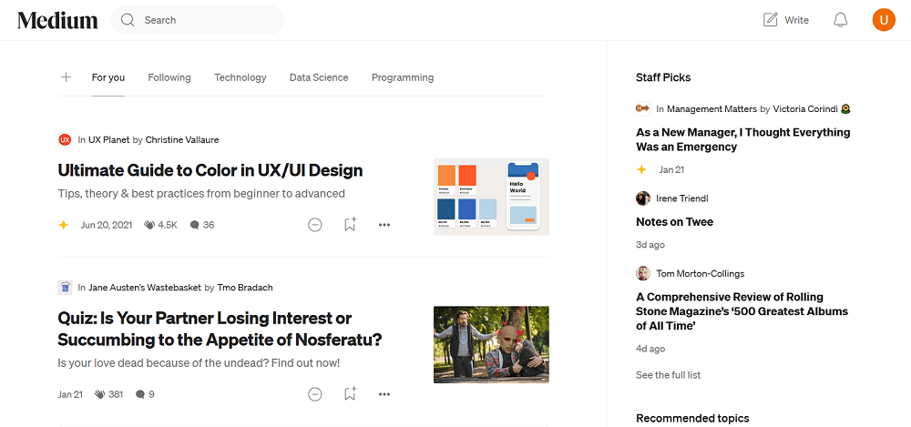
Medium has a clean, distraction-free interface with generous white space, a muted color palette, and a focus on typography to ensure an optimal reading experience. Its design eliminates unnecessary visual elements, using a single-column layout that guides the reader’s attention to the content without distractions.
The use of a customized typeface, easy navigation, and a clutter-free environment enhances readability while staying elegant.
10. Dark Mode
Dark Mode is a UI design trend that presents interfaces with a dark background and light text, reducing eye strain, improving readability in low-light environments, and enhancing battery efficiency on OLED and AMOLED screens.
Instead of the traditional bright, white backgrounds, dark mode uses muted greys, deep blacks, and accent colours to create a sleek, modern, and visually comfortable experience.
Dark Mode is more than just a design preference—it is functional and performance-driven, making it popular across mobile apps, operating systems, websites, and software platforms. It allows users to toggle between light and dark themes, providing them with control over their viewing experience. It assists in:
- Improves Battery Efficiency: Saves power on OLED/AMOLED screens, extending battery life on mobile devices.
- Better Focus on Content: Dark backgrounds help highlight images, videos, and important UI elements, making them stand out.
- Great for Night-Time or Low-Light Use: Reduces brightness levels, preventing screen glare in dim environments.
When to use it: Productivity Apps, Entertainment Platforms, Developer Tools, and Mobile-First Experiences.
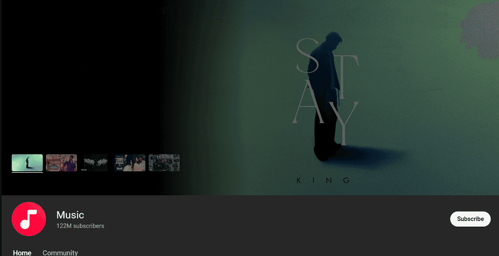
Spotify has a dark-themed UI, featuring deep blacks and dark grays, provides a sleek and modern aesthetic while allowing album art, icons, and text to stand out with high contrast. This design choice is particularly beneficial for long listening sessions, as it minimizes blue light exposure and improves battery efficiency, especially on OLED screens.
By using highlights and intuitive navigation, it ensures that its interface remains both functional and visually engaging, reinforcing its dominance in the digital music space.
11. Glassmorphism
Glassmorphism is a UI design trend that creates a frosted-glass effect using transparency, blurring, and subtle layering to give a sense of depth and hierarchy. It is inspired by real-world glass surfaces, where background elements remain partially visible but blurred, creating a soft and modern aesthetic.
This trend has gained popularity in modern operating systems (like macOS Big Sur and Windows 11), dashboards, mobile apps, and website designs, providing a lightweight, elegant, and futuristic look.
It often works well with background colours, smooth gradients, and layered UI elements to create a visually appealing interface. It can help you in:
- Creates a Sense of Depth & Layering: Improves visual hierarchy without relying on heavy shadows or borders.
- Maintains Focus on Content: The soft blur effect allows UI elements to stand out while still maintaining context.
- Lightweight & Minimalist Feel: Gives a futuristic, clean interface without adding clutter.
When to use it: Operating Systems, Dashboards, Fintech Apps, Mobile UIs, And Luxury Brand Websites.
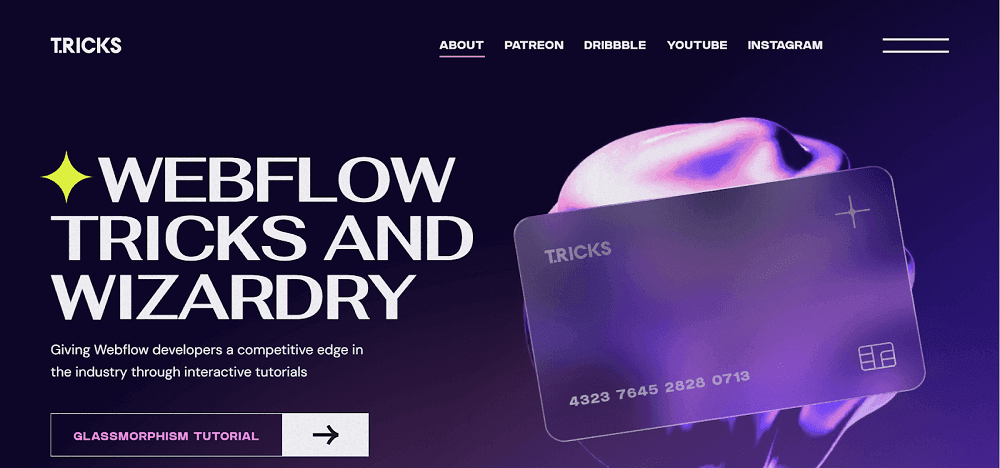
The website T.RICKS exemplifies the glassmorphism design trend, which emulates the appearance of frosted glass by utilizing translucent elements, background blurs, and subtle shadows to create depth and a layered visual hierarchy.
This approach enhances the user experience by providing an aesthetically pleasing interface that emphasizes clarity and focus on content.
12. Neumorphism
Neumorphism, also known as Soft UI, is a modern design trend that creates an extruded effect in which UI elements appear embedded into or floating above the background. It achieves this look using soft shadows, light sources, and subtle gradients to mimic the appearance of physical objects while maintaining a minimalist and futuristic aesthetic.
Neumorphism design is derived from skeuomorphism (realistic design) and flat design (minimalism), giving interfaces a soft, tactile, and interactive feel. While visually appealing, it requires careful contrast management to ensure usability, especially for accessibility needs. The design works well because:
- Creates a Futuristic, Soft Design: Feels sleek, modern, and visually distinct from traditional UI styles.
- Enhances User Engagement: The depth and tactile feel make interactions more intuitive and immersive.
- Minimalist Yet Expressive: Provides a balance between flat design simplicity and skeuomorphic depth.
- Smooth & Natural Interaction Design: The pressed-in and raised effects add a sense of responsiveness.
When to use it: Finance Apps, Dashboards, Smart Home UI, and Branding-Focused experiences.
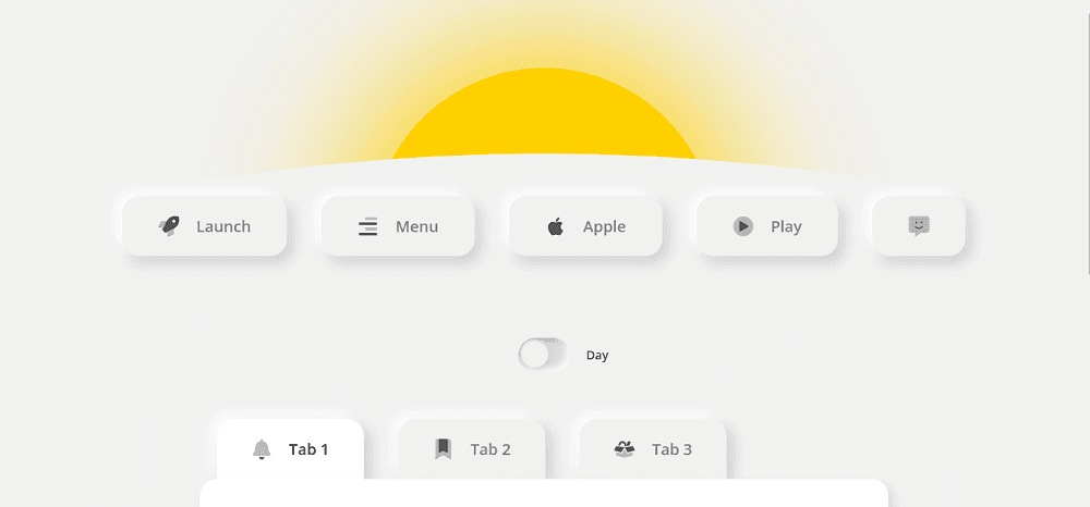
The website Neumorphism Day and Night exemplifies the neumorphism design trend, which showcases skeuomorphism and flat design. This style utilizes subtle shadows and highlights to give UI components, such as buttons and cards, a three-dimensional appearance that seems to emerge from or recede into the background.
The site features a toggle between 'Day' and 'Night' modes, demonstrating the adaptability of neuromorphic design across different lighting themes.
13. Skeuomorphic
Skeuomorphism is a design approach that mimics real-world objects, materials, and textures in digital interfaces to create a familiar and intuitive user experience. It was widely used in early UI design, such as Apple’s pre-iOS 7 interface.
This interface has elements like a notepad that looks like an actual paper notebook and calculator apps that resemble physical calculators. While modern design has shifted toward flat and minimalist styles, Skeuomorphism is making a comeback in 3D interfaces, AR/VR, and spatial computing, where real-world familiarity enhances usability. It can help in:
- Enhances Intuitiveness & Reduces Learning Curve: Makes interfaces instantly familiar by replicating real-world objects, reducing the learning curve for users.
- Bridges the Gap Between Physical & Digital Interfaces: Enhances AR and VR experiences by providing familiar visual metaphors, making digital interactions feel more natural.
- Supports Visual Storytelling & Emotional Connection: Helps brands and products establish a stronger emotional connection with users, making digital interactions more personal, engaging, and memorable over time.
When to use it: Gaming, AR/VR Applications, 3D Interfaces, Educational Tools, and Apps.
Before the release of iOS 7 in 2013, Apple’s user interface was heavily based on skeuomorphic design, a style that mimics real-world materials and objects in digital interfaces. This approach aimed to make software intuitive by replicating familiar physical objects.
Apple’s pre-iOS 7 design featured leather-bound calendars, wooden bookshelves in iBooks, green felt in Game Center, and glossy buttons resembling real-world textures. This 3D-like outlook helped users transition from physical tools to digital applications by making interactions feel natural and familiar.
👉 Find the top UX research AI tools used by our design experts.
14. Text and Emoji Mix
The Text and Emoji Mix design trend uses written content with emojis to create a more expressive, engaging, and visually appealing communication style. Emojis add personality, tone, and clarity to text, making interactions feel more human and relatable.
They help break monotony, enhance readability, and provide quick visual cues for users to interpret information effortlessly. This trend is commonly used in chat interfaces, social media, marketing copy, notifications, onboarding screens, and even navigation elements, making digital experiences feel more playful, modern, and conversational. It can help in:
- Enhances Readability & Engagement: Emojis break up text, making content easier to scan and understand. They add emphasis to key points, improving user retention and engagement.
- Adds Personality & Emotion: Emojis humanise digital interactions by conveying tone and mood, making conversations feel more natural, friendly, and engaging.
- Strengthens Brand Identity: Using emojis strategically makes brand communication more approachable, visually appealing, and memorable, increasing user interaction and social engagement.
When to use it: Chat Interfaces, Social Media Content, Marketing Materials, Onboarding Screens, and Navigation Elements.
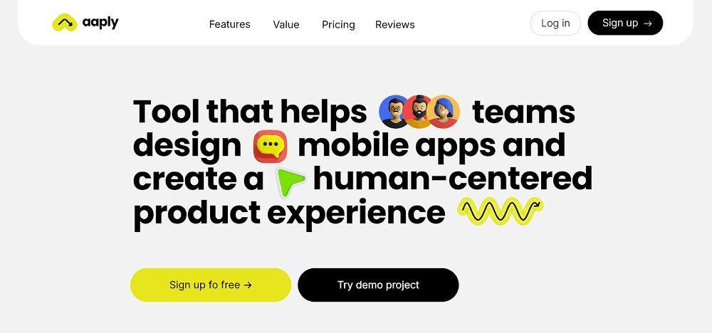
Aaply website's design features both text and emojis to convey information in an engaging and relatable manner. For instance, the phrase "Tool that helps teams design mobile apps and create a user-centered product experience" is accompanied by relevant emojis, adding a visual element that enhances comprehension and user engagement. This combination of text and emojis not only makes the content more approachable but also reflects Aaply's user-friendly approach to design.
15. Deconstructed Hero Sections
Deconstructed Hero Sections break away from traditional centred or symmetrical hero layouts by using asymmetry, layered elements, overlapping text, and unconventional typography placements. This design approach challenges uniformity and creates a visually striking first impression, making web pages feel more creative, modern, and engaging.
Instead of a predictable hero section with a static image and centred text, this trend plays with broken grids, bold typography, floating elements, and layered compositions, often incorporating motion effects to add depth. It’s widely used in creative portfolios, startup websites, and brand storytelling pages to convey innovation and uniqueness. It can help in:
- Captures Attention Instantly: Unconventional layouts disrupt visual expectations, making the page feel bold and engaging, keeping users interested from the first glance.
- Improves Storytelling & Visual Flow: The layered, asymmetric composition directs user attention through the content dynamically, enhancing storytelling and user journey.
- Encourages Interaction & Exploration: Elements like staggered typography, motion effects, and overlapping visuals create a playful, interactive experience, increasing engagement.
When to use it: Startups, portfolios, and marketing campaigns.
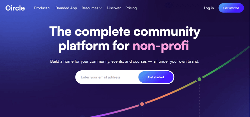
Circle has a deconstructed hero sections. The design showcases specific features of a product by isolating and highlighting individual UI components. In this design, rather than displaying the entire interface, selected elements are extracted and presented prominently to draw attention to key functionalities. This approach not only emphasizes the product's capabilities but also provides a clean and focused visual experience for visitors.
Why Brands Like Coca Cola, Deloitte, Gartner Choose us for UI/UX Design?
Leading global brands like Coca-Cola, Deloitte, and Gartner choose Tenet for their UI/UX design needs due to our proven track record of delivering exceptional results.
Our commitment to excellence and client satisfaction sets us apart in the industry. You should hire our UI UX design company because:
1. Proven Success and Client Satisfaction
With over 450 completed projects and generating $1.54 billion in revenue, we boast a 98% client satisfaction rate, reflecting our ability to deliver exceptional results consistently.
2. Industry Expertise Across Diverse Sectors
Serving 15+ industries, including e-commerce, healthcare, finance, and SaaS, we craft customized UI/UX strategies that cater to specific sector needs, ensuring relevance and effectiveness.
👉 Running a SaaS business? You must read these SaaS UX design best practices.
3. Global Reach with Localized Strategies
Operating in over 15 countries and trusted by seven Fortune 1000 companies, we excel at localising UI/UX strategies to engage diverse audiences effectively.
4. Data-Driven Approach for Maximum ROI
Utilising advanced analytics, we optimise UI/UX designs to enhance user engagement and conversion rates, ensuring clients achieve maximum return on investment.
👉 Learn how much does CRO service cost.
5. Continuous Innovation and Optimization
Our team continuously monitors and refines UI/UX designs to maintain relevance, cost-efficiency, and top performance, adapting to evolving market trends.
6. Experienced Team Committed to Excellence
Our UI/UX experts focus on delivering high-quality designs with clear communication and detailed reporting, ensuring transparency and client satisfaction.
👉 Find top UI UX design companies with our curated list
Frequently Asked Questions
What is the next big trend in UX?
The next big trend in UX in 2026 is designing for inclusivity. Inclusive design ensures digital experiences are accessible and usable for diverse users, including those with disabilities, different cultures, languages, and technology access levels.
It prioritises equity, flexibility, and adaptability, ensuring everyone, regardless of ability, can interact with a product efficiently and comfortably.
UI UX freelancers or designers— which one to hire?
The decision between hiring UI/UX freelancers and full-time designers is influenced by your project's scale, budget, and long-term requirements.
Hiring a freelancer is ideal if you require a quick, flexible, and cost-effective solution for projects such as website redesigns, app prototypes, or particular UI/UX jobs. Freelancers are perfect for start-ups, small enterprises, and one-off jobs.
On the other hand, a full-time UI/UX designer is ideal if your company requires ongoing design work, product innovation, and close cooperation with developers and stakeholders. This position is perfect for firms that create long-term goods, SaaS platforms, or design companies.
👉 Not sure how much budget you will require for UI UX service? Check out our detailed guide on UI UX design cost breakdown.
How much does it cost to hire a UI UX designer?
The cost to hire a UI UX designer varies from $25 to $200 per hour, with the cost to hire a junior designer at $40,000 - $60,000 going up to $90,000 - $150,000 for a senior designer. The cost of hiring a UI/UX designer varies based on experience, location, and project scope.
What is the difference between UI and UX?
UI (User Interface) Design focuses on a product's visual and interactive aspects, such as layouts, buttons, typography, colours, and animations. It guarantees that the interface is both aesthetically beautiful and intuitive.
UX (User Experience) Design focuses on the complete user journey, ensuring that a product is simple to use, efficient, and pleasurable. It entails researching, wireframing, usability testing, and optimising the user flow.
Is UX design in demand right now?
Yes, UX design is in demand right now and will continue to grow. Industries such as technology, e-commerce, fintech, and healthcare are heavily investing in user experience to boost engagement and retention. As AI-driven personalisation, accessibility, and immersive experiences evolve, competent UX designers remain critical to innovation and corporate success.
What problems do UI/UX designers solve?
UI/UX designers address challenges such as poor usability, difficult navigation, low user engagement, high bounce rates, and inefficient workflows.
They improve user experiences by enhancing interface design, accessibility, responsiveness, and conversion rates, allowing consumers to interact with and enjoy digital products or services more easily.
👉 Learn more about UI UX terms:
Expertise Delivered Straight to Your Inbox
Expertise Delivered Straight to Your Inbox


Got an idea on your mind?
We’d love to hear about your brand, your visions, current challenges, even if you’re not sure what your next step is.
Let’s talk


