Global
 By
By Share
By Share

Your startup needs customers, but if your product is confusing, people won’t use it. They’ll leave, and your business will struggle.
A poor user experience leads to frustration, bad reviews, and lost revenue. If people can’t quickly understand your product, they’ll move on to a competitor.
At Tenet, we’ve completed 300+ UX design projects for startups, helping them build products that attract, engage, and retain users.
Based on our experience, we have shared the most effective design principles for UX startups. Investing in UX design for startups makes your product simple and enjoyable to use.
A great user experience keeps customers happy, increases engagement, and helps your startup grow.
Let’s dive into how UX can give your startup a competitive edge over your core competitors.
UX Design for startups is making apps or websites simple and fun to use, so new companies can quickly attract customers.
It’s about learning what users want, designing fast solutions, and optimizing them with feedback— helping startups save money, grow fast, and beat bigger competitors.
How UX design is different from enterprise UX:
UX design for startups and big companies both want to make their digital product helpful and functional for their users.
But they do it in different ways because startups and big companies work differently.
Explore our UX design services by country:
Category: User Research/Usability
Key Focus Prioritize user needs
When to Use: This is a core principle of UX design that needs to be followed whenever you are building a digital product.
In this approach, end users’ needs are the primary focus throughout the design process. To understand the end users’ needs, in-person interviews and surveys are conducted to gather qualitative and quantitative user insights. In addition, usability testing is performed, where users are made to use the app in front of UX experts. These experts then analyze the points of friction that users face in their journey and make design decisions based on the insights gained from the analysis.
All these user insights are then used to make design decisions. The process ensures that all the design decisions are taken post considering the user behaviors and pain points—which is a must for startups aiming for product-market fit.
Real World Example:
Duolingo
Duolingo is an application for learning foreign languages. The developers made the design keeping the user in mind. They knew that this app would have a wide audience. After all, people of any age and any country can want to learn a new language.
So to cater to this wide audience, they designed the app super intuitive and easy-to-understand. For example, check out this screenshot from the Duolingo app below. The text is written in Hindi.
They offer multi-language support in their app, allowing users to learn in the language they understand best, which greatly simplifies their learning journey.

Duolingo also knew that people drop their interest in learning a new language very soon. So to keep people hooked, they gamified the learning experience on the app.
For example, the screenshot below is of a game on the Duolingo app in which the user is required to select a picture of a house.

Category: Interaction Design / Usability
Key Focus: Maintain a familiar and unified look and feel across the platform
When to Use: Follow this principle throughout the design process to reinforce brand identity and enhance usability
You need to create a predictable and uniform experience across your digital product. It involves using familiar layouts, navigation, and design patterns that align with users' expectations and mental models.
It also means ensuring similar design elements are used across the product that behaves the same way throughout the product. By ensuring familiarity and uniformity of design elements across the app, you reduce cognitive load in users’ heads and make it easier for them to interact with your product.
Sometimes, you might need to add a unique, unfamiliar design. For such cases employing UX research and usability testing helps determine when you can safely deviate from common patterns and when to stick with them to maintain an intuitive, user-friendly experience.
Real-world example:
Gmail
Gmail is an excellent example of an app with a consistent UI design. The product uses a familiar layout, colour scheme, iconography and design pattern across different sections—whether you're checking your inbox, sent, or spam page (screenshots below).
The emails are listed similarly, with the subject line and sender displayed and the most recent emails on top.
You have the same star icon to mark an email as important and, same icon to mark an email as read, delete it or archive it.
Check out the screenshots of the 3 pages: ‘Inbox’, ‘Sent’ and ‘Spam’ with similar layout below:
‘Inbox’ page:

‘Sent’ page:

‘Spam’ page:

Category: Usability
Key Focus: Focus on essential features only
When to Use: When resources are limited and a quick market entry and validation of idea is needed, use this strategy.
MVP design emphasizes on building only those features and functionalities in your product that are essential to make your target users experience your core offering.
The lean MVP design helps you test your idea fast, gather user feedback, and find product-market fit with minimal effort.
Real-world example:
Dropbox
Dropbox is a cloud-based file storage and collaboration platform that allows users to save, access, and share files across multiple devices conveniently.
While building Dropbox during its initial months, Drew Houston, the CEO of Dropbox, wanted a quick and easy way to validate that file synchronization was a problem that most people didn’t know they had.
So he and his team built a basic MVP in which a Dropbox folder appears on user’s computer desktop as they install the application.
Now, anything the user drags into that folder is uploaded automatically to the Dropbox cloud service and then instantly replicated across all of user’s computers and devices.
Check out the screenshot below of the folder below.
Here’s a DropBox demo video (from 16 years ago):
This was a quick and easy way to make users experience a new way of file storing and sharing that Dropbox had to offer.
They got a great response with this MVP and Dropbox grew on to become a multi-billion dollar company.
Category: Accessibility
Key Focus: Design inclusively for all users
When to Use: When you want to make your app accessible to as many people as possible, including people with disabilities
If you are building an app for a wide range of audience, including people with minor to major disabilities, you need to make sure that your design is such that even those people are able to use your product seamlessly.
Ensure that your product meets accessibility standards (like WCAG) so that it’s usable by people with disabilities such as weak or no eyesight, colour blindness, compromised cognitive and physical abilities etc.
Doing this also builds a reputation for supporting inclusivity—a competitive advantage for startups.
Real-world example: Zoom
Zoom is a widely used video conferencing platform that connects people for meetings, webinars, and virtual events.
It has crafted its tool to be accessible to people from all walks of life. It supports real-time transcription of the conversation to aid users with hearing impairments. It allows users to access functions without a mouse through keyboard shortcuts.
Zoom also has screen reader support to help visually impaired users navigate meeting controls with ease.
Checkout the screenshot below for activating Live Transcript on Zoom:

Category: Usability
Key Focus: Organize content to guide user attention in the right direction
When to Use: This principle should be used whenever you are creating any digital product, from the beginning.
Establish a clear visual hierarchy to draw users’ attention to the correct elements on your platform such that their navigation through it becomes easy. You set the visual hierarchy by strategically making certain elements more visually prominent than others, by controlling size, colour, spacing, contrast etc.
Humans typically read the page in F-pattern or Z-pattern:
1. The F Pattern — In pages with a lot of text content, we start by moving our gaze horizontally across the top, from left to right.
Then we shift our gaze down along the left side, looking for relevant clues. When something catches our attention, we briefly scan further to the right.
Here’s an example from Medium:

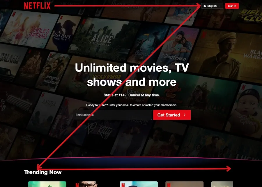
2. The Z Pattern — In pages without much text, our eye starts scanning from top left to top right, then diagonally down to bottom left, stopping at the bottom right. (The Z-pattern is depicted in the Netflix page screenshot below.)
So based on this information, you can place the elements such that they are read in the order you want.
Real World Example
Netflix
Netflix has used principles of visual hierarchy to guide the attention of users quite effectively.
In their landing page (see screenshot below), they have leveraged the fact that users are likely to scan low-density information pages in the Z-pattern. They have laid out the elements in a Z-pattern on the page, to make users’ navigation easy and make them read the elements in the right order so that they understand the platform quickly.
In addition, they have put the CTA right in the middle of the page to make the next action clear and intuitive to the user.
‘Unlimited movies, TV shows and more’ is put in big bold text in the centre, which makes sense because this is their main offering and needs to get conveyed emphatically and instantly.
Category: Validating/User Feedback
Key Focus: Quickly visualize and test ideas
When to Use: This strategy should be used during the ideation and validation phase.
Rapid prototyping involves quickly creating low-fidelity representations of a product, such as hand-drawn sketches, wireframes, or basic clickable mockups, to visualize and test core concepts before investing in development.
These prototypes help teams validate user flows, screen layouts, and interactions with minimal effort.
By conducting usability tests on prototypes, startups can identify pain points of users, gather actionable feedback, and iterate on designs without costly rework.
Category: Usability
Key Focus: Reduce complexity for quick comprehension
When to Use: This principle needs to be followed from starting, from the initial stages of design and development.
Simplicity in UX design is subjective but it can be loosely defined as “serving users what they need, when they need it, in the most straightforward way possible“. As a startup, your product is new for your users.
So it’s crucial that you make your product simple i.e. easy to understand. The information on your platform should be laid out clearly, in a clean layout so that it is easy to understand and navigation on the platform should be intuitive.
Avoid cluttering pages with too much information or complicating your flows with unnecessary steps.
Below is an example of a cluttered webpage design.
In this webpage above too much text has been fit into very little space, in an untidy way. Avoid this kind of cluttered design.
Real-World Example:
PhonePe
PhonePe is a peer to peer payments app in India, with a wide adoption of over 570 million user. This wide adoption has only been possible due to the simplicity of the process.
Users just have to select the person they wish to send the money to, then enter the amount, fill in their security PIN and that’s it - the amount gets transferred in seconds.
Check out the screenshots of the app below:
Category: User Research / Interaction Design
Focus: Adapt design to users’ real-life situations
When to Use: This principle needs to be followed when you want to optimize user experience based on the specific real-life situation users interact with your product.
One way to personalize and enhance users’ experience in your digital product is to adapt the user journey of based on the context in which the user is interacting with your product. The context are real world circumstances currently experienced by the user such as device type, location, time of day, or background distractions that may influence usability of your product.
To get to know about the context in which users use your product, conduct user interviews, surveys, and create user journey maps.
Once you have understood the specific conditions i.e. the context, you can adapt your digital experience to enhance the user journey of your product.
Real-World Example:
Spotify
Spotify uses context-aware recommendations to enhance user experience.
They deliver personalized playlists to users based on various contextual factors like time of day, activity patterns, and listening habits.
For instance, in the morning, users might see an upbeat playlist to start their day, while in the evening, they may find relaxing tunes to wind down.
Check out the screenshot below of the Spotify landing page for a user in the evening.

Spotify greets the user with ‘Good Evening’ and suggests songs apt for the evening such as soothing ‘Flute Music’.
Spotify also curates workout playlists when it detects activity patterns associated with exercise, such as connecting to a fitness tracker or playing high-energy songs during specific timeframes.
This approach helps users discover relevant content effortlessly, making the listening experience more engaging.
Category: Design Process / Consistency
Focus: Ensure visual and functional consistency across products
When to Use: Use this strategy since the start of UI/UX design and development.
A design system is a collection of reusable UI building blocks, design guidelines and interaction patterns that product teams use throughout the digital product to create a consistent user experience.
Consider it as a blueprint offering a unified language and structured framework that guides teams through the complex process of creating digital products.
These systems help teams maintain a cohesive visual language across platforms by standardizing elements such as buttons, typography, colour schemes, and interaction patterns.
These systems cut out the need to recreate the same or similar components for multiple projects from scratch.
Real Life Example:
Airbnb
Airbnb’s design system, DLS (Design Language System), standardizes UI components, enabling quick and consistent interface creation across the platform.
For instance, Airbnb has a consistent design for all the property pages, with the same pictures section, amenities section, reserve section etc. as can be seen from the screenshots below.
Below are the screenshots of a property page. You can see the consistency in the design elements.

Category: Performance/Usability
Key Focus: Ensure optimal experiences across devices
When to Use: Build a responsive design when targeting a diverse user base that accesses the product on various devices.
While designing, keep in mind mobile devices and all the other device types that your target user would use your product on, from the beginning.
The design should be such that it adapts to the different screen sizes without compromising on the visual appeal and functionality of your product.
Given that 62.54% of the internet traffic comes from mobile, making responsive design is no longer an option but a mandatory requirement for startups.
Real-World Example:
Flipkart
Flipkart is an Indian e-commerce company selling a wide variety of products from electronics to apparels on its online digital platform.
Although they have a mobile app, they have made their website mobile-responsive because they are aware that a significant amount of people land on their website via mobile.
Check out the screenshots below of their web pages on mobile and web, both equally visually appealing and well-functioning.
Here’s a mobile version of the Flipkart app:

Here’s the desktop version of Flipkart website:

Category: Usability
Focus: Minimizing cognitive load by revealing information gradually.
When to Use: Ideal for complex interfaces or processes where presenting all information at once could overwhelm the user.
Progressive Disclosure is a design strategy that initially presents only the most essential information to the user. Additional details or options are revealed gradually as needed, reducing clutter and helping users focus on the task at hand.
This approach enhances usability by preventing information overload and making complex systems easy to use. This is especially important when you are a startup and the user is barely aware of your product.
Real Life Example:
Amazon’s product pages utilize progressive disclosure effectively.
The initial view presents key details such as the product title, price, and a brief description, allowing users to quickly assess relevance as shown in the screenshot below.

This approach of progressive disclosure reduces visual clutter and cognitive load, ensuring that shoppers can focus on primary information while still having access to deeper details when needed, ultimately enhancing the overall user experience.
RELATED UI/UX DESIGN RESOURCES
Lean UX is a user-centred design approach that focuses on minimizing waste, maximizing learning about the target user, and iterating quickly based on user feedback.
Here is how startups can apply Lean UX principles:
Treat design ideas as experiments. Before building a full onboarding flow, create a simple version. Test it with real users to see if it helps them get started. If it works, improve it. If not, adjust and test again.
Action items:
Include product, design, engineering, and marketing teams early. Schedule regular check-ins, share updates, and get feedback from everyone. This speeds up decision-making and avoids last-minute surprises.
Action items:
Create simple prototypes instead of fully developed features. Use tools like Figma to design, share, and get feedback. Run quick user tests and make changes based on real insights.
Action items:
Break work into short cycles (sprints). After each sprint, test what you built, see how users interact with it, and make improvements. Repeat this process to keep refining your product.
Action items:
Track key data to understand what works. Measure success rates, time spent on tasks, and conversions. Use these insights to make informed design decisions instead of guessing.
Action items:
Write only what’s necessary. Use working prototypes and simple notes instead of long documents. This keeps your team flexible and focused on building, testing, and improving.
Action items:
Looking for UX design services for healthcare or eCommerce niche? Check out our services:
AcePlus wanted to build an immersive and engaging e-learning platform for children.
Through this platform, their vision was to make learning fun and accessible for every student, irrespective of their geographical location.
At Tenet, we completed the development of the Android mobile app, 15 immersive games, the backend of the mobile application, the super-admin panel, and the website (front-end and back-end) within 7 months.
Here are some UX design samples from our project:

Here’s how our design and development work helped our client in user acquisition:

👉 Explore our UI UX design services and get a free proposal from our experts.

Shantanu Pandey is a UI/UX design, branding, and growth marketing expert. As the Founder & CEO of Tenet, he helps global brands create amazing digital experiences.
Expertise Delivered Straight to Your Inbox
Expertise Delivered Straight to Your Inbox

We’d love to hear about your brand, your visions, current challenges, even if you’re not sure what your next step is.
Let’s talk

NY

LDN

DXB

DL

SG
NY
LDN
DXB
DL
SG


 U.A.E:
 India:
 UK:
UK: USA:
USA: