Ecommerce CRO Audit For Product, Category, and Homepage
 By
By Share
By Share

Your website visitors are walking away empty-handed. They land on your website, but press the 'Back' button before they ever press the 'Buy' button.
Why?
It's because your website has elements that repel the visitors away, such as substandard-quality images, draining UI/UX experience, tasteless copywriting, etc.
Your website also lacks elements encouraging visitors to buy, such as live chats, product comparison tools, and size charts.
We at Tenet help you figure out these elements via our data-centric CRO audit services.
Our CRO audit helps you increase your website's conversion rate, which massively impacts your revenue (as discussed below).
What is a conversion rate optimization (CRO) audit in ecommerce?
A CRO audit analyzes your e-commerce website to figure out the ‘repelling’ and ‘propelling’ elements, as discussed above. This helps you increase your conversion rate, i.e., the percentage of visitors purchasing.
A CRO audit answers questions such as:
- At what steps are my visitors getting dropped off?
- What’s causing the drop-off?
- How can I make the product look more attractive?
- How can I make the buying journey easier?
- What are the reasons buyers can leave the website in the buying journey? How to avoid that?
By the end of our audit, you’ll have a clear roadmap of improvements needed to boost your site’s performance and increase conversions.
💡 Hire our CRO audit services and see how we can help you increase conversions and engagement on your product, website, and apps.
How can a CRO audit improve your ecommerce business revenue and bottom line?
A slight increase in your conversion rate can lead to a big impact on revenue. Let’s see how.
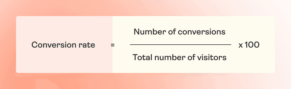
If your website receives 50,000 visitors monthly and makes 500 sales, your conversion rate is 1% (using the above formula).
Now, let’s say we increase your conversion rate to 1.5%.
This would mean you will be making 750 sales per month. This is a significant increase in revenue with the same amount of traffic.
At Tenet, our e-commerce CRO agency has helped e-commerce brands more than triple their conversion rates, which has directly impacted their revenue growth.
Download our eCommerce CRO audit checklist with 300+ pointers
Access our pre-built CRO audit template that we used to help 100+ clients. Here’s a sneak peek:
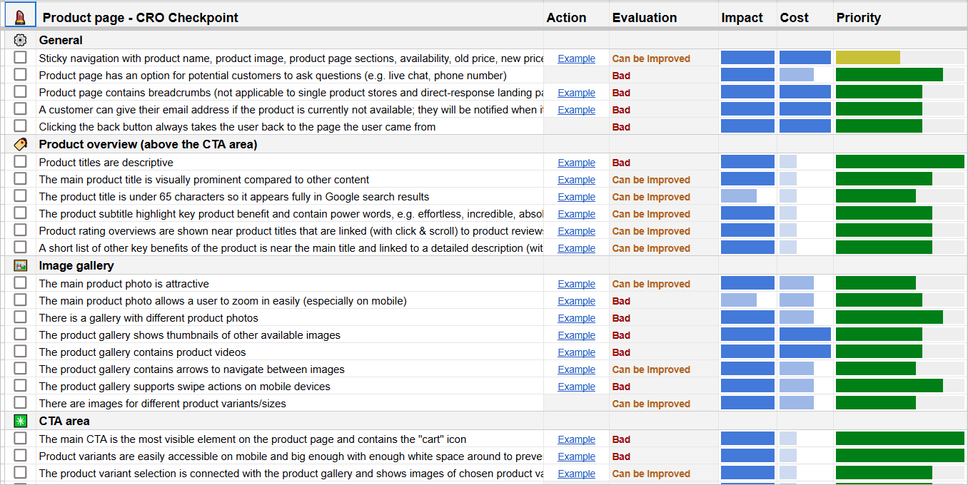
- Google Sheet (make a copy or download for free) →
Essential e-commerce CRO audit tools you need
Here are some of the most essential tools for ecommerce CRO audits:
Used for heatmaps, session recordings, and user feedback. It helps you understand where users are clicking on, scrolling, and what they’re ignoring.
It provides in-depth insights into website traffic, user behavior, and conversion funnels. It tracks key metrics like bounce rate and user journey to spot drop-off points.
It offers heatmaps, scroll maps, and A/B testing to analyze how visitors interact with your site and which areas need optimization.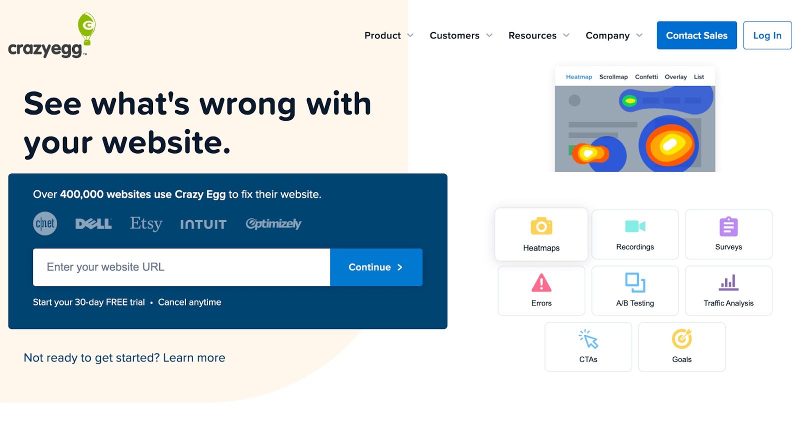
A powerful A/B testing tool to experiment with different versions of your website and measure which performs better in conversion rate.

It helps you optimize the user experience with features like heatmaps, A/B testing, and user session recordings. It also provides detailed insights into user behavior and engagement.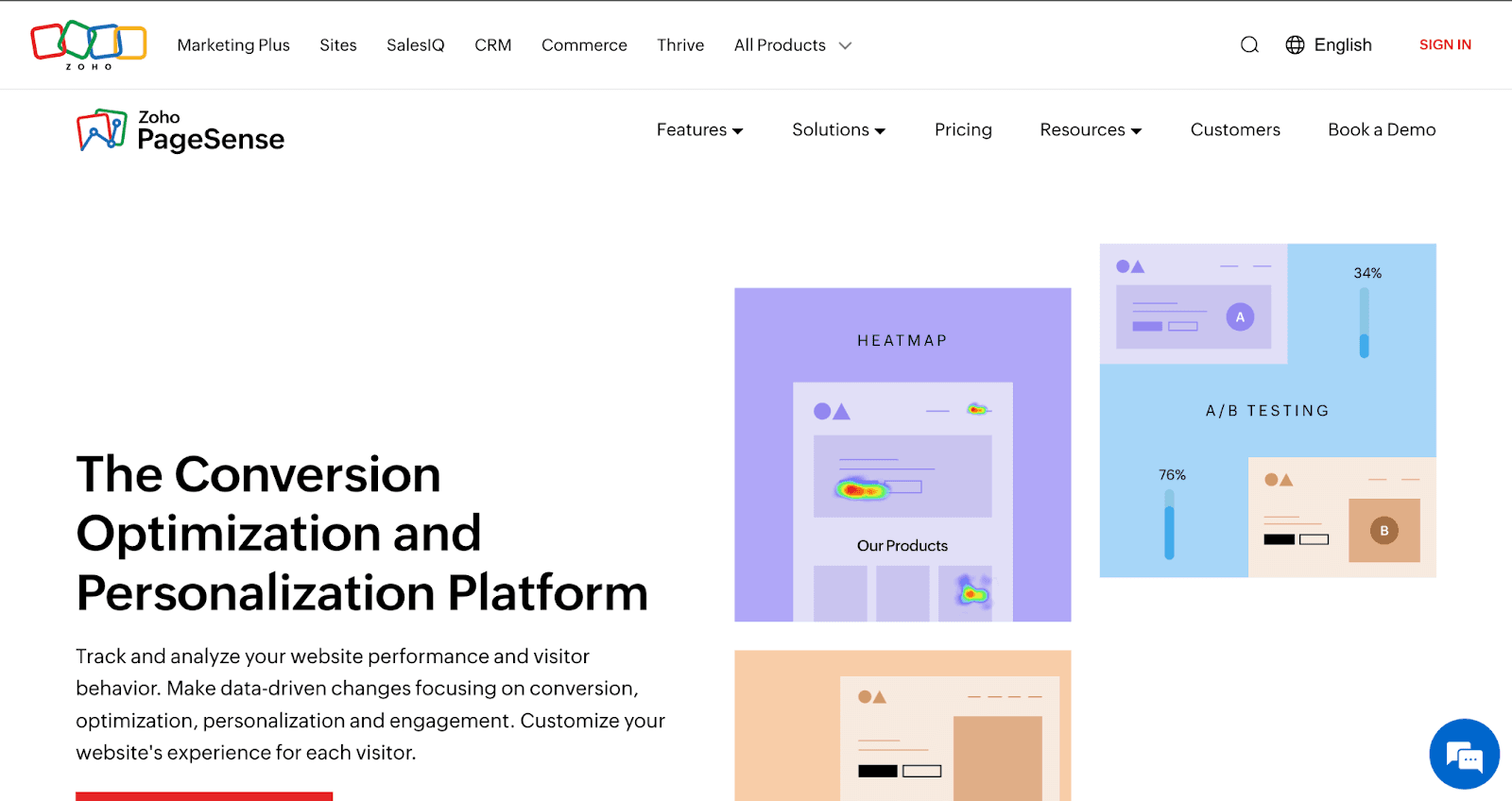
You can find more tools in our 300+ pointer Ecommerce CRO checklist.
How to perform an ecommerce CRO audit?
We believe each page type (Home page, category page, product page, and checkout page) serves a different purpose in pushing the user ahead in their buying journey.
Hence, in our audits, we evaluate each page separately. We assess these pages for the ‘elements’ that either propel visitors ahead in the buying journey or repel them away from the website.
We have covered our CRO audit process for each page type in detail below:
How to do Ecommerce CRO audit for a Home Page
Purpose of Home Page: Establish Immediate Trust in the brand, Communicate Value Proposition, and Push users to take the next action.
The home page is often visitors' first point of contact. As soon as the user lands on the home page, they should feel a sense of trust. If they don’t trust you, they won’t engage with you.
Apart from trust, you need to give users a solid reason to engage with you, which is done through a clear value proposition. Tell users what you sell and why they should buy it rather than your competitor.
Lastly, if they have decided to engage with you, make their next step as easy and intuitive as possible.
The ‘elements’ that help you build trust, communicate value proposition, and push users ahead have been listed below:
1. Website Design (UI)
According to studies, 46% of people say a website’s design is the number one factor in determining a business's credibility.
In a study by Google, researchers found that customers form a first impression of your website (or brand) within the first 50 milliseconds. There’s no thinking with this first impression—the visual aesthetics of the website form it.
So, you need to make your website design appealing to the eyes.
Here are some practices you can follow to make your homepage visually attractive:
1. Your homepage should be clean. It should not be overloaded with information.
2. Your color palette should be consistent and harmonious. Choose 3 to 5 complementary colors with strong contrasts.
3. Your images/video resolution should be at least HD quality.
4. Your typography should be easily readable and attractive.
5. Also, with 60% of internet usage happening on mobile devices, your homepage (rather than the entire website) should be mobile-responsive.
Here’s an example:
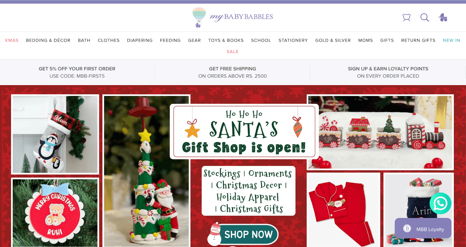
✔️ Follow: MyBabyBabbles
MyBabyBabbles’ homepage is visually appealing:
1. The UI & UX is clean and easy to understand.
2. It has a harmonious and consistent color palette.
3. The images are of high quality and showcase the product(s).
4. The typography is consistent, legible, and attractive.
5. Key offers and promotions are highlighted prominently
❌ Not to follow: AliExpress
AliExpress’ homepage is not visually appealing:
1. It is cluttered.
2. It has an inconsistent and non-harmonious color palette.
3. It needs better-quality images.
4. It has unattractive typography.
5. No prominent CTA or promotion is highlighted. The user doesn’t know what to do next.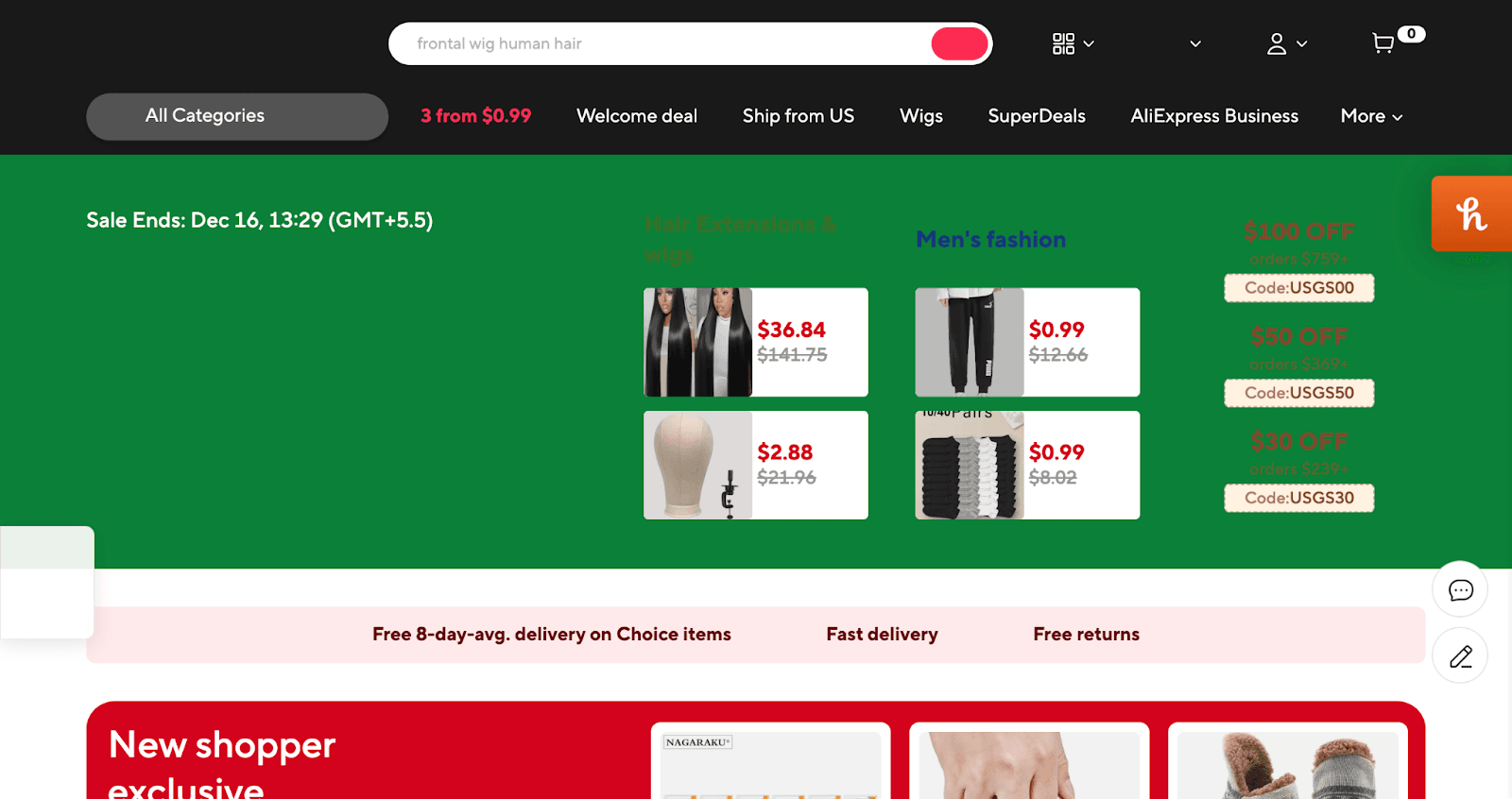
2. Loading speed
A slow-loading homepage creates a bad first impression for users and can lead to a loss of trust and a high bounce rate. 47% of consumers expect a webpage to load in 2 seconds or less, and 71% of people will abandon a site if it takes more than 3 seconds.
We use tools like Google PageSpeed Insights and GTMetrix to evaluate your loading speeds.
3. Prominent and Clear Value Proposition
Your value proposition tells users what you offer and why they should buy from you instead of your competitors. It sets expectations and drives users toward conversion.
They may lose interest and leave if your value proposition isn’t immediately apparent.
A good practice about value proposition is to keep it above the fold so that it grabs users' attention instantly.
"Above the fold" is the part of your website that visitors see without having to scroll.
Also, keep the text size big enough to be instantly visible.
Lastly, keep it short and as simple as possible for clarity.
✔️ Follow: Wayfair
Wayfair’s value proposition is clear and prominent:
1. It’s above the fold, right in the center.
2. The text size is big enough to get instant attention.
2. It’s short and simple.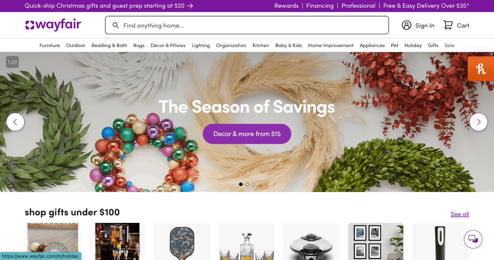
❌ Not recommended: AliExpress
AliExpress's value proposition is not prominent:
1. It’s located at the bottom of the page.
2. The text size is not big enough.
4. Visually prominent CTAs
Once you have established trust and communicated your value proposition, you want to avoid any kind of friction in the user’s next step.
For that, your CTAs should be instantly visible to the user.
In 2000, the average human attention span was 12 seconds. By 2013, that number had fallen to 8 seconds, a second shorter than a goldfish. (You know, the fish is notorious for being unfocused.)
As a result, it's more important than ever to design CTAs that capture attention quickly and effectively.
For that, your CTAs should preferably be buttons. Buttons grab more attention than links due to their design and clear call to action.
To make your button CTAs even more prominent, follow these practices:
1. Keep your CTA button above the fold and in the center
2. It should be big enough for the user to notice it instantly.
3. Color contrast the CTA button against the background.
4. Surround the CTA with white/blank space.
5. Avoid competing graphics that take away the prominence of your CTA.
6. Avoid large navigation menus that might overshadow your CTA.
7. There should only be one primary CTA.
In short, your CTA should be the most visible element on your home page, maybe second only to your value proposition.
Example
✔️ Follow: Wayfair
Wayfair has a perfect CTA on their home page:
1. The CTA is a button.
2. The CTA is above the fold.
2. It is big enough for the user to notice it instantly.
3. Its color is in contrast to the background color.
4. It’s surrounded by blank space to create visual simplicity.
5. There are no competing graphics.
6. The navigation menu does not overshadow the CTA.
❌ Not to follow: Bonanza
The “Shop Now” CTA for Bonanza is not prominent:
1. The CTA is text and not a button.
2. The CTA is at the bottom of the page.
3. It is not big enough.
4. Its color is not in contrast with the background color.
5. There are multiple competing graphics.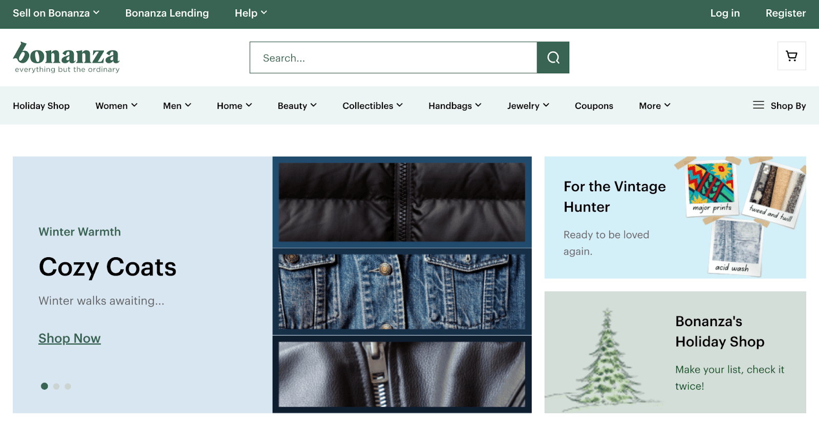
👉 Need help in website development services that focuses on conversion and user engagement? Learn how our website development service can help.
5. Less noticeable secondary CTA
There should only be one prominent CTA on the home page. When there are two or more CTAs, users are no longer directed to do any action. Instead, they get mentally consumed trying to sift out differences between the multiple CTAs. This leads to drop-off.
So, keep the secondary CTAs less noticeable on your homepage.
✔️ Follow: REI
On REI’s homepage, there is only one prominent CTA. The rest of the other CTAs are lower in the visual hierarchy.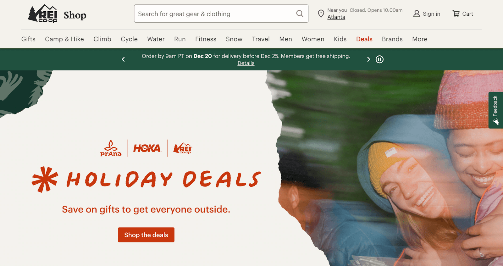
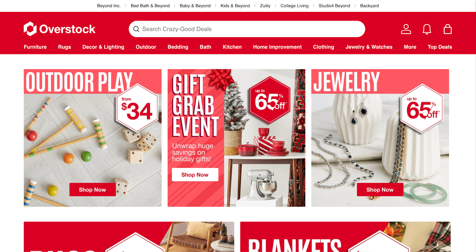
❌ Not to follow: Overstock
Overstock has multiple CTAs on the home page at the same level of visual hierarchy. This is not the best practice for CTAs on the home page.
6. Showcasing hero products on the Home Page
Hero product is the best-selling product of the brand.
Showcasing hero products on the home page is a great strategy to drive conversions. It simplifies decision making for the visitors, and the chances of them taking the next step are high since it is the brand's best-selling product.
Example: Winky Lux
This brand prominently displays its hero product (Tri-Colored Temptations Lipstick) on the home page.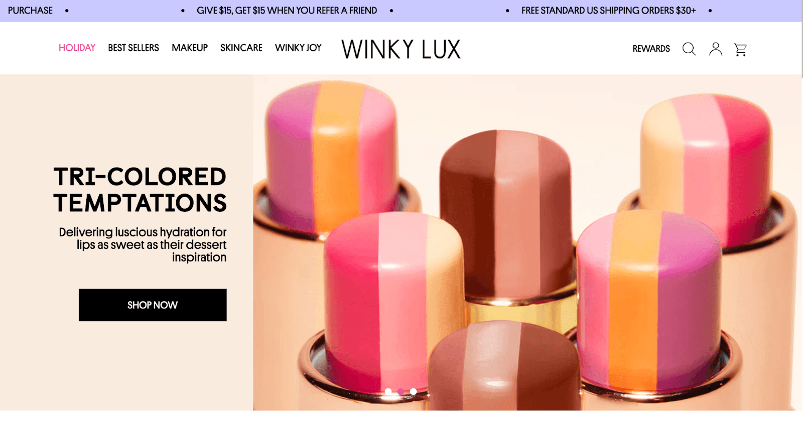
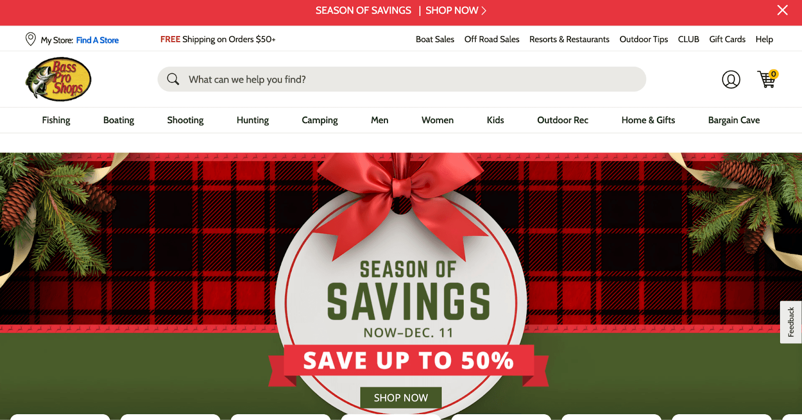
7. Making the Home Page seasonal
A seasonal homepage adds excitement and makes your website feel alive and in tune with the moment. It’s a great way to showcase festive offers, spark curiosity, and create that “I need to grab this now” feeling.
It helps you connect with your customers on a more personal level, making their shopping experience even more memorable.
Example: Bass Pro Shops
Bass Pro Shops have aligned their home page with the Christmas festive season. They have added Christmas-y images and are giving Christmas discounts.
This creates an emotional and memorable experience for the visitors. With their festive discount offer, they are also creating a feeling of urgency.
This was all about the Home Page CRO audit. Next, we will cover the Product Page.
How to perform ecommerce CRO audit for product pages
Purpose of product pages: Give users every bit of information they need to make the buying decision and make them press the ‘Buy’ or ’Add to Cart’ button.
1. Product Descriptions
Product descriptions play a crucial role in influencing customer decisions. They should clearly communicate the product’s features, benefits, and unique selling points, creating a sense of value.
A well-written product description is crucial to increase your conversion rates.
Best practices for writing product descriptions:
- It should be comprehensive.
- Focus on clarity and conciseness.
- Use bullet points for easy reading.
- Incorporate relevant keywords for SEO.
- Address customer pain points.
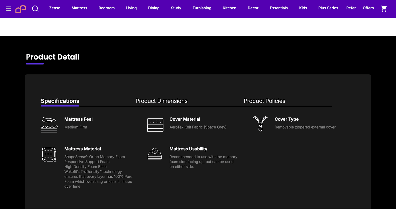
Example: Wakefit
Below are some screenshots of Wakefit's product page. In their ‘Product Detail’ section, they have fleshed the product details:
1. They have stated everything the customer wants to know about the product.
2. The description is clear and concise.
3. They have broken down the details into different points.
4. They have also addressed customer pain points. (Check the ‘Mattress Material’ point)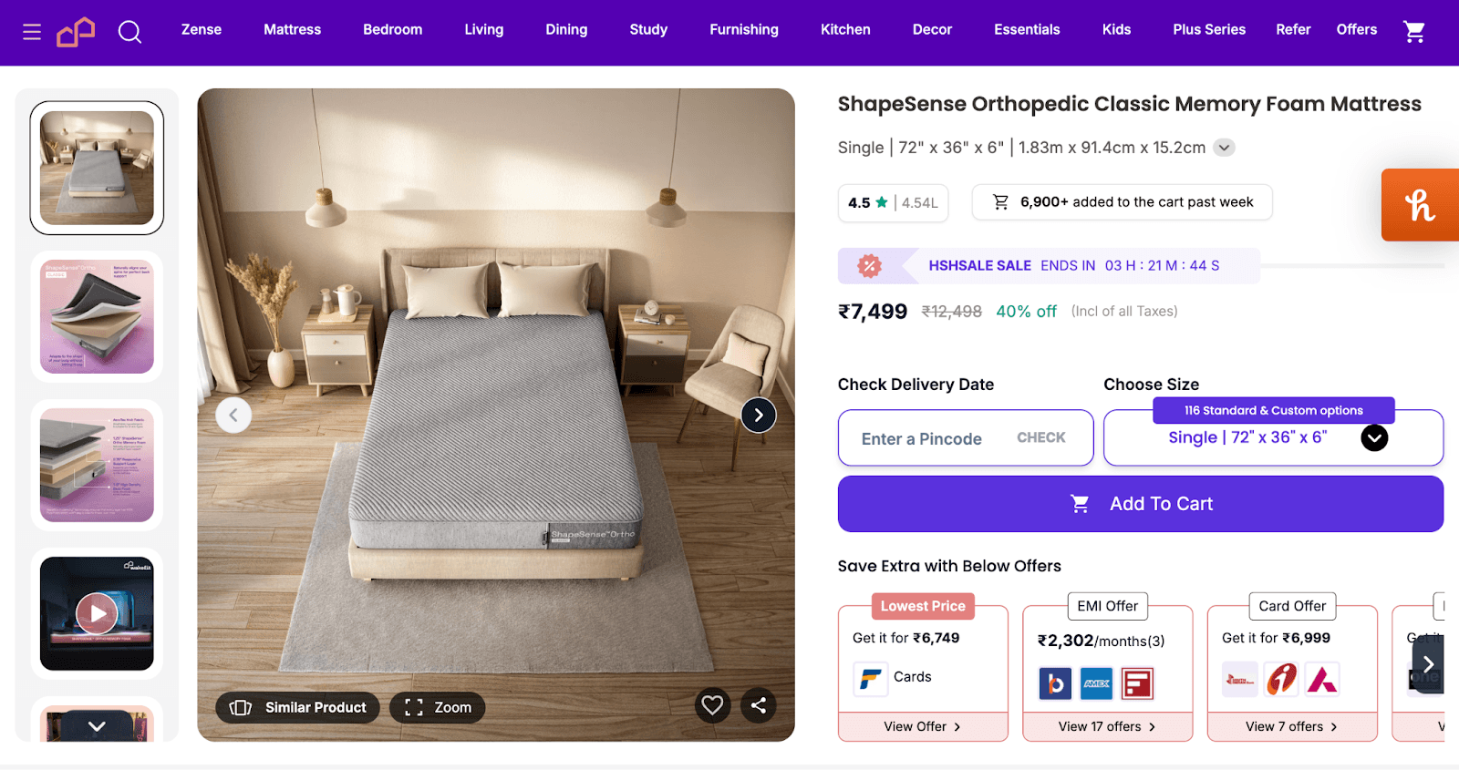
2. Product Images and Videos
Product images and videos can significantly impact a customer’s buying decision. Many online shoppers say they are more likely to buy a product if they see a video of it in action.
Best practices:
- Use high-quality (at least HD), zoomable images.
- Show the product from multiple angles.
- Incorporate videos that demonstrate product use.
- Allow customers to see the product in context (e.g., a person using it).
Example: Wakefit
Wakefit has diligently followed all the best practices:
1. Their photos and videos are of excellent quality.
2. Their pics and videos show the product from multiple angles.
3. They have demonstrated product use cases in their videos. (check out their website)
4. Their video shows people sleeping on their mattresses. (check out their website)
3. Trust signals and social proof
Trust signals, such as customer reviews and ratings, significantly impact the likelihood of purchase. 88% of consumers trust online reviews as much as personal recommendations.
Social proof strategies:
- Display customer reviews and testimonials with photos/videos to increase credibility.
- Feature expert reviews or endorsements.
- Showcase how many people have purchased and reviewed the product.
- Real time small popups of others purchasing products on the site, are also used to increase conversions.
Example: Wakefit
Wakefit has aced social proof display on their product page as well:
1. They have displayed customer reviews and testimonials.
2 They have displayed the count of customer reviews.
3. They have partnered with big brands such as Myntra, Boat, etc, and showcased it well. This again builds credibility.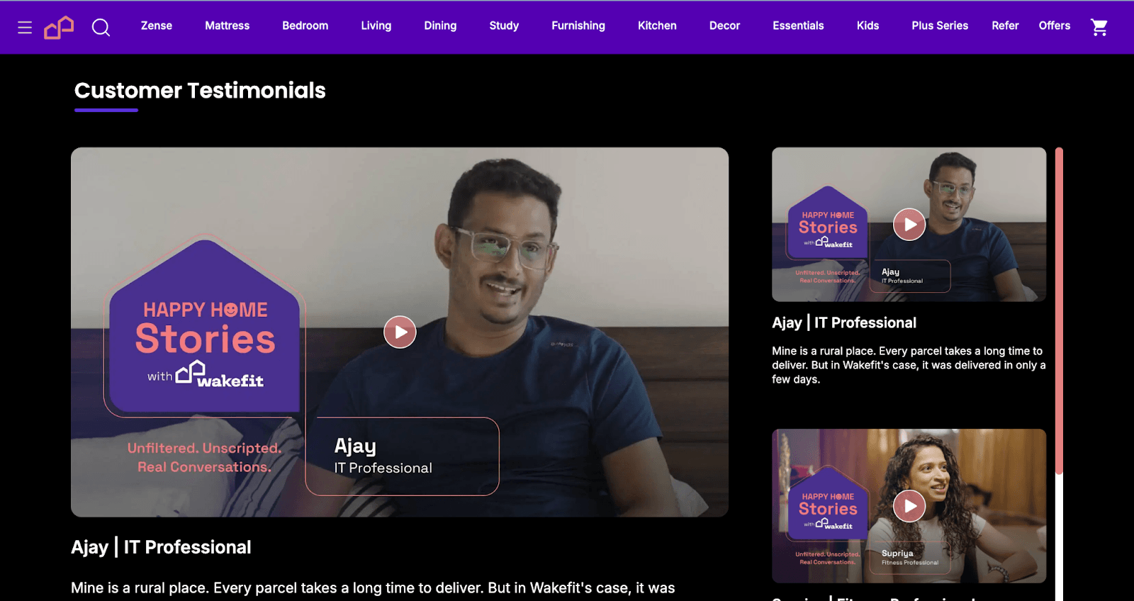
4. Display payment options
Displaying the right payment options on the product page can increase conversions. 54% of shoppers abandon their cart due to a lack of preferred payment methods.
Best practices:
- Display icons for all the supported payment methods (e.g., UPI, PayPal, credit cards)
- Highlight the offers corresponding to the payment options.
Example: Wakefit
Wakefit displays the payment options beautifully and has clearly highlighted the offers associated with each payment option.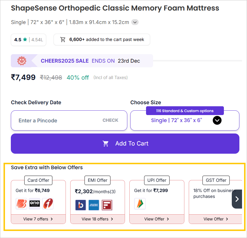
5. Link to size guide
Offering a clear and easy-to-find size guide on the product page can reduce return rates and increase conversions.
Best practices:
- Place the size guide link near the sizing options.
- Provide a comprehensive guide with measurements and fit advice.
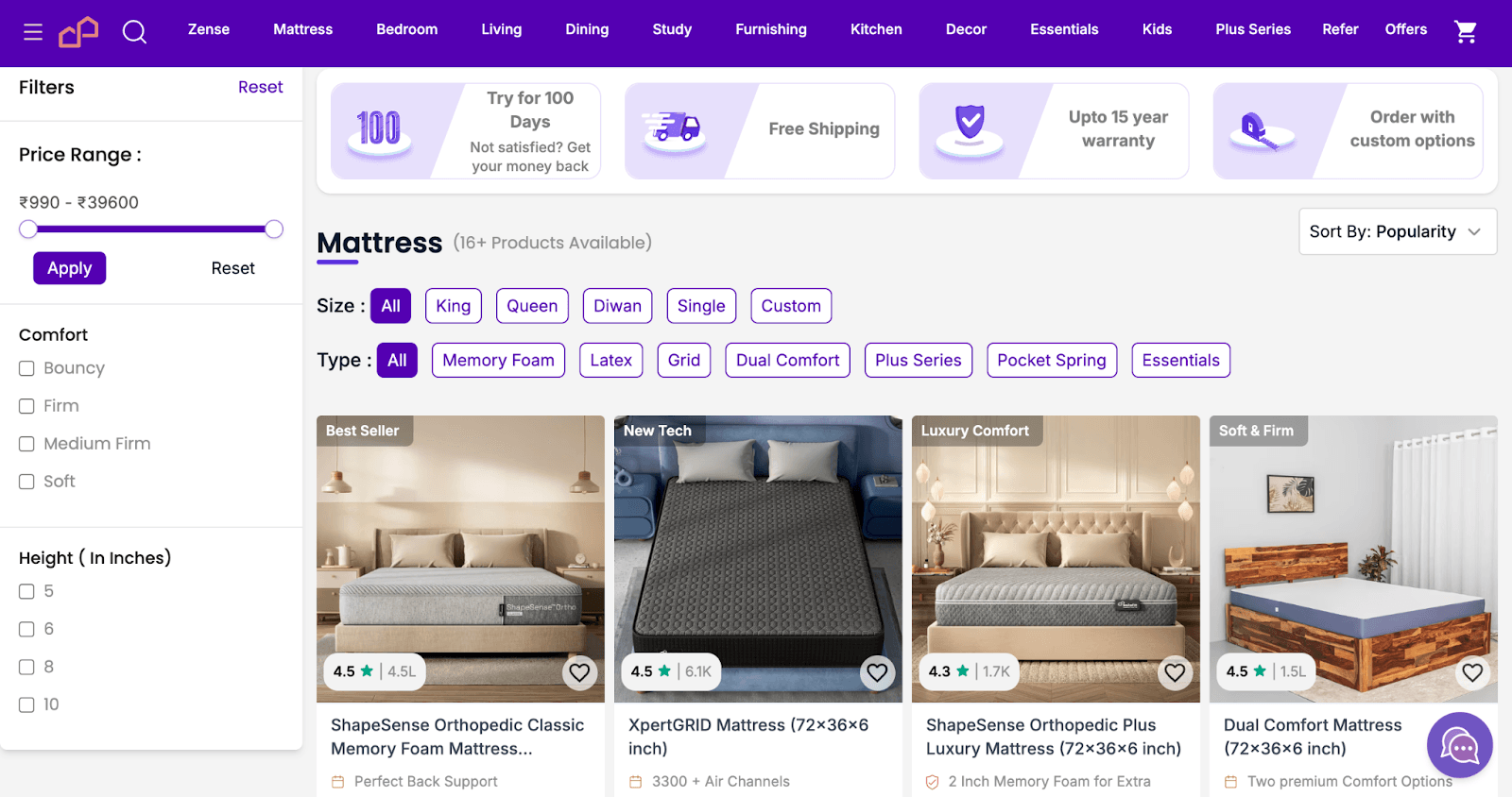
Example: Flipkart
Flipkart displays a comprehensive size guide with measurement and fit advice. The size guide link is placed near the sizing options. Check the screenshots below: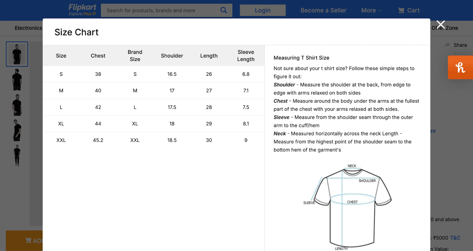
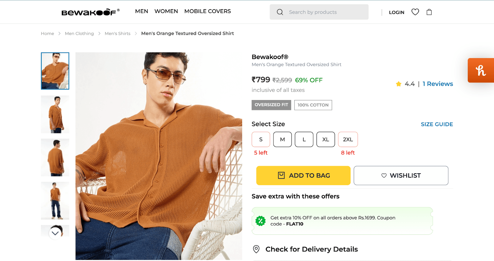
6. Urgency/Scarcity
Creating a sense of urgency or scarcity can encourage users to purchase quickly. Many ecommerce owners say they develop a sense of urgency for a product that makes it more likely to sell.
Best practices:
- Display limited-time offers or countdowns.
- Show low-stock notifications (e.g., “Only 3 left in stock!”).
Example: Bevakoof
You can see in the screenshot below how they have displayed ‘5 left’ in the select size section.
7. Product comparison feature
A product comparison feature can help customers make informed decisions, especially when faced with multiple similar products. 81% of consumers are likely to research and compare products before purchasing.
Best practices:
- Enable side-by-side comparisons of key features.
- Highlight the product differences in a user-friendly format.
Example: Wakefit
Wakefit has a product comparison tool on the product pages, where customers can compare different options. Checkout the screenshot below: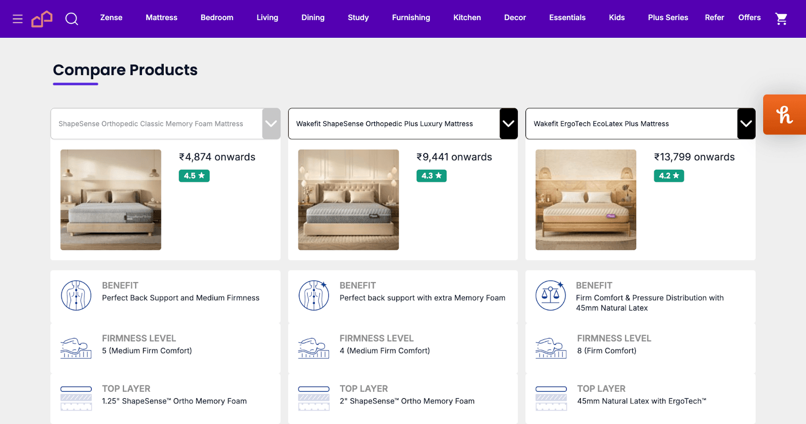
8. Anchoring pricing
Anchoring pricing helps customers perceive the value of a product by presenting a higher-priced product next to the target product. It makes the customer perceive it as being a good purchase deal.
Best practices:
- Show the original price alongside the discounted price.
- Use strikethroughs or “Save X%” to highlight savings.
Example: Flipkart
Check out the screenshot below. It shows 66% off on the price. The sellers on Flipkart keep the original price inflated and then give a discount on that inflated price.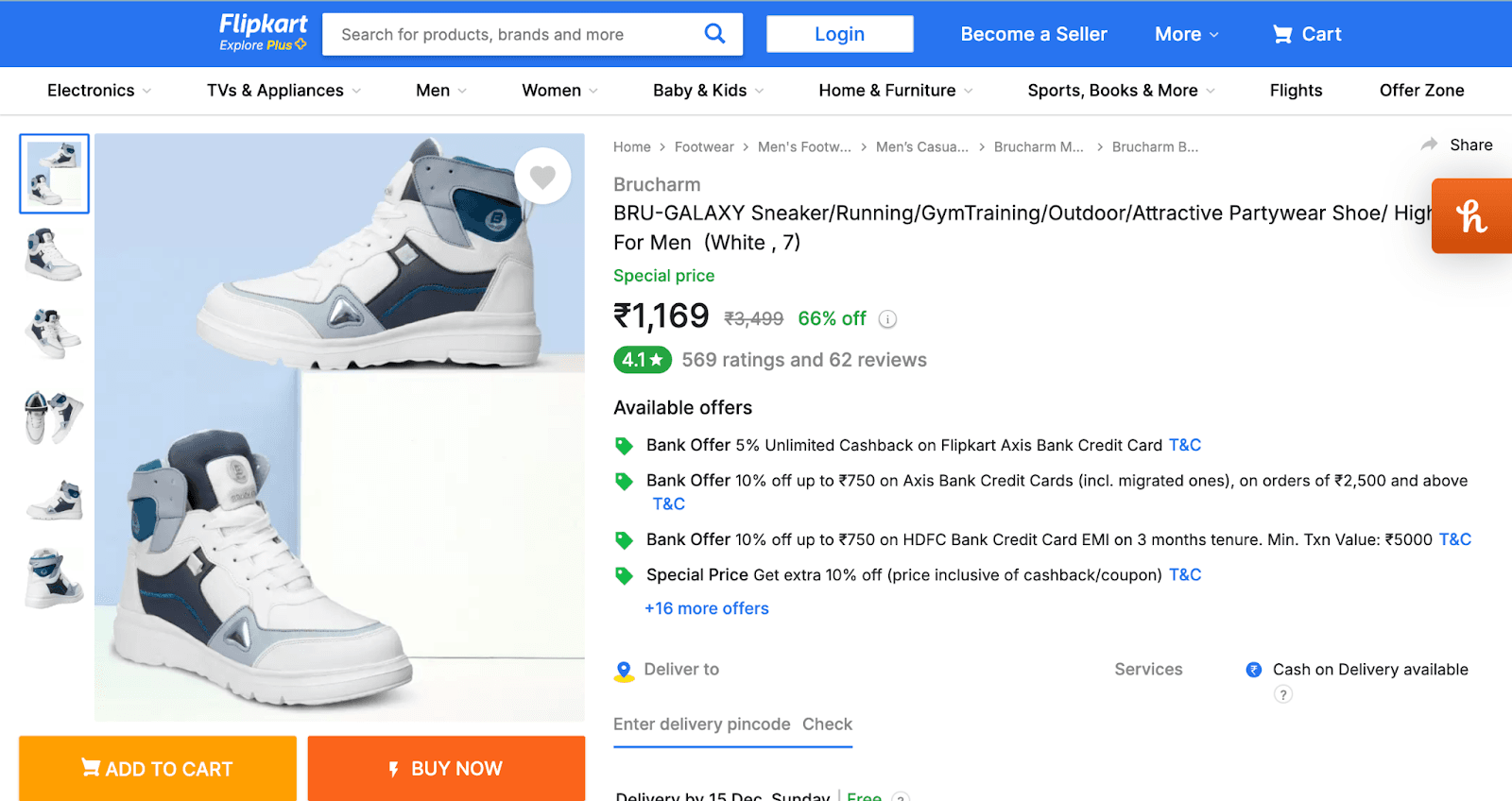
9. Live chat
Live chat has been proven to increase customer satisfaction and conversions. 42% of customers are more likely to purchase if live chat is available on the product page.
Best practices:
- Use proactive chat prompts (e.g., “Can I help you find something?”).
- Ensure the chat support is available 24/7 or during peak shopping times.
Example: Wakefit
Wakefit has ‘Chat with us’ and ‘Video call assist’ options on their product page.
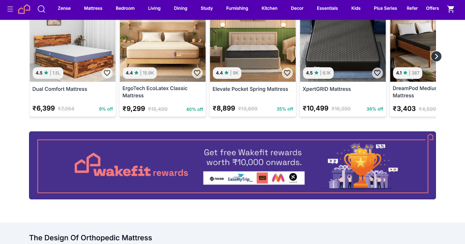
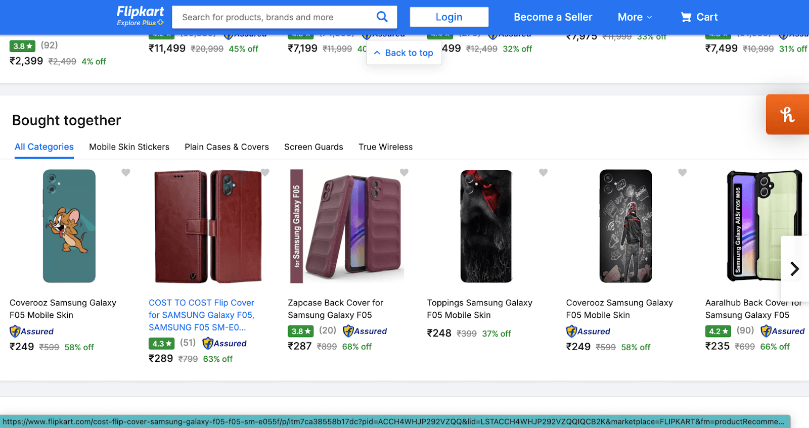
10. Cross-Sells/ Up-sells
Cross-sell and up-sell strategies can increase the average order value. Online Shoppers are willing to buy more if it comes with an exciting offering like a gift or discount.
Best practices:
- Suggest related products that complement the current product.
- Offer discounts on the second product when bundled.
Example: Flipkart
Flipkart has a ‘Similar products’ section using, which they cross-sell. They also have a ‘Bought together’ section to upsell.
11. Call to Action
A visually prominent and clear CTA guides users toward the next step of the buying journey.
Best practices:
- Use action-oriented words like “Add to Cart” or “Buy Now.”
- Ensure the CTA stands out visually.
- A/B tests different CTA placements for better performance.
Example: Wakefit
Wakefit has a visually prominent ‘Add To Cart’ CTA on its product pages. Check out the screenshot below:
How to do ecommerce CRO audit for category pages
Purpose of category pages: The page aims to help users easily explore and find the products they wish to buy.
The following elements impact the user’s navigation experience in category pages:
1. Category page UI design
The category page UI needs to be visually appealing and intuitive to keep users engaged. A clean, simple layout with clear headers and easy access to filtering options can significantly improve user experience and reduce bounce rates.
Best Practices:
- Use consistent typography and high-quality product images.
- Keep the category page visibly clean.
- Place filters and sorting options in easily accessible areas.
- Highlight important product categories prominently.
Example: Wakefit
Wakefit uses a simple, organized layout with easy access to filters and sorting options, making it easier for users to navigate through different products. They display high-quality images and use attractive typography.
Check out this screenshot of one of their category pages:
2. Optimized filters and sorting options
Filters are crucial for helping users narrow down a large pool of products to those that fit their specific needs. Sorting options should be easy to use and well-organized.
Best Practices:
- Use filters for size, color, material, brand, and price range.
- Sorting options should include the most relevant criteria, like best-selling or top-rated products.
Example: Amazon
Amazon has all the required filters (in the left panel) and sorting options (top right) in their category pages. 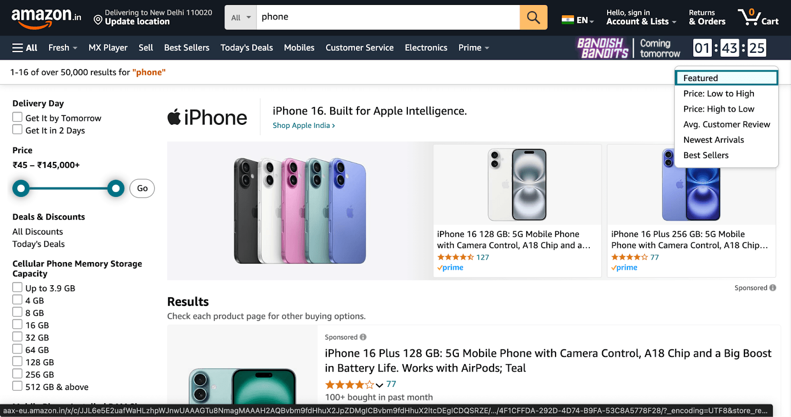
3. Logical organization of categories (parent/child structure)
Products should be categorized logically, with clear parent-child relationships that help users understand where to look for specific products. This helps users find what they are looking for faster.
Best Practices:
- Group similar products together under appropriate categories.
- Use clear parent/child hierarchies for easy navigation.
Example: Amazon
Amazon has grouped the products into logically structured categories. They have established a parent-child hierarchy to make navigation more manageable for the users. Check out their website here.
4. Segmentation
Segmenting products into dynamic groups such as "New Arrivals," "Best Sellers," “Trending,” and "Sale" allows users to easily explore curated selections, making the shopping experience more personalized and efficient. This also helps guide users directly to high-demand areas of the site.
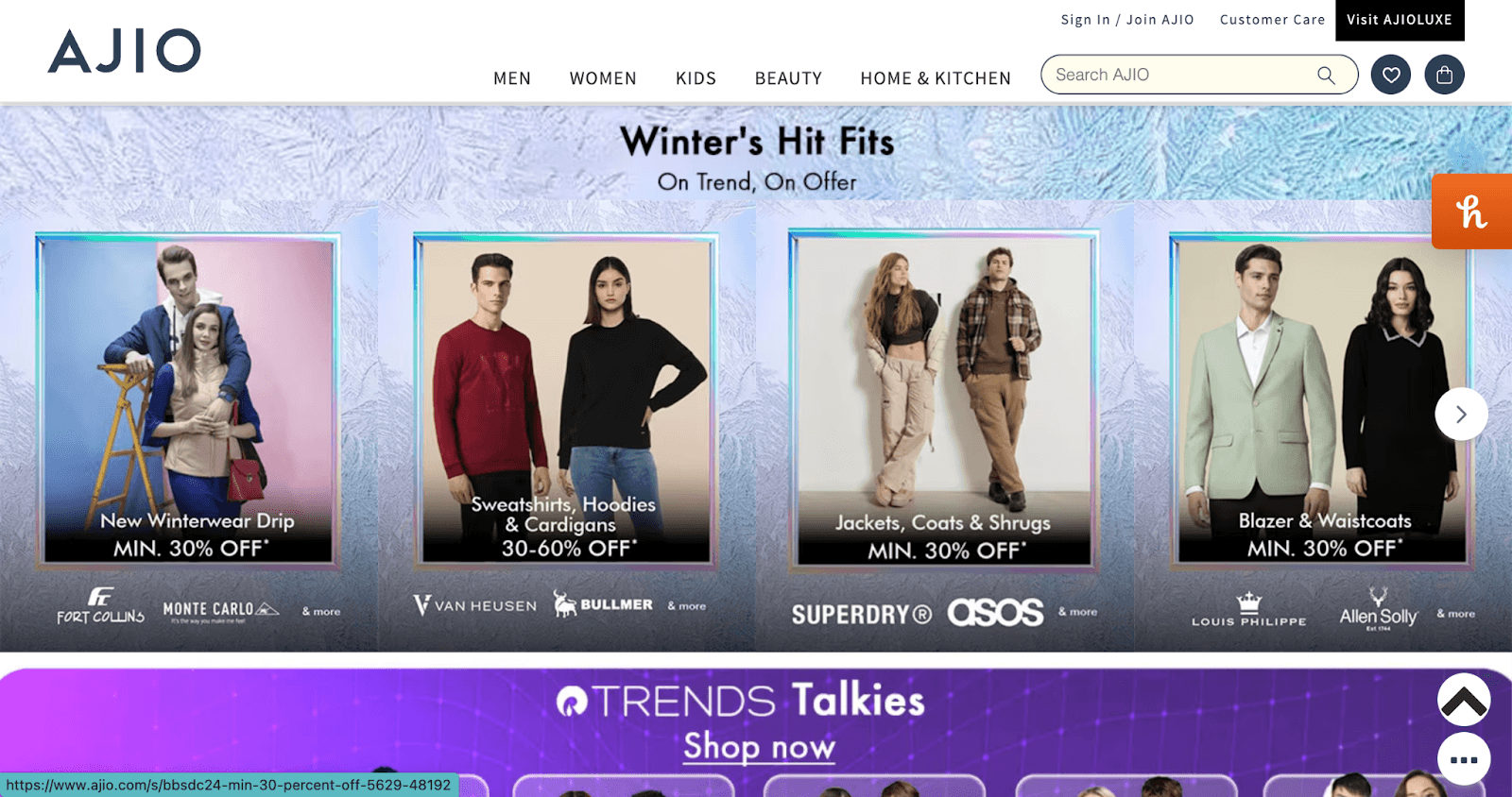
Example: Ajio
Ajio has dynamic segments such as ‘Winter’s Hit Fits’ and ‘Trends Talkies’ to let users explore seasonal and trendy clothing.
5. Sort by relevance and highlight bestsellers
Show products based on relevance, factoring in user preferences, past behavior, and top-selling items within the category. Highlight the top-selling items in the category to guide users toward popular and trusted choices.
Example: Flipkart
Flipkart highlights the best-seller products on their category page. 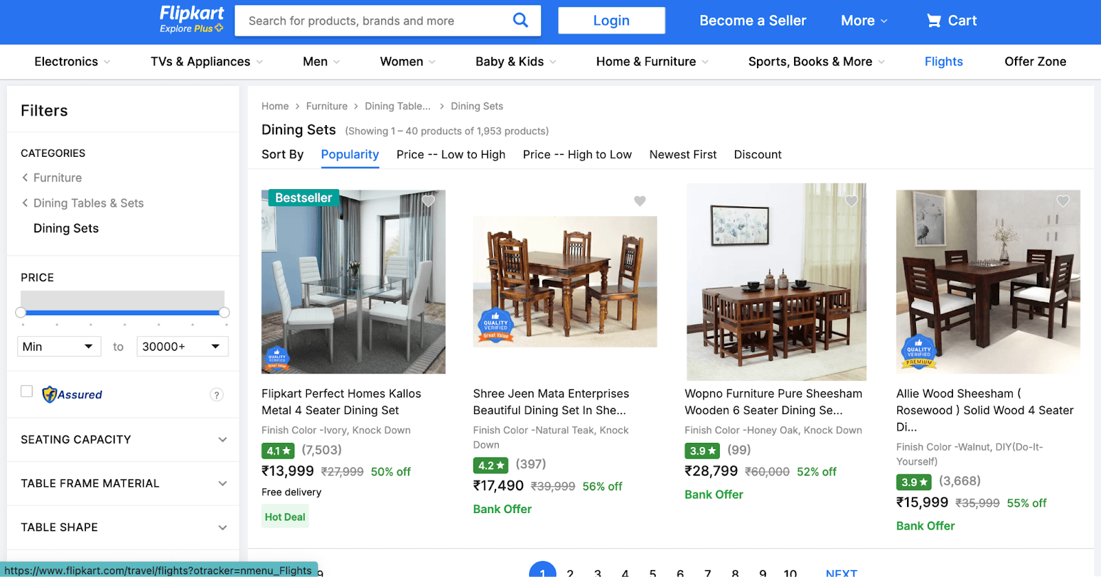
How to do ecommerce CRO audit for checkout pages
Purpose of checkout pages: Facilitate a smooth, efficient, and secure transaction process. It should minimize friction, address customer concerns, and encourage trust.
The following elements impact the user’s experience on the checkout page:
1. Minimize form fields
Only ask for the essential info that is critical to place and fulfill the order, such as:
- Name
- Shipping Address
- Payment Information
- Contact Details (Email or Phone for updates)
Fewer fields mean a quicker checkout, reducing abandonment.
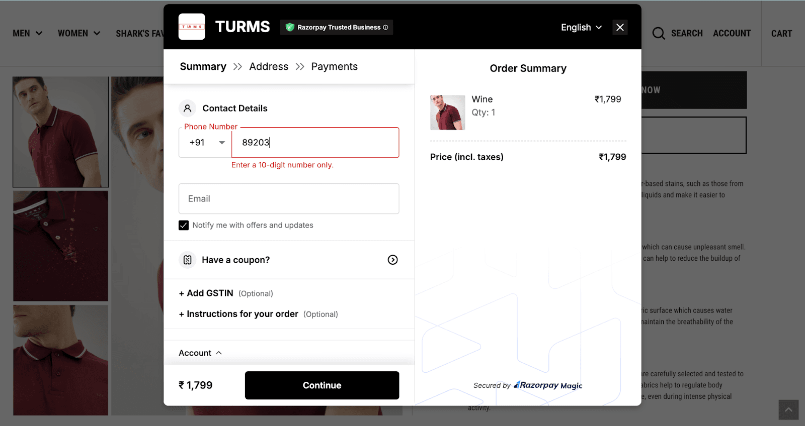
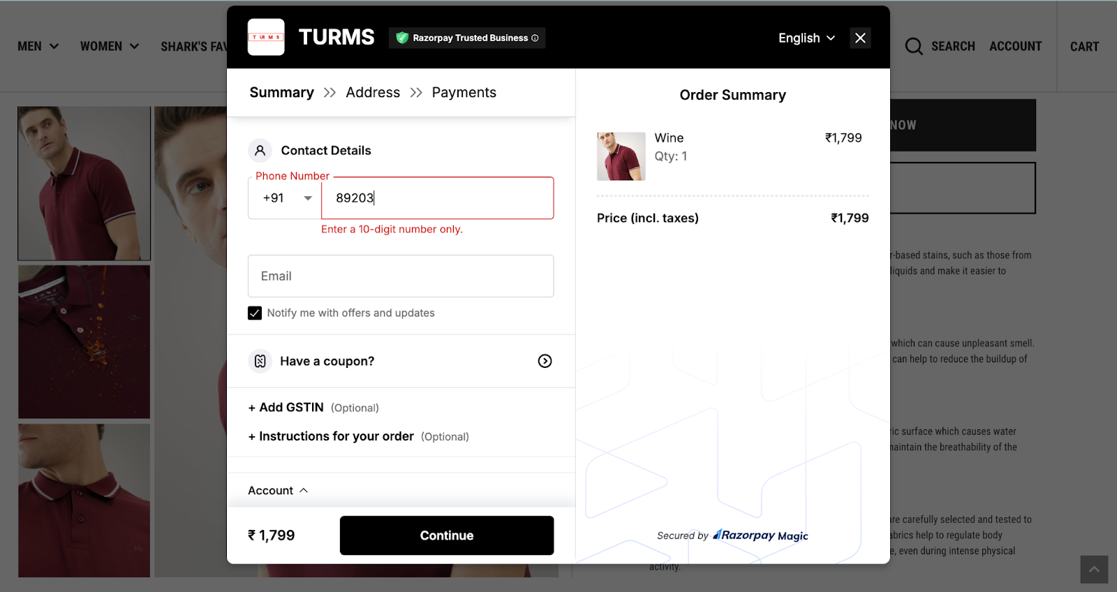
Example: Turms
Turms just ask for the contact details, address, and payment details at the checkout.
2. Progress indicator
Show users their progress and how many steps are left to complete the checkout. This manages expectations and reduces frustration.
Example: Flipkart
Flipkart tells you how many total steps and which step you are on. Check the screenshot below: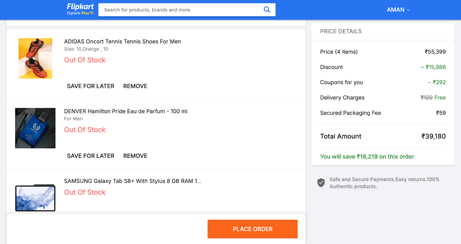
3. Guest checkout option
Allow customers to check out as guests, avoiding forced account creation that leads to cart abandonment.
Example: Nike
Nike gives their users a guest checkout option. 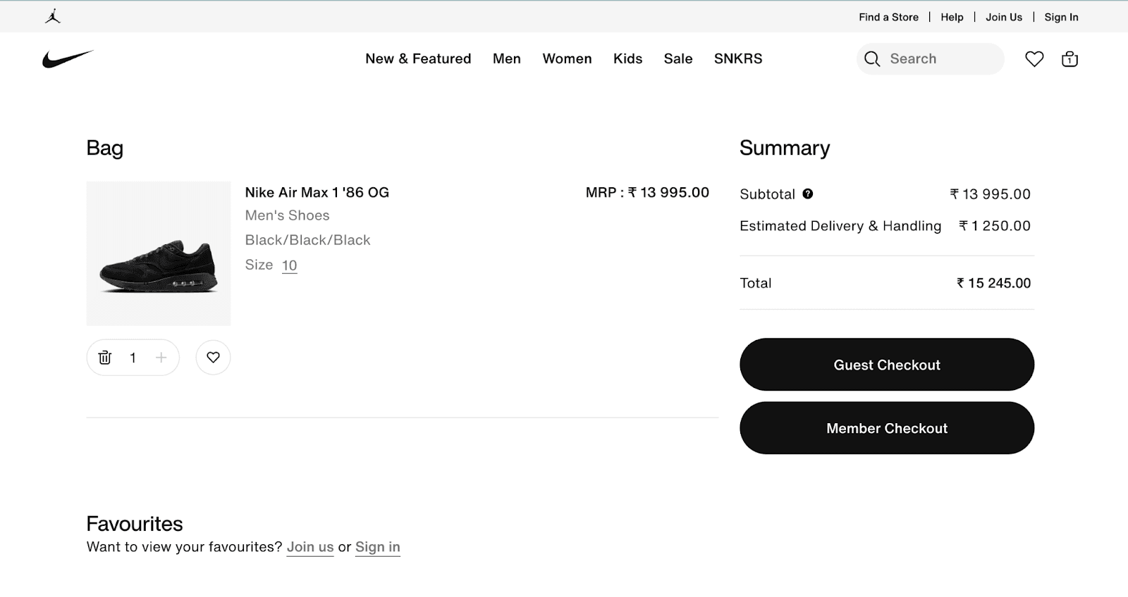
4. Offer multiple & secure payment options
Provide a variety of payment methods, such as credit cards, PayPal, Apple Pay, Google Pay, etc., to cater to different preferences and build trust.
Integrate SSL certificates to reassure your users of the privacy of their data.
Example: Flipkart
Flipkart offers multiple payment options to users, such as UPI, Paytm, credit cards, etc.. It has also integrated SSL certificates into its website.
5. Transparent pricing
Display all costs upfront, including taxes and shipping, to avoid hidden fees and prevent cart abandonment.
Example: Flipkart
Flipkart gives you an upfront break of the amount, as shown in the screenshot below:

6. Auto-fill fields
Use auto-fill for address and payment details, speeding up the process, especially for returning customers.
Many ecommerce websites, such as Amazon, Flipkart, etc., do this.
7. Optimize for mobile
Ensure the checkout is mobile-friendly, as a complicated phone process can result in lost sales. As discussed above
Example: Amazon
Amazon is optimized for mobile. Checkout the screenshot below:
8. Simplify navigation
Remove distractions during checkout, focusing on completing the purchase to increase conversions.
Example: Turms
On their checkout page, there is no distraction at all. Customers are just directed to provide the essential details and make the payments.
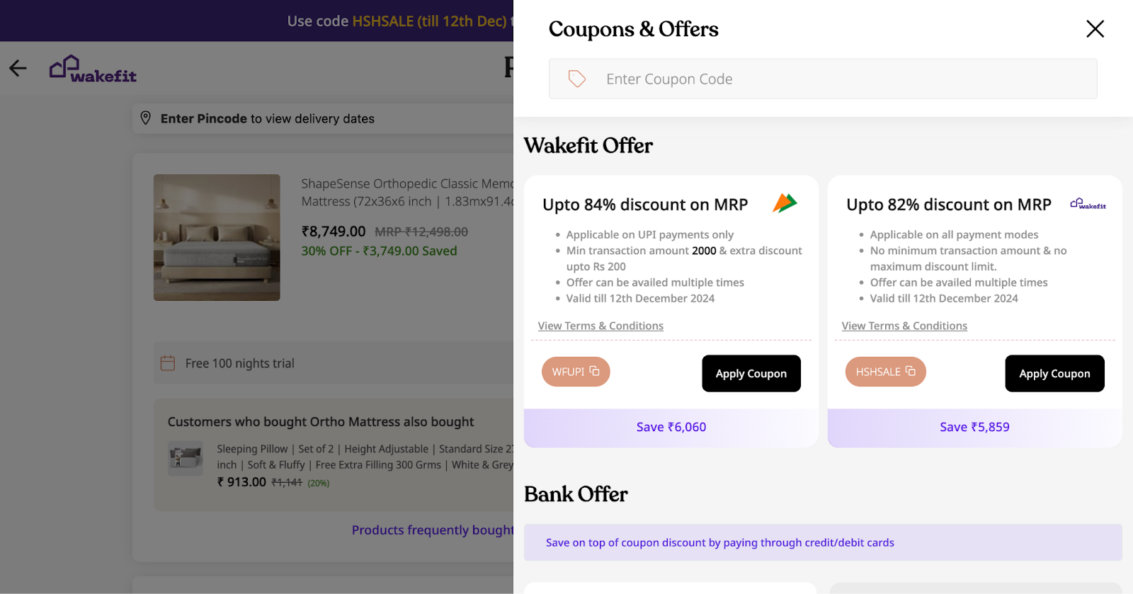
9. Offer discounts & coupons clearly
Make discounts and coupon applications easy to find to prevent frustration and cart abandonment.
Example: Wakefit
Wakefit displays the offers clearly and prominently on their checkout page. Check the screenshot below:
10. Exit-intent popups
Use exit-intent popups offering incentives (like free shipping) to encourage users to complete their purchase.
Many websites, such as Skullcandy, Jcrew, etc.
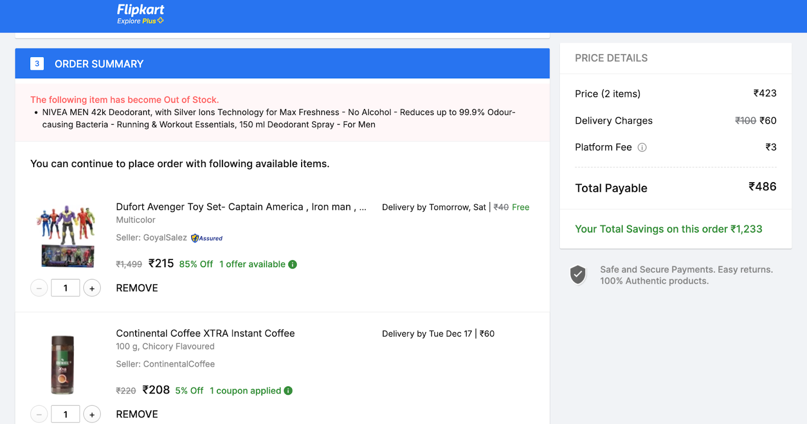
11. Show a summary of the order
Provide an order summary with images, quantities, and pricing details to confirm the customer's decision.
Example: Flipkart
Flipkart displays a clear and comprehensive order summary on their checkout page. Check the screenshot below:

12. Allow easy edits
Enable customers to modify cart contents without leaving the checkout page to avoid abandonment over small mistakes.
Example: Flipkart
Flipkart lets you edit the cart contents on the checkout page.
You can change the quantity or remove a product from the checkout page. Check the screenshot below:
13. Reassure with a clear return policy
Display your return policy on the checkout page to reassure customers and encourage purchase finalization.
Example: Macy’s
Macy’s displays a link to their return policy on their checkout page (at the bottom).
14. Pre-fill shipping info for logged-in users
Auto-fill shipping details for logged-in customers to streamline the process and reduce cart abandonment.
Many websites, such as Amazon, Flipkart, etc. do this.
We evaluate your website for all the elements listed above for different pages.
How often should you audit your online store?
We recommend doing a full audit every six months (also suggested by Shopify).
A 6-month timeline is effective because:
- Many eCommerce businesses operate on seasonal patterns, such as holiday sales, making mid-year and year-end audits ideal for preparation.
- 6-monthly audits also ensure your site keeps pace with technological updates ( substantial technological advancements happen in 6 months).
- A 6-month interval provides ample time to analyze data, fine-tune strategies, and assess ROI from the previous audit.
Having said that, section ‘specific’ audits might be needed after every major website redesign and product/feature launch.
Audits help you catch issues like slow load times, broken links, or confusing navigation that could harm the user experience. It’s a chance to review your conversion rates and checkout process to ensure everything is working at its best.
At Tenet, we’re all about keeping your store fresh, optimized, and driving maximum results!
What is included in an ecommerce CRO audit report?
Tenet’s ecommerce CRO audit report is crafted to deliver actionable insights that drive results.
Here are some samples from a recent project we completed for ecommerce CRO improvement for a store selling newborn & kids products.
Google Analytics Audit
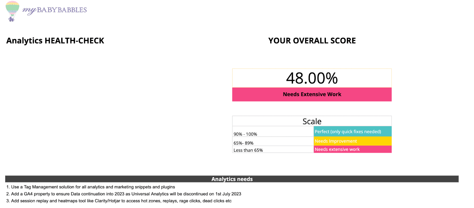
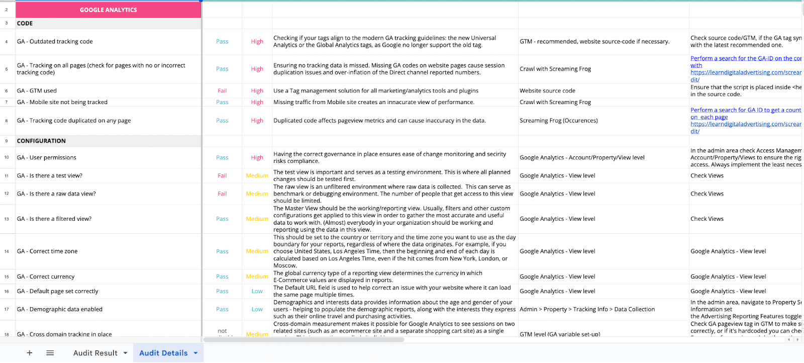
GA audited revealed areas where the data capturing infrastructure needed improvement. The report comes with suggestions of all impact categories (low, medium, and high) along with next steps, action items, dependencies, and references to help the client & developers understand why we’re recommending what we’re recommending.
Competitive Benchmarking and UX Audit
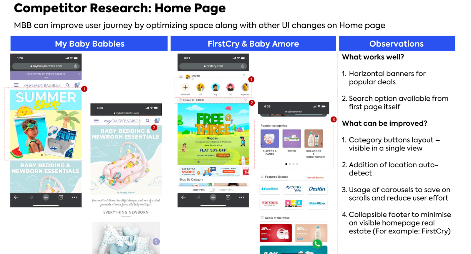
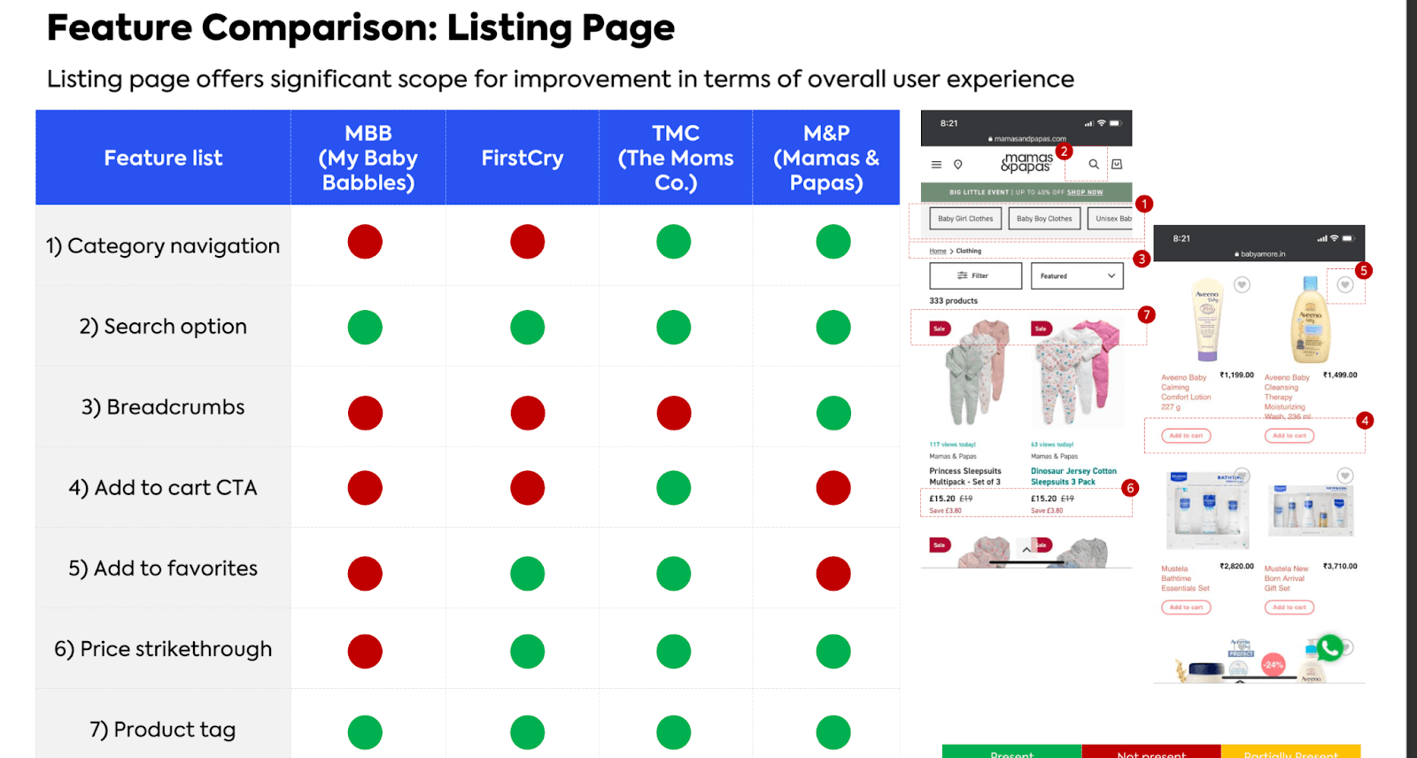
Top brands are spending millions of dollars trying to improve their conversion rates. It is always a good idea to ensure we’re not missing something our competitors are already doing and winning. We combine competitive research with unique recommendations not only to match but surpass the strategies your competitors use.
Our Proprietary Checklist Containing Over 300+ Custom Recommendations
This checklist is carefully curated by our team after successfully delivering results for multiple small and big brands across the globe.
To summarize, here’s what you’ll find in it:
1. Key issues with priorities
We identify and rank issues based on their impact on your revenue and conversion rates, ensuring you tackle the most critical ones first.
2. Conversion barriers
Detailed analysis of obstacles in your customer journey, such as slow-loading pages or confusing checkout processes that hinder conversions.
3. UX/UI enhancements
Practical recommendations to improve your site’s usability, ensuring seamless navigation and a better shopping experience.
4. Data-driven insights
A comprehensive review of your store’s performance data to uncover hidden growth opportunities.
5. Data infrastructure improvements
GA4 Audit that reveals and recommends best practices for best results.
6. Competitive benchmarking
Understand what your competitors are spending millions of dollars on, and outsmart them by improving and implementing them on your website.
7. Tailored action plan
Each finding has prioritized action steps, giving you a clear roadmap to increase revenue and improve metrics.
At Tenet, we aim to empower you with solutions, not just highlight problems, for sustainable growth.
How much does an ecommerce CRO audit typically cost?
This may usually fall between $1,000 and $15,000, depending on the website's complexity and the depth of the audit.
An e-commerce CRO (Conversion Rate Optimization) audit generally operates on a project-based pricing model. Simpler audits may cost less, while more detailed ones that involve user testing, advanced analytics, and in-depth recommendations tend to be pricier.
The final cost can vary based on website size, traffic, and specific business objectives.
When is a conversion optimization audit right for You?
We recommend a conversion optimization audit when you're getting traffic but struggling to turn those visitors into customers.
A CRO audit helps you identify the missing elements on your website—elements that repel website visitors and elements that might be great drivers in the customer buying journey.
A CRO ensures your website features work together smoothly, creating an easier, more enjoyable journey for customers—from browsing to buying—ultimately boosting conversions.
When is a conversion optimization audit not right for you?
A CRO audit may not be right for you if:
1. Quick fix: A CRO audit may not be the best approach if you're seeking immediate solutions. Examining every aspect of your website and implementing changes based on the findings takes considerable time.
2. Recent major changes: If significant changes have recently been made to the website, it’s wise to hold off on a CRO audit. Allow some time for these changes to take effect before assessing their impact.
3. Undefined goals: The process can become unfocused and ineffective without clear objectives for what the audit aims to achieve.
This was a glimpse into our CRO audit process.
If you are looking for any help with your website’s CRO, feel free to reach out to us. We have served more than 300 happy clients in 15+ countries.

Shantanu Pandey
Shantanu Pandey is a UI/UX design, branding, and growth marketing expert. As the Founder & CEO of Tenet, he helps global brands create amazing digital experiences.

Got an idea on your mind?
We’d love to hear about your brand, your visions, current challenges, even if you’re not sure what your next step is.
Let’s talk


 U.A.E:
 India:
 UK:
UK: USA:
USA: